Welcome to the Web! Web Development with Shiny 101
Figure 1
Figure 2
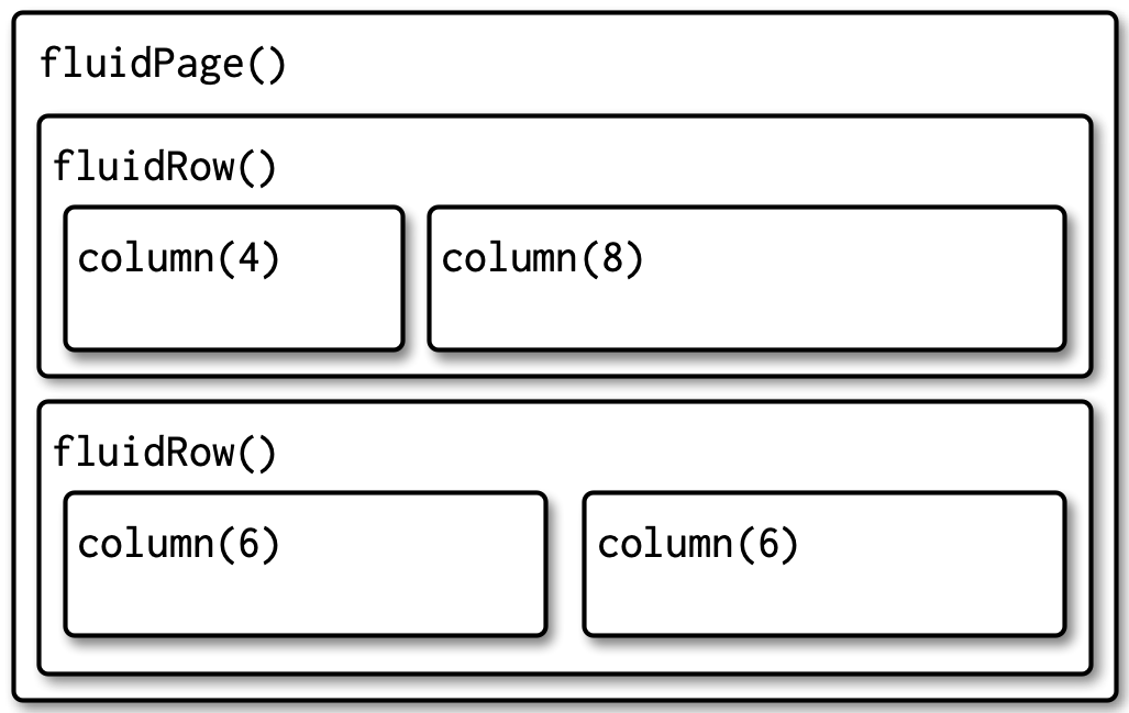
Figure 3

Figure 4
Building the Ground Floor of a Shiny App
Figure 1
Figure 2
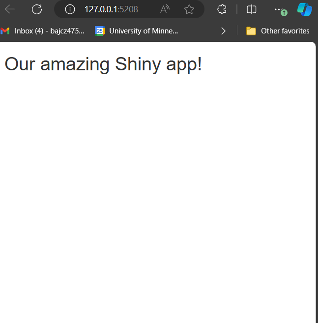
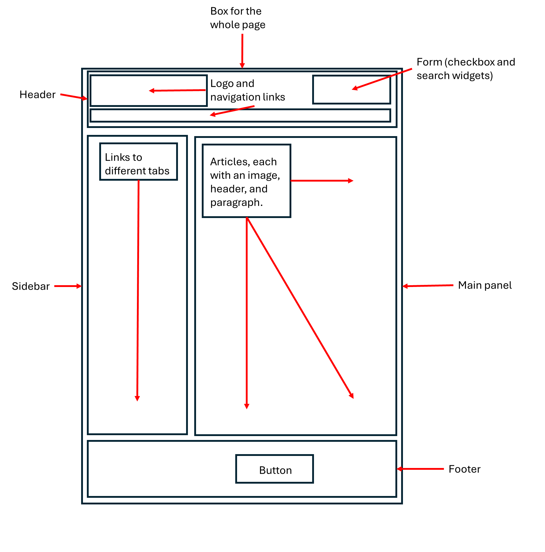
The app is not much to look at yet…we have added
a lot of HTML boxes to give it more underlying structure, but
haven’t given these new boxes any non-HTML contents yet.
Figure 3
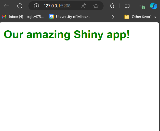
We’ve restyled our title to make it a
little more snazzy using CSS.
Figure 4
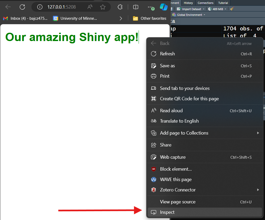
Open developers tools in Microsoft Edge by
right-clicking any element on any website.
Figure 5
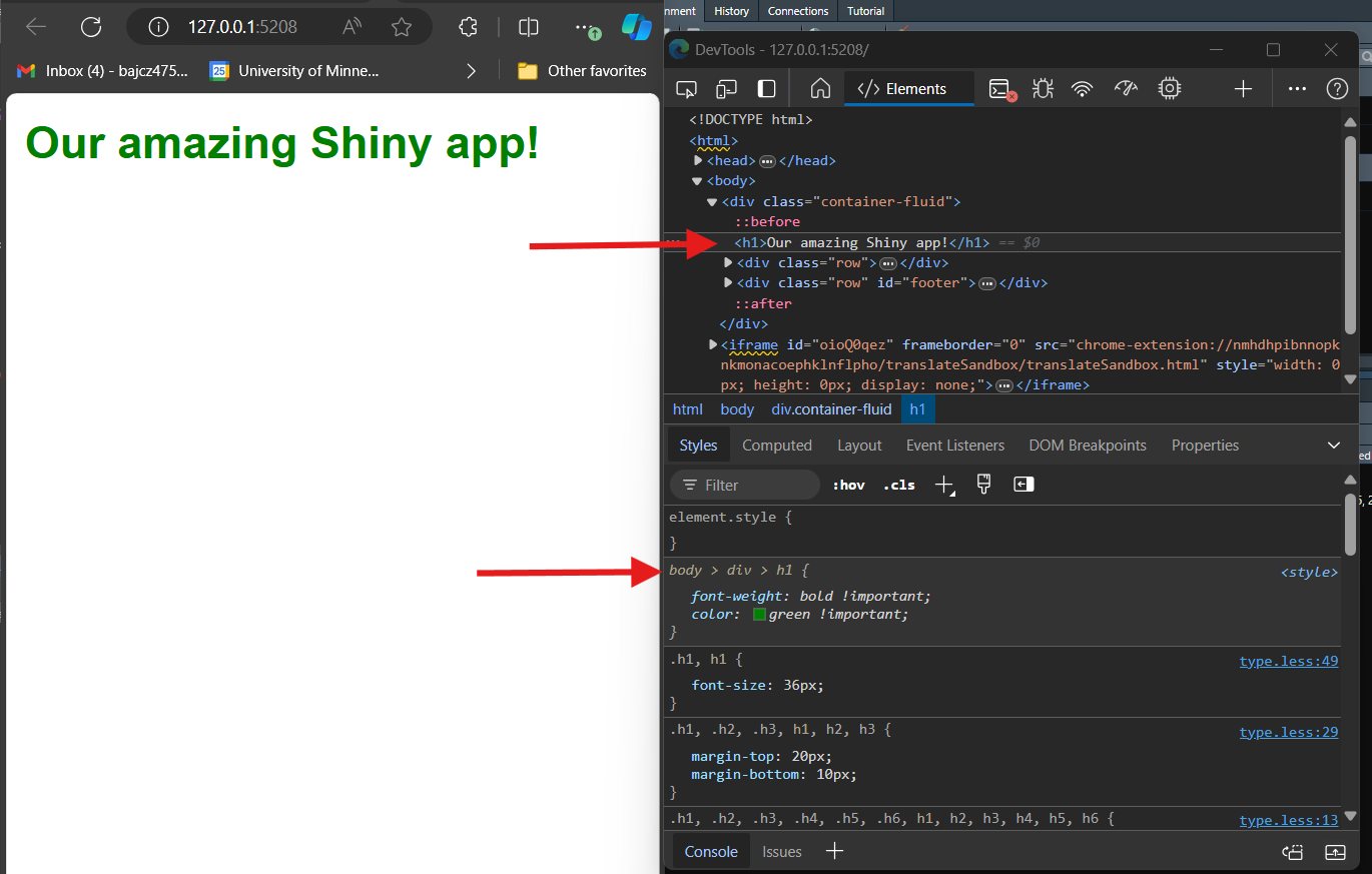
The developer’s tools dashboard shows an
intimidating amount of information. The most important thing to know is
that it shows the website’s current HTML and CSS, allowing you to see
and examine both in real time.
Figure 6
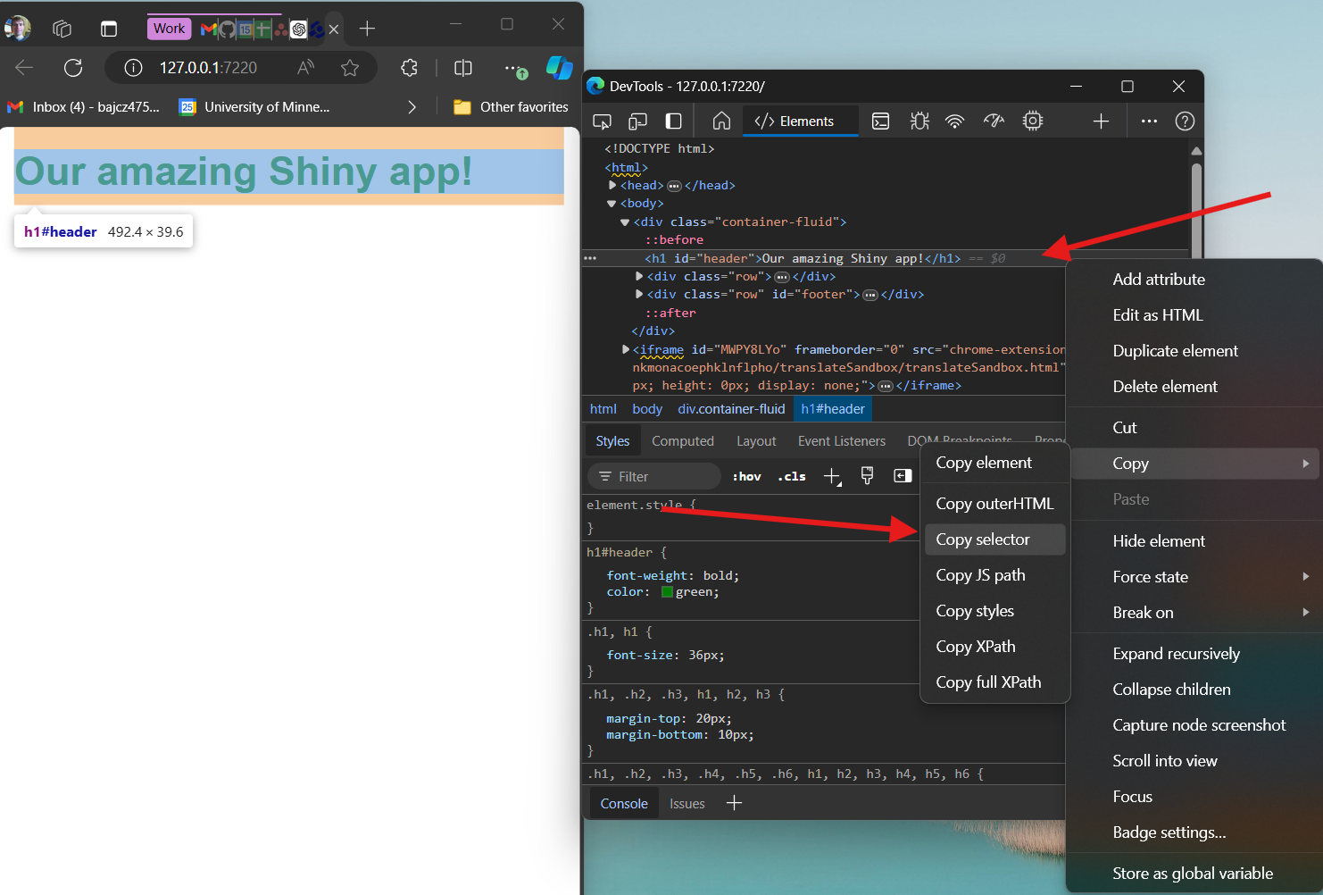
The developer tools dashboard is one of the most
powerful tools in a web developer’s toolbox. For example, it can be used
to grab the selector for any element you wish to style using CSS.
R Shiny's Core Concepts: Rendering and Outputting, Input Widgets, and Reactivity
Figure 1
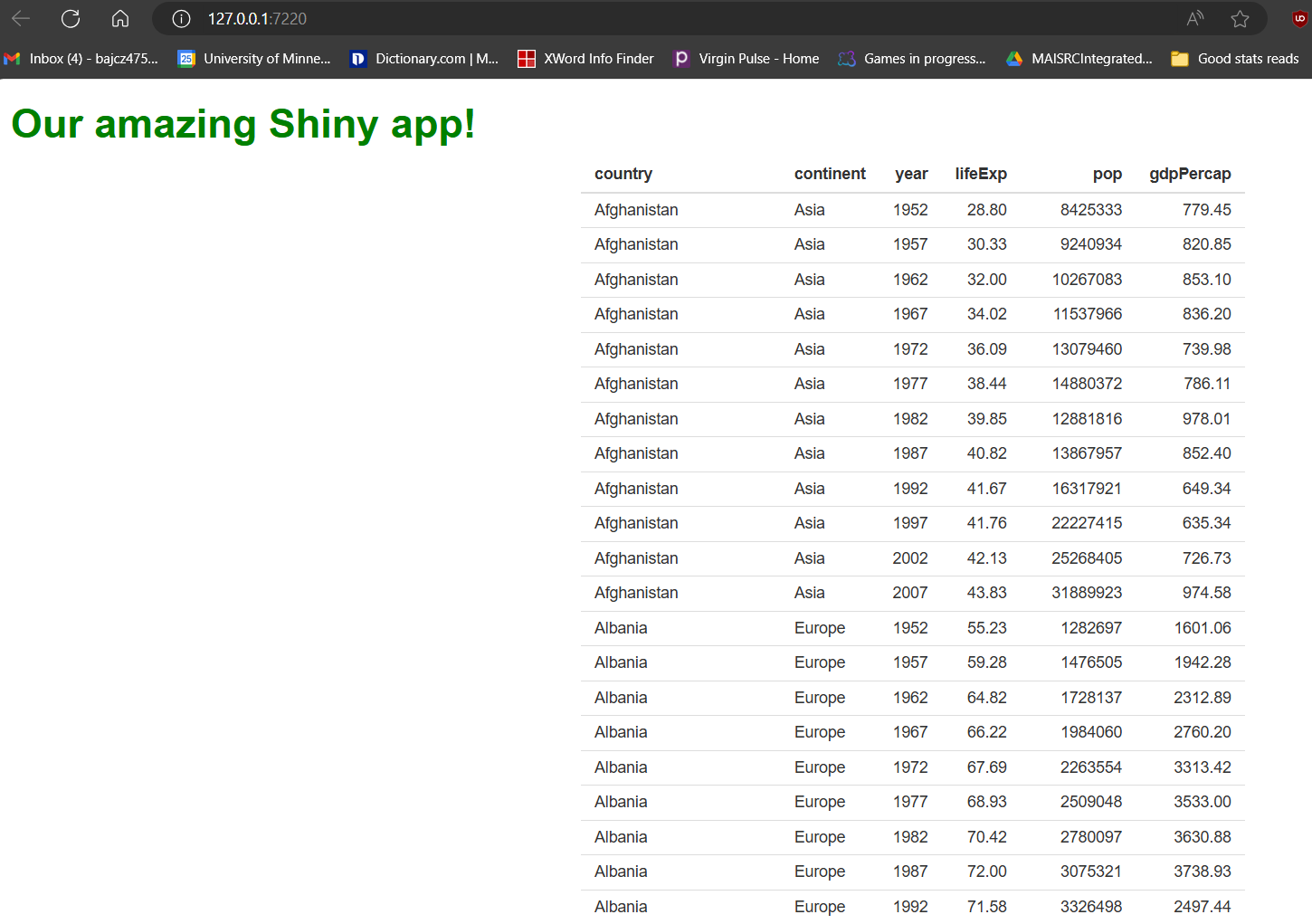
Our Shiny app with our basic HTML table of the
gapminder data set.
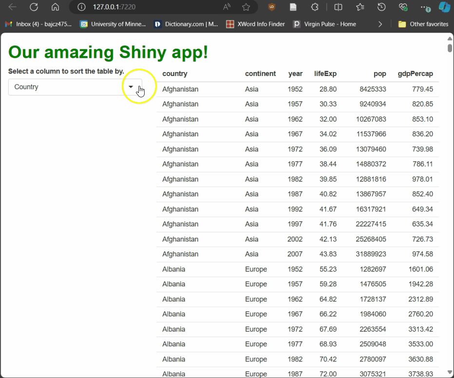
Figure 2
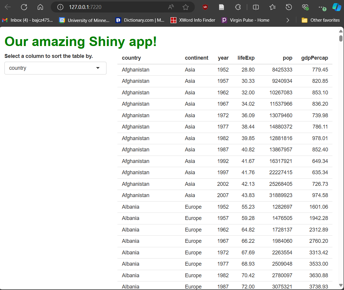
Our new selectInput, drop-down-menu-style
widget.
Figure 3
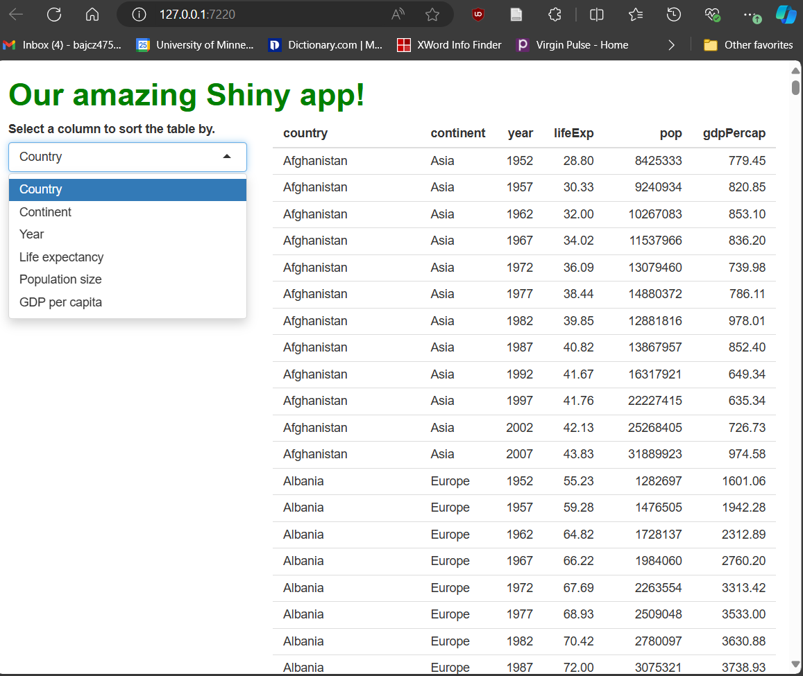
Now our choices look much more human-readable,
but the original column names are preserved for work behind the
scenes.
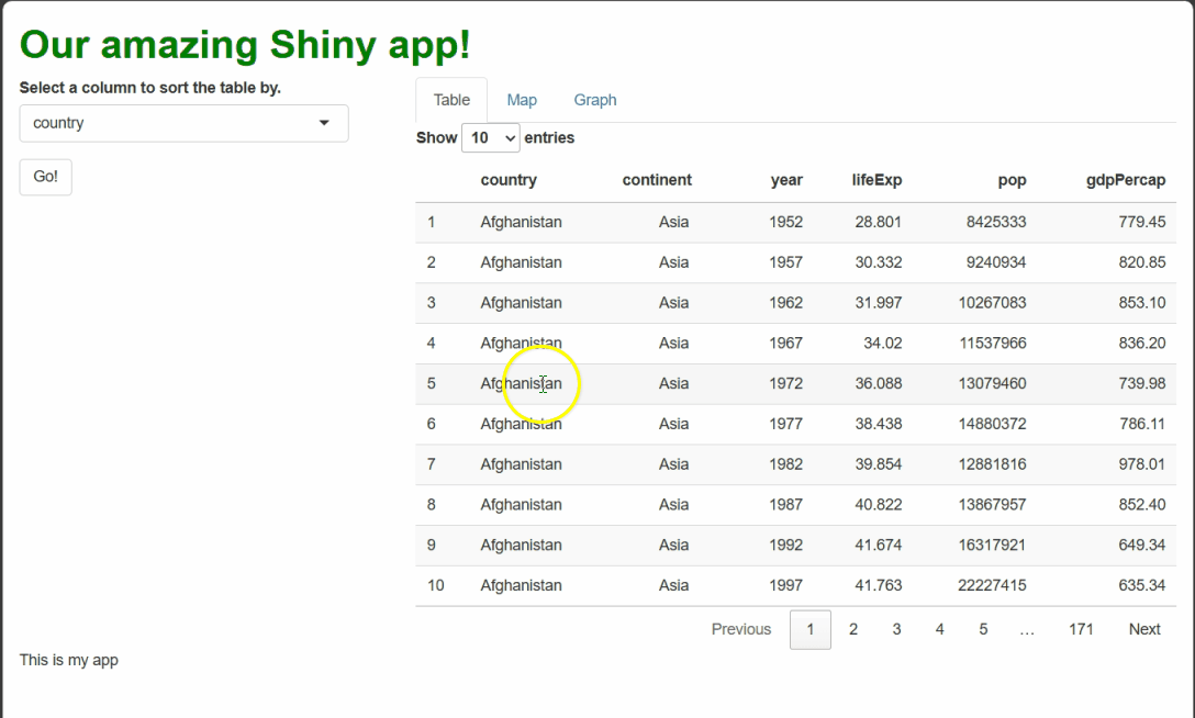
Figure 4
Now, when a user selects a new column using the
drop-down widget, the table is rebuilt, sorted by that column.
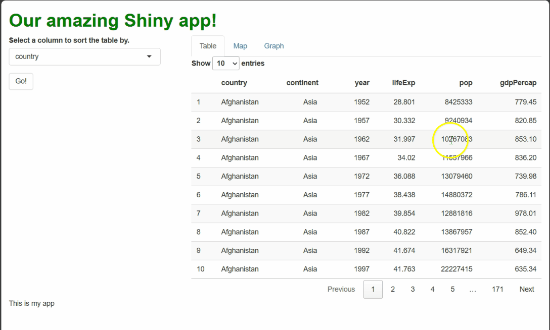
Figure 5
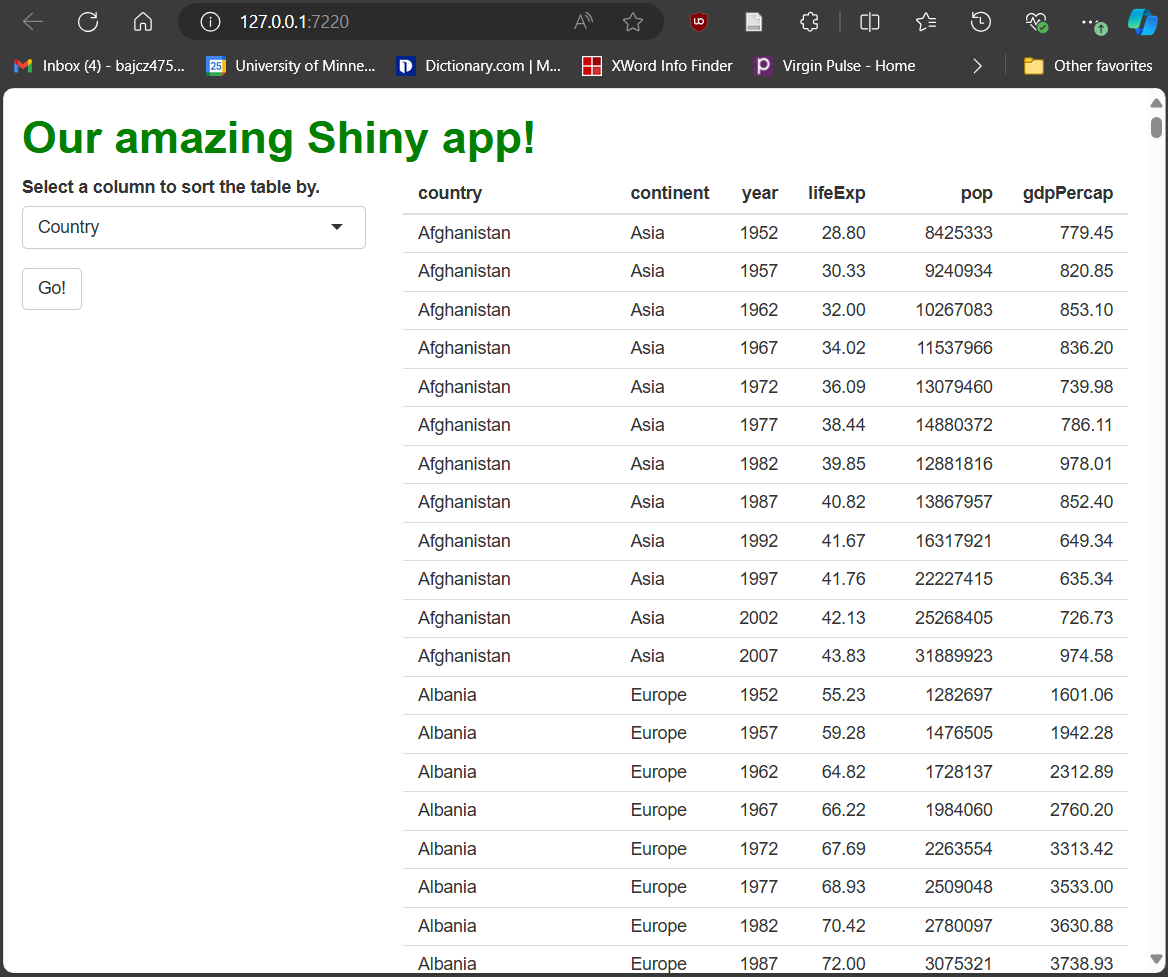
A new “Go” button has been added to our app’s
sidebar panel.
Figure 6
Thanks to isolate(), our table only re-renders
when the “Go” button is pressed, but the drop-down menu’s current value
is still used at that time.
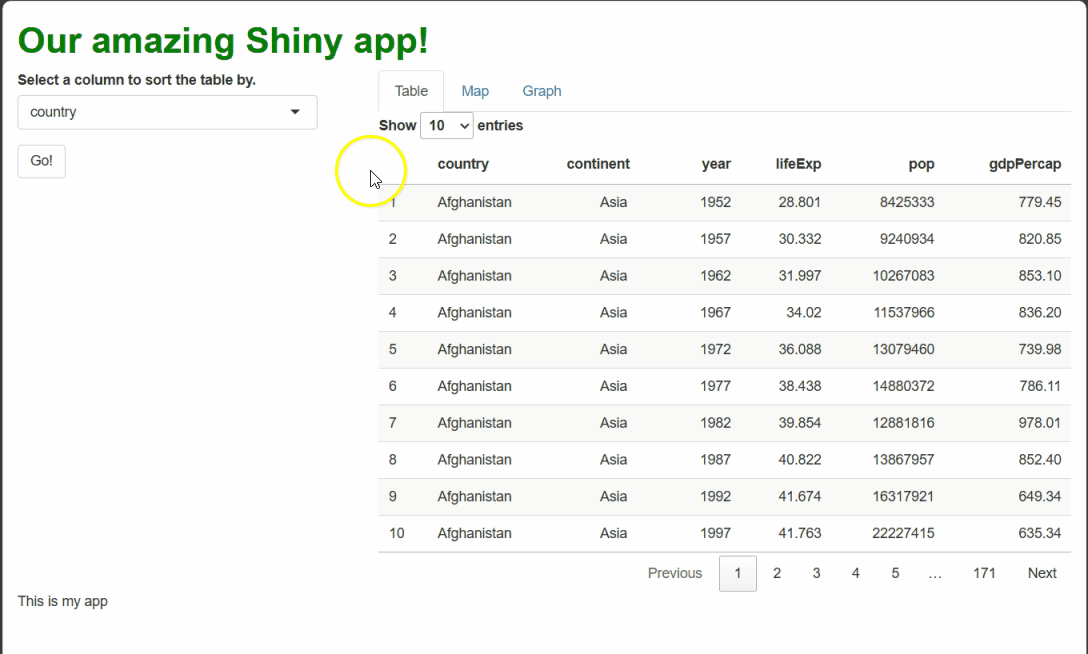
Figure 7
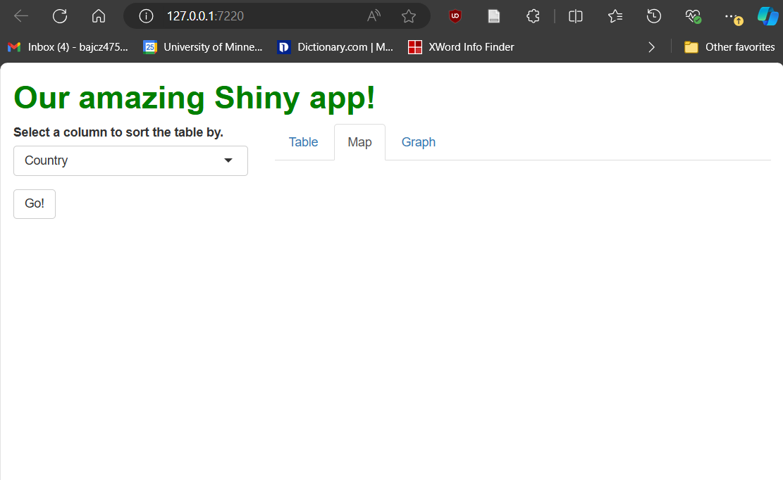
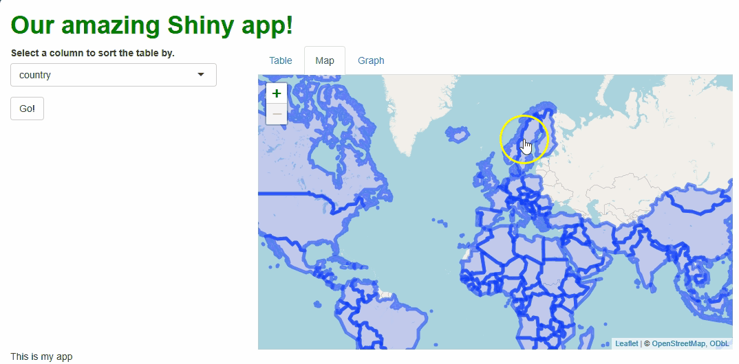
We’ve split our “main panel” cell into three
tabs using a tabsetPanel().
Shiny Showstoppers: DTs and Leaflets and Plotlys, Oh My!
Figure 1
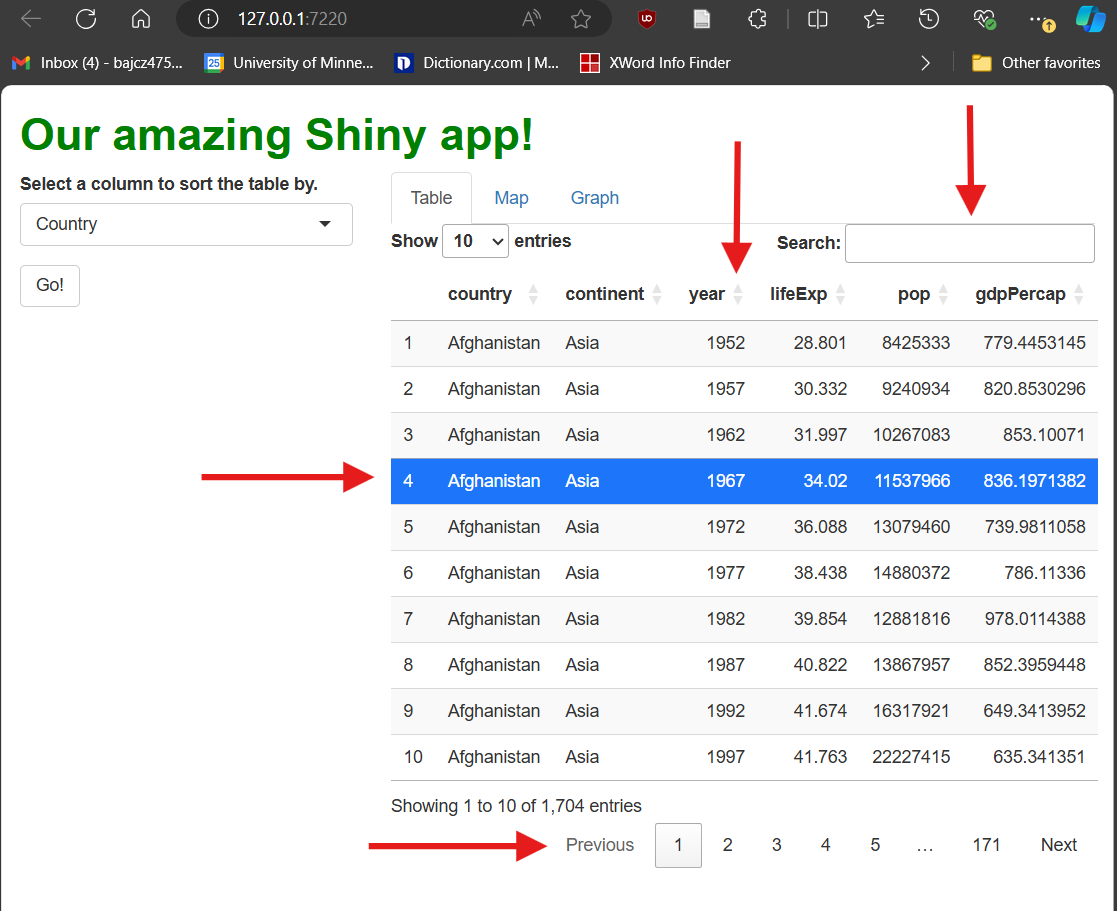
DT tables come with several interactive
features, including pagination, searching, row selection, and column
sorting (indicated by red arrows).
Figure 2
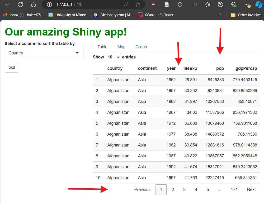
Notice that, in this DT, there are no sorting
arrows, and there is no search bar or current page info in the
bottom-left. Row selection is also disabled.
Figure 3
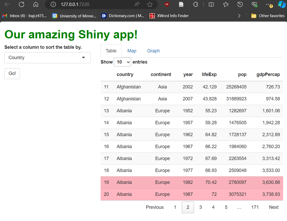
Note that, now, our continent column values are
center-aligned, our GDP data have been rounded, and any row with a life
expectancy value greater than 70 is now in light pink, perhaps helping
these rows stand out for our users.
Figure 4
By using print(), we can see that our cell
selection reactive object is a matrix holding the row and column numbers
of the cell selected by the user.
Figure 5
Whenever we click a value in the last three
columns, some procedurally generated text appears on screen beneath our
table.
Figure 6
With the two adjustments outlined above, our app
now successfully removes our text when a user de-selects a cell. The
table also seems to successfully acknowledge when the table has been
sorted versus when it hasn’t when rendering our procedural text.
Figure 7
This clip shows that our “solution” is easy to
trick. If a user selects a new column in the drop-down menu but
doesn’t trigger the table to re-sort before selecting
a cell, our code will think the table has been re-sorted when it hasn’t
and will reference the wrong row’s data in our procedural text.
Figure 8
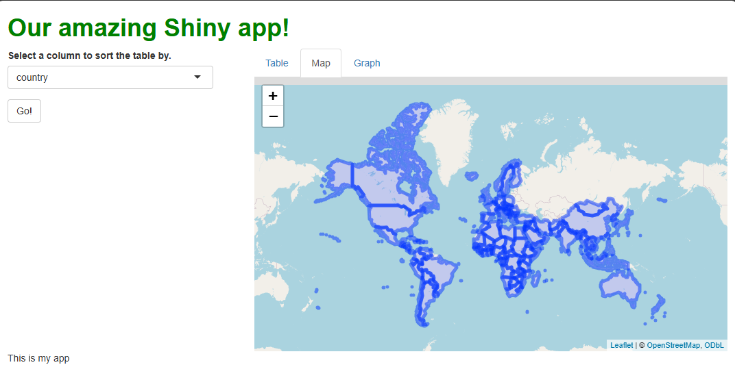
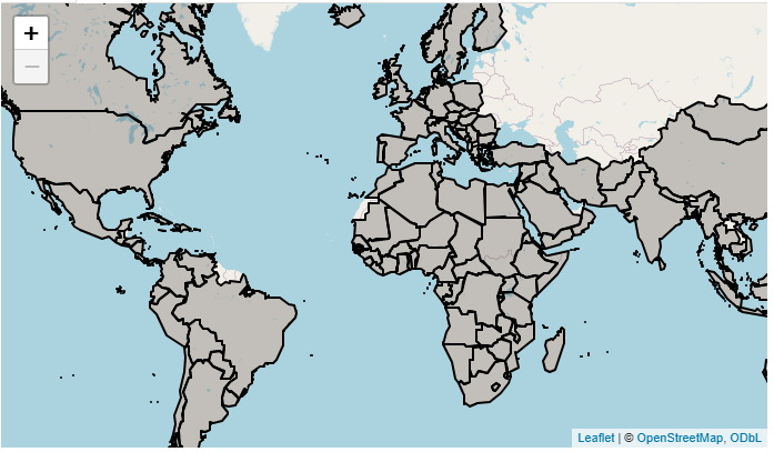
A default leaflet map showing the countries in
our data set using fuzzy blue outlines.
Figure 9
We can see that the map is now zoomed in a
little more than before on start-up, and can’t zoom out any further.
When we try to pan the map outside of its bounds, it snaps our focus
back within those bounds. Lastly, we’re unable to zoom the map in beyond
a certain level.
Figure 10
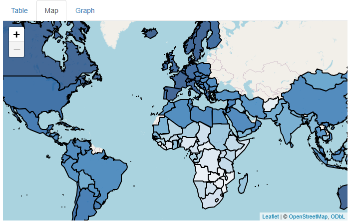
Amazing what adjusting a few stroke (outline)
parameters can do!
Figure 11
We’ve successfully mapped each country’s 2007
life expectancy value to the fill color of that country’s polygon.
Figure 12
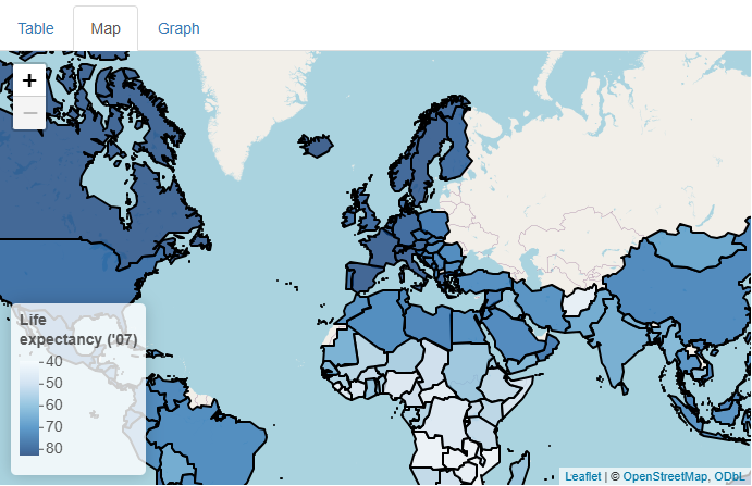
We’ve added a legend so that users can easily
associate different fill colors with different life expectancy
values.
Figure 13
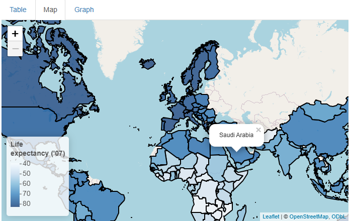
Simple tooltips (pop-ups) that appear and
disappear on mouse click, showing each country’s name.
Figure 14
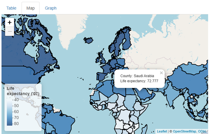
Now, the tooltips also contain the exact life
expectancy value of each country. Raw HTML line breaks are used to make
the result more human-readable.
Figure 15
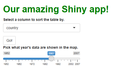
A slider input widget allowing users to select
which year’s data to show in the map.
Figure 16
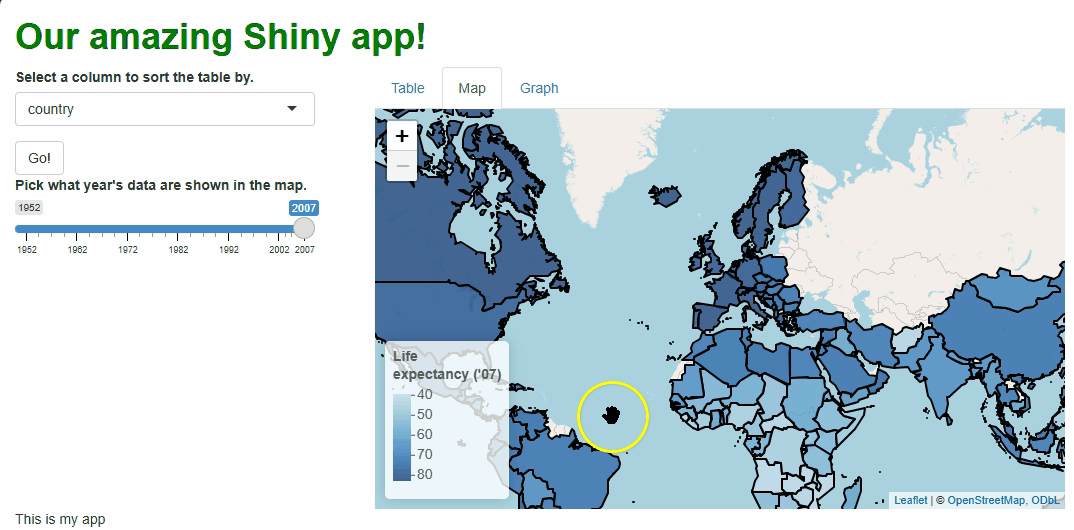
The map rebuilds each time a new year is chosen
in the slider widget to show data from that year (and the legend title
changes too). Within-country shifts in life expectancy over time are
more noticeable because a single palette is used for all years rather
than a new one being built for each year’s data.
Figure 17
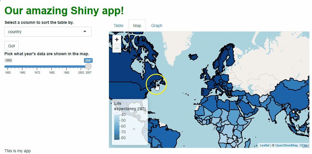
By using the proxy system, key components of the
map needn’t be rebuilt each time, and the app needn’t freeze while the
updates occur, resulting in a faster and subtler transition between map
versions.
Figure 18

A proxy is used to update a map’s focus point;
we “fly to” a location clicked on by the user.
Figure 19
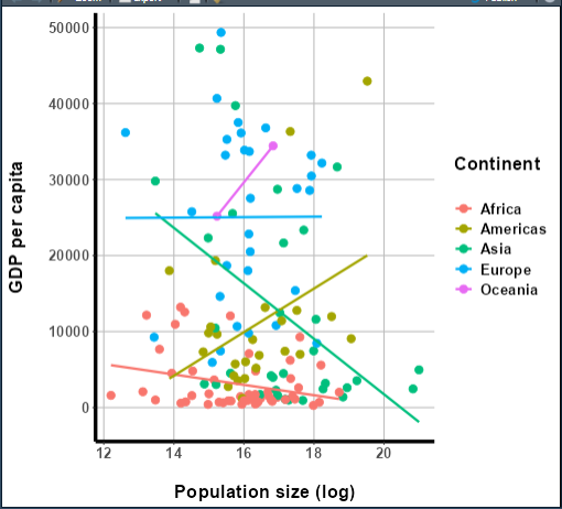
The ggplot graph produced by the code
above.
Figure 20
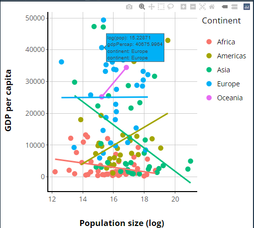
The same graph as before (more or less) but now
rendered using plotly’s system via ggplotly().
Figure 21
In this clip, we see many of plotly’s
interactive features, including tooltips, legend key filtering, and the
modebar of buttons.
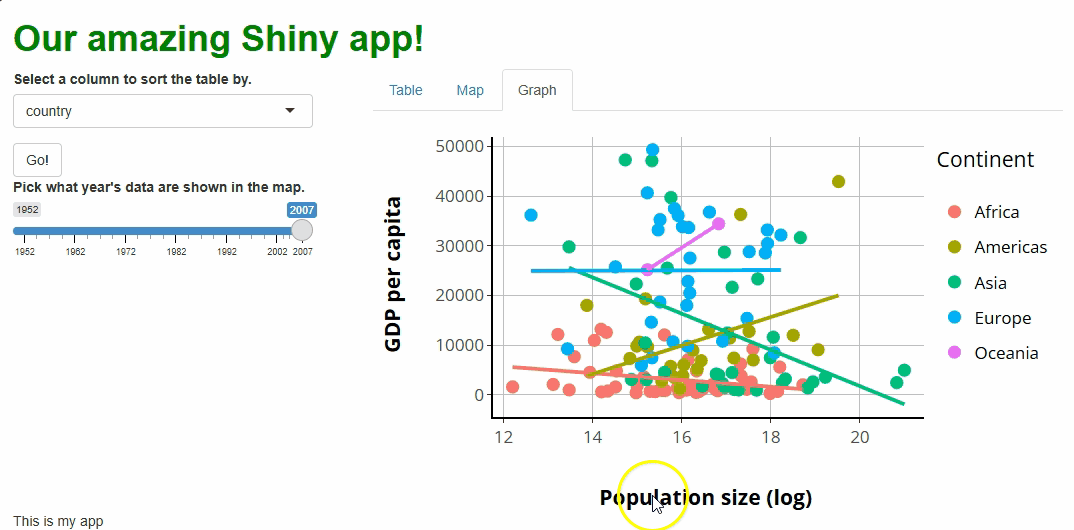
Figure 22
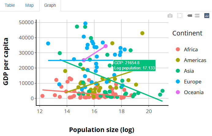
Our plotly graph now has a centered
legend, like the source graph did, and tooltips that are more
human-readable.
Figure 23
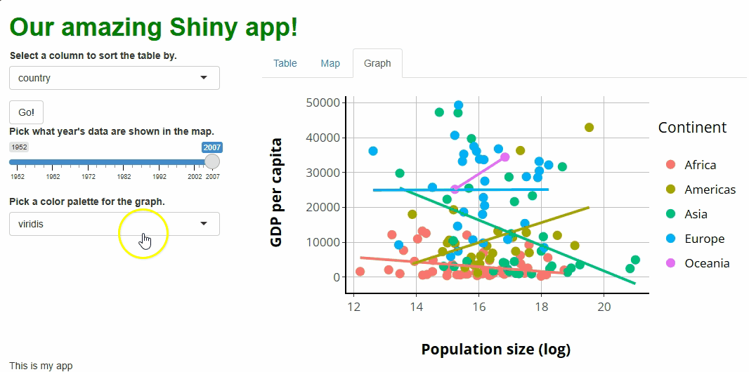
We’ve added a drop-down menu widget that allows
users to select a new color palette for our graph. However, not all
aspects of the graph change colors like we might expect. For example,
the legend keys do change colors, but incorrectly.
Figure 24
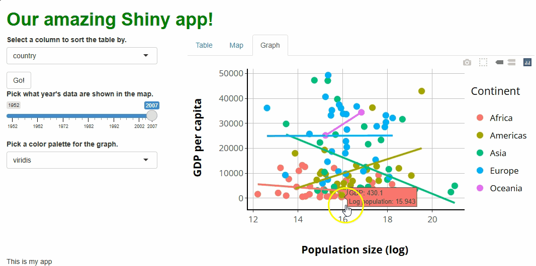
When users click on specific points, a message
appears to give them more detailed population data information.