Shiny Showstoppers: DTs and Leaflets and Plotlys, Oh My!
Last updated on 2025-04-15 | Edit this page
Overview
Questions
- How do I add an interactive map/table/graph to my app?
- What features do these widgets have?
- How do I adjust their appearance?
- How can I modify these widgets to handle events without simply rebuilding them each time?
- What events related to these widgets can I watch for?
Objectives
- Name the essential functions of the
DT,leafletandplotlypackages. - Experiment with the standard interactive features of the plots/tables/maps produced by these packages, and recognize how to disable them.
- Customize the look and feel of these graphics.
- Update complex interactive graphics instead of remaking them using proxies.
- Recognize some events a user might trigger on these complex interactive graphics and how to watch for them.
Disclaimer
At a few point, this lesson’s code may produce warnings when executed. Ignore these—the code works as intended!
Catching up
In case you need it, here is the complete ui.R,
global.R, and server.R code up to this
point:
R
#ui.r
ui = fluidPage(
tags$head(
tags$link(href = "styles.css",
rel = "stylesheet"),
tags$title("Check this out!")
),
h1("Our amazing Shiny app!",
id = "header"),
fluidRow(
column(width = 4,
selectInput(
inputId = "sorted_column",
label = "Select a column to sort the table by.",
choices = names(gap)
),
actionButton(
inputId = "go_button",
label = "Go!")
),
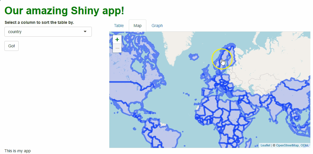
column(width = 8, tabsetPanel(
tabPanel(title = "Table", tableOutput("table1")),
tabPanel(title = "Map"),
tabPanel(title = "Graph")
))
),
tags$footer("This is my app")
)
R
#global.R
library(shiny)
library(dplyr)
library(ggplot2)
library(plotly)
library(DT)
library(leaflet)
library(gapminder)
library(sf)

gap = as.data.frame(gapminder)
R
#server.R
server = function(input, output, session) {

  #INITIAL TABLE
  output$table1 = renderTable({
    gap
  })

  #UPDATE UPON BUTTON PRESS USING PROXY
  observeEvent(input$go_button,
               ignoreInit = FALSE, {

      output$table1 = renderTable({

        gap %>%
        arrange(!!sym(input$sorted_column))

    })
  })

}
Introduction
While input widgets like drop-down menus and buttons are powerful ways to give users control of your app and enable many powerful forms of interactive engagement, they aren’t always transformative by themselves. There are much more powerful widgets!
And, since our app’s server is powered by R—a programming language built for data work—it make senses we’d be able to include widgets that put data at our users’ fingertips in cool ways. Of all the data-centered widgets, few are more familiar and enlightening than tables, maps, and graphs. Because these graphics are so ubiquitous, it probably won’t surprise you that there are JavaScript packages for creating web-enabled, interactive versions of these graphic types.
While there are others, in this lesson we’ll use the DT
(tables), leaflet (maps), and plotly (graphs)
packages to produce these graphics; each has been ported into R + R
Shiny via packages of the same names. Each package could easily
be a course unto itself! As such, we’ll look only at the basic
idea that cut across them all—greater depth can be found elsewhere.
Learning leaflet and plotly, specifically,
come with challenges we’ll have to negotiate:
leafletbuilds maps, which represent spatial data. These, and the packages that work with them (e.g.,sf), are complicated! I’ll gloss over the details, but we’ll need to occasionally borrow tools fromsfto accomplish anything.If you’re familiar with
ggplot2(or a comparable data visualization suite), you already know that learning programmatic graph-making can have a steep learning curve.plotlyhas the same curve (perhaps a steeper one for R users, since it’s very JavaScript-like). Again, I’ll gloss over the details, but even the basics may be a lift.
Let’s start simple, then, with DT, which will feature
constructs most like those we’re already familiar with. Let’s swap out
our functional but drab table for a better, DT table. Along
the way, we can learn all the key concepts we’ll need to tackle
leaflet and plotly too.
Turning the tables
Basic table
All we must do to swap out our old table for a new one (besides
loading DT by executing library(DT), if you
haven’t done so!) is to change our renderTable({}) and
tableOutput() calls to renderDT({}) and
dataTableOutput() calls:
R
##This code should **replace** ALL table-related code contained within your server.R file!

#INITIAL TABLE
  output$table1 = renderDT({ #<--CHANGE FUNCTION
    gap
  })

  #UPDATE UPON BUTTON PRESS
  observeEvent({input$go_button},
               ignoreInit = FALSE, {

   output$table1 = renderDT({ #<--CHANGE FUNCTION
      gap %>%
      arrange(!!sym(input$sorted_column))

   })
  })
R
##This code should **replace** the content of the "main panel" cell within the BODY section of your ui.R file!

##... other UI code...

###MAIN PANEL CELL
    column(width = 8, tabsetPanel(
      ###TABLE TAB
      tabPanel(title = "Table",
        dataTableOutput(outputId = "table1")), #<--CHANGE FUNCTION
      ###MAP TAB
      tabPanel(title = "Map"),
      ###GRAPH TAB
      tabPanel(title = "Graph")
    )
   )

##... other UI code...
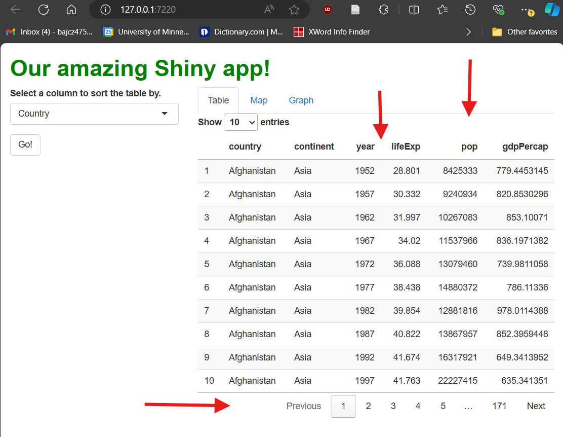
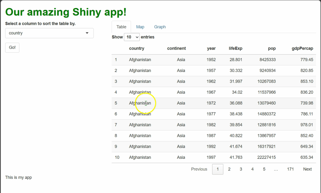
Once you’ve made the changes represented above, restart your app. When you do, you’ll notice our new table looks very different:
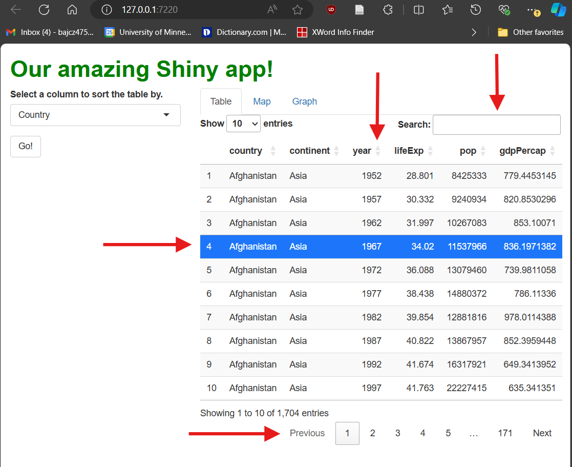
Our table is now paginated, i.e., divided into pages. Users can flip between pages using numbered buttons as well as “Next” and “Previous” buttons in the bottom-right. Users can also change page length in the upper-left. These features limit how much data is shown at once when a data set has many rows, and they also keep the table a more consistent height in your UI.
It’s searchable—users can type strings (chunks of letters/numbers/symbols) into the search box in the upper-right; the table will filter to only rows containing that string anywhere.
It’s sortable—users can click the up/down arrows next to each column’s name to sort the table by that column. [You’ll note this functionality makes our drop-down menu widget redundant!]
It’s (modestly) styled—it’s visually more appealing than our previous table because it comes with some automatic CSS (bold column names and “zebra striping,” e.g.).
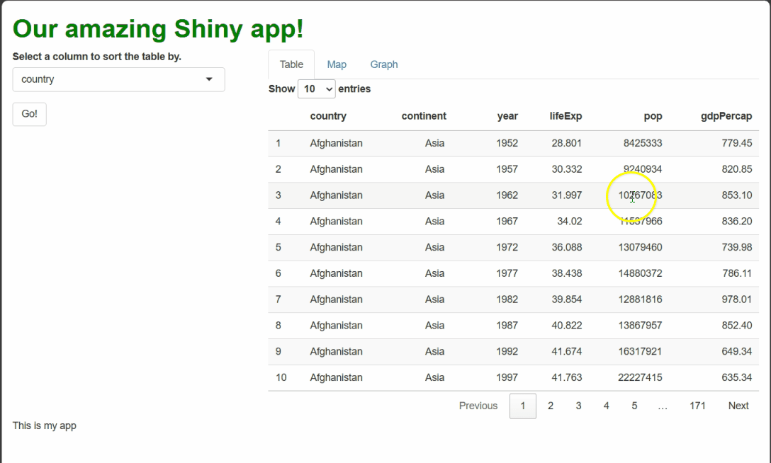
[Side-note: Web developers call elements with pre-set CSS rules opinionated. Opinionated elements are nice in that they require less styling, but if you do choose to restyle them, it can be hard to overcome their “opinions.”]It’s selectable—users can click to highlight rows. This event doesn’t actually do anything by default besides change the table’s appearance, but it could be handled in some clever way.
Now that we have a DT table (or any complex interactive
graphic), there are four things we’ll very commonly want to do
to it:
Simplify its functionality.
Customize its style.
Watch for relevant events.
Update it to handle those events.
Let’s tackle the first two items first.
More (or less) basic DT
As we saw, DT tables come with many interactive
features! However, “more” is not always “better” from a
UX (user experience) standpoint. Some
users might find certain features confusing, especially if they aren’t
necessary, are poorly explained, or don’t result in obvious reactions.
Others may find having a lot of features overwhelming, even if they do
understand them all.
The datatable() function’s options
parameter allows us to reduce the features our table:
R
##This code should **replace** ALL table-related code contained within your server.R file!

#INITIAL TABLE
  output$table1 = renderDT({
    gap %>%
      datatable(
        selection = "none", #<--TURNS OFF ROW SELECTION
        options = list(
          info = FALSE, #<--NO BOTTOM-LEFT INFO
          ordering = FALSE, #<--NO SORTING
          searching = FALSE #<--NO SEARCH BAR
        )
      )
  })

#UPDATE UPON BUTTON PRESS
  observeEvent(input$go_button, {

    output$table1 = renderDT({
      gap %>%
        arrange(!!sym(input$sorted_column)) %>%
        #SAME AS ABOVE
        datatable(
          selection = "none",
          options = list(
            info = FALSE,
            ordering = FALSE,
            searching = FALSE
          )
        )
    })

  })
That’s better! Potentially, this version is more digestible and intuitive for our users (and could be easier for us to explain and handle too!):
More broadly, if a DT table (or any other complex
interactive graphic) has a feature, you should assume you can turn it
off (you may simply have to Google for the way to do it).
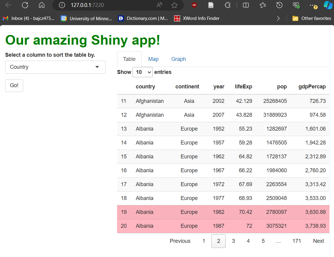
Next, let’s tinker with our table’s aesthetics. Let’s make three changes that demonstrate what’s possible:
Let’s round the
gdpPercapcolumn.Let’s make the
continentcolumn center-aligned.Let’s highlight all rows with
lifeExpvalues >70in pink.
We’ll use functions from the format*() and
style*() families—specifically, formatRound(),
formatStyle(), and styleEqual():
R
##This code should **replace** ALL table-related code contained within your server.R file!

#INITIAL TABLE
  output$table1 = renderDT({
    gap %>%
      datatable(
        selection = "none",
        options = list(
          info = FALSE,
          ordering = FALSE,
          searching = FALSE
        )
      ) %>%
      #IN THE SECOND ARGUMENTS OF THESE FUNCTIONS, WE WRITE 'R-LIKE' CSS. WE USE camelCase FOR PROPERTIES, QUOTED STRINGS FOR VALUES, AND = INSTEAD OF : AND ;.
      formatRound(columns = "gdpPercap",
                  digits = 2) %>%
      formatStyle(columns = "continent",
                  textAlign = "center") %>% #<--COMPARE WITH text-align: center; FORMAT
      formatStyle(
        columns = "lifeExp", #<--wHAT COLUMN WILL WE CONDITIONALLY FORMAT BY?
        target = "row", #<--WILL WE STYLE THE WHOLE ROWS OR JUST INDIVIDUAL CELLS?
        backgroundColor = styleEqual(
          levels = gap$lifeExp,
          values = ifelse(gap$lifeExp > 70, "lightpink", "white") #WHAT RULE WILL WE USE, AND WHAT NEW CSS VALUES WILL WE SET FOR EACH POSSIBILITY?
        )
      )
  })

  #UPDATE UPON BUTTON PRESS
  observeEvent({input$go_button},
               ignoreInit = FALSE, {

                 output$table1 = renderDT({
                   gap %>%
                     arrange(!!sym(input$sorted_column)) %>%
                     datatable(
                       selection = "none",
                       options = list(
                         info = FALSE,
                         ordering = FALSE,
                         searching = FALSE
                       )
                     ) %>%
      #SAME AS ABOVE
      formatRound(columns = "gdpPercap", digits = 2) %>%
      formatStyle(columns = "continent", textAlign = "center") %>%
      formatStyle(
        columns = "lifeExp",
        target = "row",
        backgroundColor = styleEqual(
          levels = gap$lifeExp,
          values = ifelse(gap$lifeExp > 70, "lightpink", "white")
        )
      )

    })
  })
format*() functions ask us to pick one or more columns
to restyle. Then, we provide property and
value pairings as inputs, just as we would in CSS, but
using “R-like” syntax, e.g., textAlign = center
versus text-align: center;.
If we want to format columns, rows, or cells
conditionally, i.e., formatting only
some rows according to a rule, we use the style*()
functions. In the example above, we used styleEqual() to
apply a light pink background to only rows with life expectancy values
greater than 70. These rows might then stand out better to
users, enabling new workflows.
Update, don’t remake, DT edition!
So far, when user actions have spurred a change to our table (e.g., how it’s sorted), we’ve re-rendered the entire table to handle those events.
This approach works, but it’s undesirable for (at least) four reasons:
With large data sets, it could be slow! Remember that, as R code executes server-side, the app must remain unresponsive until that execution finishes, so users will have to wait in the meantime.
-
To the user, the table may “flicker” out and in again as it’s remade (if the process is fast), which might look “glitch-y.”
- If the process is slow, however, the table will instead “gray out” and the whole app will appear to “freeze” while the underlying code executes.
If the user has customized the table in any way (they’ve navigated to a specific page, e.g.), those customizations are lost (unless we store that information and re-apply it, which is possible but tedious).
As we’ve seen, rebuilding the table often necessitates repeating the same table-building code in multiple places—first when we build the initial table and again when we re-build it. This “code bloat” makes your code harder to manage and makes it more likely you will introduce inconsistencies.
If you think about it, if all we’re doing is changing the data our table is displaying, there’s no need to remake the whole table—why rebuild all rows, columns, and cells when we just need to change their contents?
Callout
Whenever possible, we should update a complex interactive graphic rather than remake it.
To update complex interactive graphics “on the fly,” we can use a construct called a proxy. A proxy is a connection that our app’s server makes with the client’s UI with respect to a specific element—it’s like a phone call between a specific reactive context and the element the user is currently seeing.
Through the proxy, our server code can describe what
specific changes need to be made, and the user’s browser can
make just those changes without redrawing the table, requesting
all the data again, or disabling the user’s control over the app. Such a
“direct line of communication” enables cleaner and snappier adjustment
of complex elements than using a render*({}) function.
DT’s proxy function, dataTableProxy(),
takes as input the outputId of the table to update. We then
pipe that proxy into a helper function to specify which specific changes
we’re requesting. For example, we’ll use the helper function
replaceData() to targetedly swap out some (or all) of the
data contained with the table’s cells, leaving all else unchanged.
Up until now, we handled column re-sorting using
renderDT({}). Let’s switch to using
dataTableProxy() to handle these events instead:
R
##This code should **replace** ALL table-related code contained within your server.R file!

##... other server code...

#INITIAL TABLE
  output$table1 = renderDT({
    gap %>%
      datatable(
        selection = "none",
        options = list(
          info = FALSE,
          ordering = FALSE,
          searching = FALSE
        )
      ) %>%
      formatRound(columns = "gdpPercap", digits = 2) %>%
      formatStyle(columns = "continent", textAlign = "center") %>%
      formatStyle(
        columns = "lifeExp",
        target = "row",
        backgroundColor = styleEqual(
          levels = gap$lifeExp,
          values = ifelse(gap$lifeExp > 70, "lightpink", "white")
        )
      )
  })

  #UPDATE UPON BUTTON PRESS USING PROXY
  observeEvent({input$go_button},
               ignoreInit = FALSE, {

  #MAKE THE NEW, SORTED VERSION OF OUR DATA SET.
  sorted_gap = gap %>%
    arrange(!!sym(input$sorted_column))

  #THEN, USE OUR PROXY TO SWAP OUT THE DATA.
  dataTableProxy(outputId = "table1") %>%
    replaceData(data = sorted_gap,
                resetPaging = FALSE) #<--OPTIONAL, BUT NICE.
  #NO OTHER CODE IS NEEDED--EVERYTHING ABOUT THE ORIGINAL TABLE IS MAINTAINED EXCEPT FOR JUST THE PART(S) WE WANT TO ALTER.

  })

  ##... other server code...
If you try the app with the changes outlined above made, it won’t look or behave all that different. However, that’s only because this particular table is so quick to rebuild! With a more complex table and a larger data set, this approach would be cleaner, faster, and less disruptive for the user. Their page choice and row selection could be maintained between updates, and they could continue to use the app while the table updated if they wanted to (it wouldn’t freeze). And, importantly, this approach requires far less code overall and eliminates the duplicate code we’ve had so far!
Watch and learn
Interactive graphics like our DT table aren’t just a
cool way to show data—they’re widgets in their own
right, and user interactions with them can trigger events we could
handle, just as with any other widget.
Let’s see an example. First, recall that row selection doesn’t
trigger events by default. Let’s turn selection back on by changing the
selection parameter inside datatable() from
"none" to
list(mode = "single", target = "cell"), which’ll enable
users to select one cell at a time:
R
##This code should **replace** the code that creates your initial table within your server.R file!

##... other server code...

  #INITIAL TABLE
  output$table1 = renderDT({
    gap %>%
      datatable(
        selection = list(mode = "single", target = "cell"), #<--TURN SELECTION ON, TARGETING INDIVIDUAL CELLS.
        options = list(
          info = FALSE,
          ordering = FALSE,
          searching = FALSE
        )
      ) %>%
      formatRound(columns = "gdpPercap", digits = 2) %>%
      formatStyle(columns = "continent", textAlign = "center") %>%
      formatStyle(
        columns = "lifeExp",
        target = "row",
        backgroundColor = styleEqual(
          levels = gap$lifeExp,
          values = ifelse(gap$lifeExp > 70, "lightpink", "white")
        )
      )
  })

##... other server code...
Next, let’s create a new observer that will watch for cell selection.
Event information regarding cell selection will be passed from the UI to
the server via the input object using
input$[outputId]_cells_selected format, so
input$table1_cells_selected is the reactive object our
observer will watch. For now, we’ll make this observer’s only operation
to print the value of input$table1_cells_selected to the R
Console every time a new cell is clicked so we can see what this object
looks like:
R
##This code should be **added to** your server.R file within the server function!

##... other server code...

#WATCH FOR CELL SELECTIONS
observeEvent({input$table1_cells_selected}, {

  print(input$table1_cells_selected)

})

##... other server code...
If you run the app now and select some cells, you’ll observe that
input$table1_cells_selected returns a matrix. Either this
matrix has no rows (when no cell is selected, such as at app start-up)
or one row with two values: row and column numbers for the selected
cell.
Of course, we aren’t handling these cell selection events right now; the app doesn’t yet respond in any new way.
Let’s change that. First, let’s add a renderText({})
call inside our new observer and a textOutput() call to our
UI, beneath our table:
R
##This code should **replace** the observeEvent that watches for cell selections in your server.R file!

##... other server code...

#WATCH FOR CELL SELECTIONS
  observeEvent({input$table1_cells_selected}, {

    output$selection_text = renderText({

      ###WE'LL PUT CODE HERE IN A MOMENT.

    })

  })

  ##... other server code...
R
##This code should **replace** the content of the "main panel" cell within the BODY section of your ui.R file!

##... other UI code...

###MAIN PANEL CELL
    column(width = 8, tabsetPanel(
      ###TABLE TAB
      tabPanel(title = "Table",
        dataTableOutput(outputId = "table1"),
        textOutput("selection_text")), #<--ADD textOutput HERE.
      ###MAP TAB
      tabPanel(title = "Map"),
      ###GRAPH TAB
      tabPanel(title = "Graph")
    )
   )

##... other UI code...
renderText({}) and textOutput() create and
display text blocks, as you might guess from their names! We can use
them to programmatically generate text and display it to users. Let’s
use these functions to generate text whenever a life expectancy, GDP per
capita, or population value is selected. Let’s have that text reference
the selected value as well as the associated country and year. This will
require a little “R elbow grease,” but no new Shiny code:
R
##This code should **replace** the observeEvent that watches for cell selections in your server.R file!

##... other server code...

#WATCH FOR CELL SELECTIONS
  observeEvent({input$table1_cells_selected}, {

    #MAKE SURE A CELL HAS BEEN SELECTED AT ALL--OTHERWISE, ABORT.
    if(length(input$table1_cells_selected) > 0) {

    #CREATE CONVENIENCE OBJECTS THAT ARE SHORTER TO TYPE.
    row_num = input$table1_cells_selected[1]
    col_num = input$table1_cells_selected[2]

    #MAKE SURE THE SELECTED CELL WAS IN COLUMNS 4-6--OTHERWISE, ABORT.
    if(col_num >= 4 & col_num <= 6) {

    #GET THE YEAR AND COUNTRY OF THE ROW SELECTED.
    country = gap$country[row_num]
    year = gap$year[row_num]

    #GET THE VALUE IN THE SELECTED CELL.
    datum = gap[row_num, col_num]

    #DETERMINE THE RIGHT TEXT STRING TO USE DEPENDING ON THE COLUMN SELECTED.
      if(col_num == 4) {
        col_string = "life expectancy"
      }
      if(col_num == 5) {
        col_string = "population"
      }
      if(col_num == 6) {
        col_string = "GDP per capita"
      }

      #RENDER OUR TEXT MESSAGE.
    output$selection_text = renderText({

      #PASTE TOGETHER ALL THE CONTENT ASSEMBLED ABOVE!
      paste0("In ", year, ", ", country, " had a ",
             col_string, " of ", datum, ".")
     })
    }
   }
  })
ERROR
Error in observeEvent({: could not find function "observeEvent"R
##... other server code...
If you make all the changes outlined above, you should see something like this when you run the app and select cells:
By using renderText({}) and textOutput() to
handle these events, we generate dynamic text that a user might feel is
personal to them and their actions, even though it’s procedurally
generated!
Challenge
If you’ve been extra observant, you might realize there are two issues with our new cell selection observer.
First, if you watch the end of the clip above, you’ll notice that, while selecting a cell will cause the rendered text message to appear or change, de-selecting a selected cell does not cause the rendered text to disappear, as the user might expect.
How would you adjust the code to remove the message when a user
de-selects a cell (or selects an inappropriate cell, such as one in the
first three columns)? Hint: If you leave a render*({})
function’s expression blank, an empty box will get rendered.
Our current code uses if()s to determine if a user has
selected a cell at all and, if so, if that cell is appropriate. We can
pair these two if()s with elses that eliminate
the rendered text whenever no (appropriate) cell has been selected:
R
##This code should **replace** the observeEvent that watches for cell selections in your server.R file!

##... other server code...

  observeEvent({input$table1_cells_selected}, {

    else_condition = renderText({}) #OUR ELSE CONDITION WILL BE TO RENDER NOTHING.

    if(length(input$table1_cells_selected) > 0) {

      row_num = input$table1_cells_selected[1]
      col_num = input$table1_cells_selected[2]

      if(col_num >= 4 & col_num <= 6) {

        country = gap$country[row_num]
        year = gap$year[row_num]

        datum = gap[row_num, col_num]

        if(col_num == 4) {
          col_string = "life expectancy"
        }
        if(col_num == 5) {
          col_string = "population"
        }
        if(col_num == 6) {
          col_string = "GDP per capita"
        }

        output$selection_text = renderText({

          paste0("In ", year, ", ", country, " had a ",
                 col_string, " of ", datum, ".")
        })
        #ADD IN OUR ELSE CONDITIONS
      } else {
        output$selection_text = else_condition
      }
    } else {
      output$selection_text = else_condition
    }
  })

  ##... other server code...
Now, if you start your app and select a cell that yields our procedurally generated text, then click that cell again to de-select it, the text will also disappear.
Challenge
EXTRA CREDIT–THIS QUESTION IS CHALLENGING!
Second, our current code does not acknowledge the possibility that
the table the user is clicking on may have been sorted by a column other
than country (the default).
If it has been otherwise sorted, a user will click cells based on the sorted data set they see, but our code currently assumes the row and column numbers are to be used for the unsorted data set. As such, it’ll most likely grab values from the wrong row if the table has been re-sorted!
How could you adjust the code to first determine if the table is sorted differently than the raw data set is and, if so, reference the sorted data set instead?
This question is a purposeful trap; it doesn’t actually have a simple solution you’re intended to know yet!
Allow me to explain: By default, the app doesn’t track if the table is sorted and, if so, how. We can’t simply ask “Hey Shiny, what column is the table sorted by, and is that different than what we started with?” At best, we’d need to use context clues and logic to figure out how the table the user can currently see is sorted and proceed accordingly.
The first solution that came to mind for me was to take the row and column numbers of the cell the user has selected and get the value in that cell in both the original data set and in a version of the data set sorted according to the current selection in our drop-down menu widget. If these two values don’t match, then the table is probably sorted by a different column than the original data set was:
R
##This code should **replace** the observeEvent that watches for cell selections in your server.R file!

##... other server code...

  observeEvent({input$table1_cells_selected}, {

    else_condition = renderText({})

    if(length(input$table1_cells_selected) > 0) {

      row_num = input$table1_cells_selected[1]
      col_num = input$table1_cells_selected[2]

      if(col_num >= 4 & col_num <= 6) {

        #GET BASELINE DATUM FIRST
        datum = gap[row_num, col_num]

        #GENERATE A SORTED VERSION OF THE DATA SET, BASED ON THE CURRENT SELECTION
        sorted_gap = gap %>%
          arrange(!!sym(input$sorted_column))

        #GET THAT VERSION'S DATUM TOO.
        sorted_datum = sorted_gap[row_num, col_num]

        #COMPARE THEM. IF THEY'RE THE SAME, THE TABLE *PROBABLY* ISN'T SORTED.
        if(sorted_datum == datum) {
          datum = datum
          country = gap$country[row_num]
          year = gap$year[row_num]
          #IF THEY'RE DIFFERENT, THE TABLE *PROBABLY* HAS BEEN SORTED, AND WE SHOULD USE THE SORTED VERSION.
        } else {
          datum = sorted_datum
          country = sorted_gap$country[row_num]
          year = sorted_gap$year[row_num]
        }

        if(col_num == 4) {
          col_string = "life expectancy"
        }
        if(col_num == 5) {
          col_string = "population"
        }
        if(col_num == 6) {
          col_string = "GDP per capita"
        }

        output$selection_text = renderText({

          paste0("In ", year, ", ", country, " had a ",
                 col_string, " of ", datum, ".")
        })
      } else {
        output$selection_text = else_condition
      }
    } else {
      output$selection_text = else_condition
    }
  })

  ##... other server code...
Now, this solution certainly works better than what we had before—the app seems to successfully acknowledge when the table has been sorted versus when it hasn’t:
This solution seems to work—when the table is sorted by a new column, such as by year, our procedural text references the right row when procedurally generating text.
However, there’s a very likely scenario in which this “solution” would fail! Consider that a user can select a new column to sort by at any time, but they must hit “go” before the sorting actually happens. If they ever select a new column and then select a cell before hitting “go,” they will “trick” our code into thinking the table has been re-sorted when, in fact, it hasn’t:
There’s another problem with our “solution:” What about duplicate values? If the table has been sorted, but the two values we compare just so happen to be equal, our code will assume the table has not been sorted when perhaps it has!
Yikes! This is a challenging problem. Luckily, there is at least one
solution, but it’s outside the scope of this lesson (to use
reactive({}) to create a new reactive object that serves as
a tracker for what column the table has been sorted by most recently
that we can update and access whenever we want).
However, we can nonetheless learn a valuable lesson from this example:
Callout
Every time you give users a new way to interact with your app, you vastly increase the number of permutations of actions users could perform. Will they do this, and then that? Or the reverse?
That means far more potential circumstances to anticipate and then handle with your code. This is why designing your app ahead of time and adding interactivity judiciously is essential.
Putting us on the map
Setup
leaflet is a JS (and now R) package for creating
web-enabled, interactive maps of spatial data, such as
latitude-longitude coordinates. So, we need some spatial data! In the
setup instructions, we asked you to download a version of the
gapminder data set we’ve prepared containing spatial data
using this link: Link
to the gapminder data set with attached spatial data. If you haven’t
downloaded that yet, do so now.
Once you’ve downloaded it, move it to your R Project folder and then load it into R using the following command:
R
##Add this code in your global.R file!

##... other global code...
gap_map = readRDS("gapminder_spatial.rds")
The rest of this lesson assumes you have gap_map; the
code shown will not work without it!
Preface
In this section we switch from making tables to making maps, but
we’ll use the same workflow we followed for DT in the last
section:
We’ll start by making a basic map.
Then, we’ll adjust some of the map’s interactive features and dress up its aesthetics a bit.
Lastly, we’ll learn about map-specific events and how to handle them without redrawing the entire map.
The specifics will be different, but we’ve already seen all the concepts, so this section will hopefully feel like a chance to practice of familiar concepts rather than an introduction to entirely new ones.
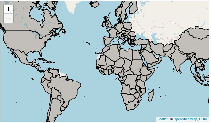
Basic map
Let’s make a leaflet map showing the countries in our
data set marked by a colored outline.
Every leaflet map has three building blocks:
A
leaflet()call. This is likeggplot()from theggplot2package—it “sets the stage” for the rest of the graphic, and you can specify some settings here that’ll apply to all subsequent components.An
addTiles()call. This places a tile, or background image, into your map. This is the familiar component that indicates where all the lakes and roads and country boundaries and such are! We’ll use the default tile, but there are many other free ones available.-
At least one
add*()function call for adding our spatial data. There are several others, but the three most commonly usedadd*()functions are:addMarkers()for adding point (0-dimensional) spatial data (like restaurant locations).addPolylines()for adding line/curve (1-dimensional) spatial data (like roads or rivers).addPolygons()for adding polygonal (2-dimensional) spatial data (like country boundaries).
Here, we’ll use addPolygons():
R
##This code should **swapped** for the the "main panel" content in the BODY section of your ui.R file!

##... other UI code...

###MAIN PANEL CELL
    column(width = 8, tabsetPanel(
      ###TABLE TAB
      tabPanel(title = "Table", dataTableOutput("table1")),
      ###MAP TAB
      tabPanel(title = "Map", leafletOutput("basic_map")), #<--OUTPUT NEW MAP.
      ###GRAPH TAB
      tabPanel(title = "Graph")
    )),
  ##... other UI code...
R
##This code should be **added to** your server.R file, below all other contents but inside of your server function!

 ##... other server code...

###MAP
  output$basic_map = renderLeaflet({

    ##FILTER TO ONLY 2007 DATA.
    gap_map2007 = gap_map %>%
      filter(year == 2007)

    leaflet() %>% #<--GET THINGS STARTED
      addTiles() %>% #<--ADD BACKGROUND TILE
      addPolygons(
        data = gap_map2007$geometry) #SPECIFY OUR SPATIAL DATA (geometry IS AN sf PACKAGE WAY OF STORING SUCH DATA)

  })
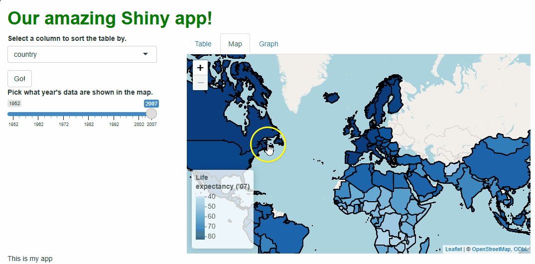
This code creates a nice, if somewhat fuzzy-looking, interactive map showing the countries for which we have data outlined in blue:
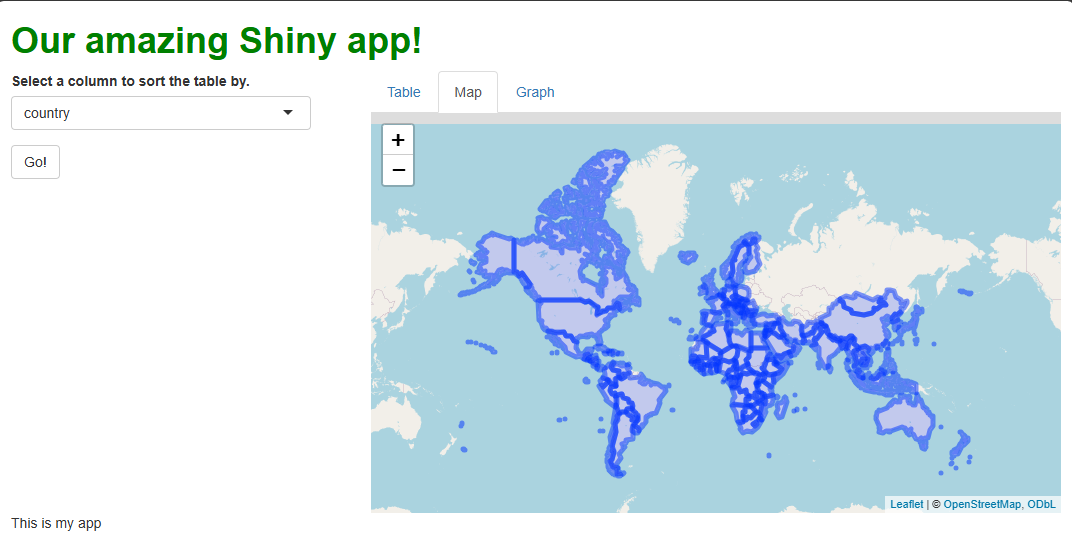
Note that you can pan the map by clicking anywhere on it, holding the click, and moving your mouse. Note you can also zoom the map using your mouse wheel (if you have one), or by using the plus/minus buttons in the upper-left. Double-clicking the map also zooms in.
If you zoom in, you’ll see the tile automatically change to show greater detail. If you zoom in really far, you can actually lose any sense of where you are and, if you zoom way out, you’ll see the world repeat several times left-to-right, which looks pretty weird!
More (or less) basic map
As we just saw, it often doesn’t make sense to allow users to pan and zoom a map with no guardrails—they can get lost by zooming in or out too far or panning the map around too much, and they can create weird visual quirks, such as making the world repeat.
The leaflet() function can be used to set min and max
zoom levels like so:
R
##This code should be **swapped for** the renderLeaflet({}) code provided previously, inside of your server function!

 ##... other server code...

###MAP
  output$basic_map = renderLeaflet({

    gap_map2007 = gap_map %>%
      filter(year == 2007)

    ##THE leaflet() FUNCTION HAS MANY OPTIONS, SUCH AS THE MIN AND MAX ZOOM LEVELS.
    leaflet(options = tileOptions(maxZoom = 6, minZoom = 2)) %>%
      addTiles() %>%
      addPolygons(
        data = gap_map2007$geometry)

  })
A minZoom of 2 makes it so almost
the entire world is visible at once (on my laptop screen, anyway!).
Meanwhile, a maxZoom of 6 allows users to zoom
into continental regions but no further. These adjustments should keep
users from zooming in or out more than makes sense for our data.
We can also set maximum bounds—these are an invisible box that users cannot pan the map beyond. If they try, the map will snap the focus (center of the map) back inside the bounds:
R
##This code should be **swapped for** the renderLeaflet({}) code provided previously, inside of your server function!

 ##... other server code...

###MAP
  output$basic_map = renderLeaflet({

    gap_map2007 = gap_map %>%
      filter(year == 2007)

    #sf'S st_bbox() FUNCTION RETRIEVES THE FOUR POINTS THAT WOULD CREATE A BOX THAT WOULD FULLY SURROUND THE SPATIAL DATA GIVEN AS INPUTS.
    bounds = unname(sf::st_bbox(gap_map2007))

    leaflet(options = tileOptions(maxZoom = 6, minZoom = 2)) %>%
      addTiles() %>%
      addPolygons(
        data = gap_map2007$geometry) %>%
      ##CONVENIENTLY, setMaxBounds() TAKES THOSE EXACT FOUR POINTS IN THE SAME ORDER.
      setMaxBounds(bounds[1], bounds[2], bounds[3], bounds[4])

  })
When a user tries to pan past the bounds we’ve set, the map now “snaps back” to within them:
While there are other features we could adjust or disable, setting
bounds and minimum and maximum zoom levels are two things you’ll often
want to do to every leaflet map.
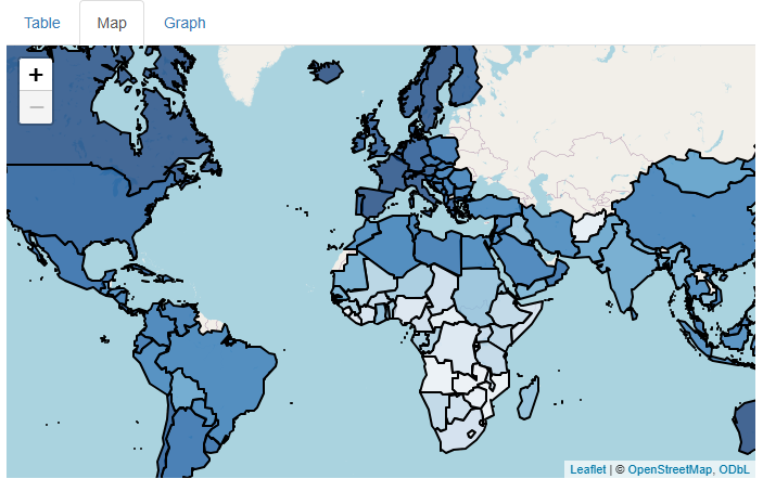
Adding some pizzazz
Our map’s aesthetics leave something to be desired right now. In particular, the default, fuzzy-blue strokes (outlines) are hard to look at.
Let’s start by cleaning those up. A lot of basic aesthetics related
to your spatial data can be controlled with parameters of the specific
add*() function you’re using. Here, we need to set new
values for color, weight, and
opacity inside addPolygons() to change the
color, thickness, and transparency of the strokes:
R
##This code should be **swapped for** the renderLeaflet({}) code provided previously, inside of your server function!

 ##... other server code...

  ###MAP
  output$basic_map = renderLeaflet({

    gap_map2007 = gap_map %>%
      filter(year == 2007)

    bounds = unname(sf::st_bbox(gap_map2007))

    leaflet(options = tileOptions(maxZoom = 6, minZoom = 2)) %>%
      addTiles() %>%
      addPolygons(
        data = gap_map2007$geometry,
        color = "black", #CHANGE STROKE COLOR TO BLACK
        weight = 2, #INCREASE STROKE THICKNESS
        opacity = 1 #MAKE FULLY OPAQUE
        ) %>%
      setMaxBounds(bounds[1], bounds[2], bounds[3], bounds[4])

  })

   ##... other server code...
These couple of changes make the graph much cleaner:
But the map still won’t engage our users very much because it’s not showing any data. Let’s have it show our life expectancy data by mapping those values to the fill color of each country’s polygon.
This’ll be a two-step process. First, we need to set up a
color palette function, which leaflet can
use to determine which colors go with which values (it can’t do this
itself). We can build this color palette function using the
colorNumeric() function, which needs two inputs: a
palette, the name of an R color palette we’d like to use,
and a domain, the entire set of values we’ll need to assign
colors to:
R
##This code should be **swapped for** the renderLeaflet({}) code provided previously, inside of your server function!

 ##... other server code...
###MAP
  output$basic_map = renderLeaflet({

    gap_map2007 = gap_map %>%
      filter(year == 2007)

    bounds = unname(sf::st_bbox(gap_map2007))

    #ESTABLISH A COLOR SCHEME TO USE FOR OUR FILL COLORS.
    map_palette = colorNumeric(palette = "Blues",
                               domain = unique(gap_map2007$lifeExp))

    leaflet(options = tileOptions(maxZoom = 6, minZoom = 2)) %>%
      addTiles() %>%
      addPolygons(
        data = gap_map2007$geometry,
        color = "black",
        weight = 2,
        opacity = 1
        ) %>%
      setMaxBounds(bounds[1], bounds[2], bounds[3], bounds[4])

  })
Then, we can add the polygon-coloring instructions and the life
expectancy data to addPolygons():
R
##This code should be **swapped for** the renderLeaflet({}) code provided previously, inside of your server function!

 ##... other server code...

###MAP
  output$basic_map = renderLeaflet({

    gap_map2007 = gap_map %>%
      filter(year == 2007)

    bounds = unname(sf::st_bbox(gap_map2007))

    map_palette = colorNumeric(palette = "Blues", domain = unique(gap_map2007$lifeExp))

    leaflet(options = tileOptions(maxZoom = 6, minZoom = 2)) %>%
      addTiles() %>%
      addPolygons(
        data = gap_map2007$geometry,
        color = "black",
        weight = 2,
        opacity = 1,
        fillColor = map_palette(gap_map2007$lifeExp), #<--WE USE OUR NEW COLOR PALETTE FUNCTION, SPECIFYING OUR DATA AS ITS INPUTS.
        fillOpacity = 0.75) %>%  #<--THE DEFAULT HERE, 0.5, WOULD WASH OUT THE COLORS TOO MUCH.
      setMaxBounds(bounds[1], bounds[2], bounds[3], bounds[4])

  })
This is already a much cooler and more engaging map:
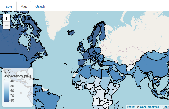
…But shouldn’t there be a legend that clarifies what
colors go with what values? We can add one using
addLegend():
R
##This code should be **swapped for** the renderLeaflet({}) code provided previously, inside of your server function!

 ##... other server code...
###MAP
  output$basic_map = renderLeaflet({

    gap_map2007 = gap_map %>%
      filter(year == 2007)

    bounds = unname(sf::st_bbox(gap_map2007))

   map_palette = colorNumeric(palette = "Blues", domain = unique(gap_map2007$lifeExp))

    leaflet(options = tileOptions(maxZoom = 6, minZoom = 2)) %>%
      addTiles() %>%
      addPolygons(
        data = gap_map2007$geometry,
        color = "black",
        weight = 2,
        opacity = 1,
        fillColor = map_palette(gap_map2007$lifeExp),
        fillOpacity = 0.75) %>%
      setMaxBounds(bounds[1], bounds[2], bounds[3], bounds[4]) %>%
      #ADD LEGEND
      addLegend(
        position = "bottomleft", #<--WHERE TO PUT IT.
        pal = map_palette, #<--COLOR PALETTE FUNCTION TO USE (AGAIN).
        values = gap_map2007$lifeExp, #WHAT SCALE BREAKS TO USE.
        opacity = 0.75, #TRANSPARENCY.
        bins = 5, #NUMBER OF BREAKS.
        title = "Life<br>expectancy ('07)" #TITLE.
      )

  })
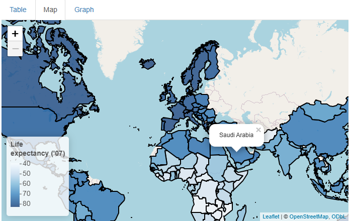
Now that’s a nice map!
…But what if our users don’t know much geography, so they don’t know which countries are which? Or what if they want to know the exact life expectancy value for a given country? Can we somehow add even more data to this map cleanly?
Yes! Adding tooltips would address both aims. A
tooltip is a small pop-up container that appears on
mouse hover (in leaflet, these variants are called
“labels”), on mouse click (leaflet calls these “popups”),
or some other action.
Using the popup parameter of addPolygons(),
we can add tooltips that appear and disappear on mouse click. Inside
them, we’ll put the name of the country being clicked:
R
##This code should be **swapped for** the renderLeaflet({}) code provided previously, inside of your server function!

 ##... other server code...
###MAP
  output$basic_map = renderLeaflet({

    gap_map2007 = gap_map %>%
      filter(year == 2007)

    bounds = unname(sf::st_bbox(gap_map2007))

    map_palette = colorNumeric(palette = "Blues", domain = unique(gap_map2007$lifeExp))

    leaflet(options = tileOptions(maxZoom = 6, minZoom = 2)) %>%
      addTiles() %>%
      addPolygons(
        data = gap_map2007$geometry,
        color = "black",
        weight = 2,
        opacity = 1,
        fillColor = map_palette(gap_map2007$lifeExp),
        fillOpacity = 0.75,
        popup = gap_map2007$country) %>% #<--MAKE A TOOLTIP HOLDING THE COUNTRY NAME THAT APPEARS/DISAPPEARS ON MOUSE CLICK.
      setMaxBounds(bounds[1], bounds[2], bounds[3], bounds[4]) %>%
      addLegend(
        position = "bottomleft",
        pal = map_palette,
        values = gap_map2007$lifeExp,
        opacity = 0.75,
        bins = 5,
        title = "Life<br>expectancy ('07)"
      )

  })
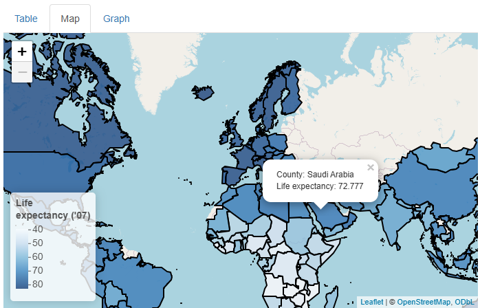
This is a nice addition, but what if we wanted to add life expectancy
values too and also keep the result human-readable? There are many
approaches we could take, but using R’s versatile paste0()
function plus the HTML line break element (<br>)
works pretty well:
R
##This code should be **swapped for** the renderLeaflet({}) code provided previously, inside of your server function!

 ##... other server code...
###MAP
  output$basic_map = renderLeaflet({

    gap_map2007 = gap_map %>%
      filter(year == 2007)

    bounds = unname(sf::st_bbox(gap_map2007))

    map_palette = colorNumeric(palette = "Blues", domain = unique(gap_map2007$lifeExp))

    leaflet(options = tileOptions(maxZoom = 6, minZoom = 2)) %>%
      addTiles() %>%
      addPolygons(
        data = gap_map2007$geometry,
        color = "black",
        weight = 2,
        opacity = 1,
        fillColor = map_palette(gap_map2007$lifeExp),
        fillOpacity = 0.75,
        #EXPANDING THE INFO PRESENTED IN THE TOOLTIPS.
        popup = paste0("Country: ",
                       gap_map2007$country,
                       "<br>Life expectancy: ",
                       gap_map2007$lifeExp)
      ) %>%
      setMaxBounds(bounds[1], bounds[2], bounds[3], bounds[4]) %>%
      addLegend(
        position = "bottomleft",
        pal = map_palette,
        values = gap_map2007$lifeExp,
        opacity = 0.75,
        bins = 5,
        title = "Life<br>expectancy ('07)"
      )

  })
Now, our map is both snazzy and extra informative:
Challenge
In the previous example, we used popup to build our
tooltips. Try using the label parameter instead. For
whatever reason, this requires more wrangling, so here’s the
exact code you’ll need:
R
label = lapply(1:nrow(gap_map2007), function(x){
                    HTML(paste0("Country: ",
                                 gap_map2007$country[x],
                                 "<br>Life Expectancy: ",
                                gap_map2007$lifeExp[x]))})
What changes? Which do you prefer? Which option would be better if a lot of users will use mobile devices, do you think?
If we use label, we get tooltips that appears on mouse
hover instead of on mouse click.
This behavior is probably more intuitive for most users; many will not expect a click to do anything cool and so they may only discover our on-click tooltips by accident!
On the other hand, tooltips that appear on hover can be annoying if a user is trying to, e.g., trace a path with their mouse, and irrelevant tooltips keep getting in the way.
Another advantage of on-click tooltips is that they don’t disappear until a user is ready for them to do so, whereas tooltips that appear on hover also disappear when the mouse is moved, which can prevent users from consulting a tooltip while also using their mouse somewhere else on the page.
However, the biggest disadvantage of on-hover tooltips is that, while there is an equivalent event to a mouse click on touchscreen devices (a finger press), there is no universal equivalent to a mouse hover (some mobile device browsers and platforms use a “long press” for this, but not all, and many users are not accustomed to performing long presses!).
So, mobile users won’t generally see tooltips if they appear
only on hover. If we’re aiming for “mobile-first” design, the
popup option is better (which is why I picked it)!
This hypothetical also demonstrates why there is no substitute for asking your users for input when building your app; without it, you’ll just be guessing as to what their needs, expectations, and workflows will be!
Update, don’t remake, leaflet edition!
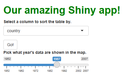
At this stage, our users have no control over our map. Let’s adds a slider input widget that will let users select which year’s data get plotted:
R
##This code should **replace** the "sidebar" cell's content within the BODY section of your ui.R file!

##... other UI code...

###SIDEBAR CELL
    column(width = 4,
           selectInput(
             inputId = "sorted_column",
             label = "Select a column to sort the table by.",
             choices = names(gap)
            ),
           actionButton(
             inputId = "go_button",
             label = "Go!"),
           sliderInput(
             inputId = "year_slider",
             label = "Pick what year's data are shown in the map.",
             value = 2007, #<--THE DEFAULT CHOICE
             min = min(gap$year), #<--MIN AND MAX CHOICES
             max = max(gap$year),
             step = 5, #<--HOW FAR APART ARE CHOICES?
             sep = "" #<--DON'T USE COMMAS AS SEPARATORS)
           )
    )
  ##... other UI code...
This adds the UI component of our input widget to our app’s sidebar cell:
But, as we now appreciate, adding the widget to the UI isn’t
enough—we also need to incorporate its reactive object
(input$year_slider) into a reactive
context in our server code somehow if we want to
handle this widget’s events.
In this case, that isn’t actually too hard; we already have code that filters the data set down to the year 2007; we can modify this code so it filters the data by whichever year has been chosen instead:
R
##This code should be **swapped for** the renderLeaflet({}) code provided previously, inside of your server function!

 ##... other server code...
###MAP
  output$basic_map = renderLeaflet({

    ##KEEP THE PRODUCT NAMED AFTER 2007 FOR NOW.
    gap_map2007 = gap_map %>%
      filter(year == as.numeric(input$year_slider)) #<--INTRODUCE THE SLIDER'S CURRENT VALUE TO FILTER BY WHATEVER YEAR IS CHOSEN.

    bounds = unname(sf::st_bbox(gap_map2007))

    map_palette = colorNumeric(palette = "Blues", domain = unique(gap_map2007$lifeExp))

    leaflet(options = tileOptions(maxZoom = 6, minZoom = 2)) %>%
      addTiles() %>%
      addPolygons(
        data = gap_map2007$geometry,
        color = "black",
        weight = 2,
        opacity = 1,
        fillColor = map_palette(gap_map2007$lifeExp),
        fillOpacity = 0.75,
        popup = paste0("Country: ",
                       gap_map2007$country,
                       "<br>Life expectancy: ",
                       gap_map2007$lifeExp)
      ) %>%
      setMaxBounds(bounds[1], bounds[2], bounds[3], bounds[4]) %>%
      addLegend(
        position = "bottomleft",
        pal = map_palette,
        values = gap_map2007$lifeExp,
        opacity = 0.75,
        bins = 5,
        #HERE, A LITTLE TRICK TO ENSURE THE LEGEND'S TITLE IS ALWAYS ACCURATE.
        title = paste0("Life<br>expectancy ('",
                       substr(input$year_slider, 3, 4),
                       ")")
      )

  })
Above, notice I made a change to the map’s legend title to make it
more “generic” and less specific to any one year. There’s another,
similar change we should make: We should make our
map_palette function more generic so that just one version
of it is used no matter which year is picked. Since the code to produce
this function will then need to run only once ever, this is a good
opportunity to relocate that code to global.R:
R
##This code should be **added to** your global.R file, below all other code!

 ##... other global code...

map_palette = colorNumeric(palette = "Blues",
                           domain = unique(gap_map$lifeExp)) #<--CHANGE TO REFERENCE THE WHOLE DATA SET INSTEAD OF JUST THOSE FROM ONE YEAR.
This new functionality gives users a new and exciting way to explore the data:
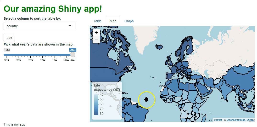
If you watch the video above closely, you’ll notice the “freeze” that
occurs every time a user selects a new year. As we saw with
DT, handling events by rebuilding our graphic is
not ideal. With maps, it can be especially problematic
because spatial data tend be voluminous, so re-rendering maps can cause
long loading times for our users and make the app look “buggy.”
Fortunately, just as with DT, leaflet
features a proxy that lets us update our rendered map
in real time, changing only those features that need
changing.
Let’s switch to that system the same way we did with
DT:
We’ll now use
renderLeaflet({})to produce just the version of the map that users sees at start-up.We use a new
observeEvent({},{})to watch for relevant events (here, our slider changing).Inside the observer, we use a proxy, built using
leafletProxy(), to make only the updates that need making:
R
##This code should be **swapped for** the renderLeaflet({}) code provided previously, inside of your server function!

 ##... other server code...

###MAP
  #RENDERLEAFLET GOES BACK TO MAKING JUST THE BASE, 2007 VERSION.
  output$basic_map = renderLeaflet({

    gap_map2007 = gap_map %>%
      filter(year == 2007) #<--CHANGE

    bounds = unname(sf::st_bbox(gap_map2007))

    leaflet(options = tileOptions(maxZoom = 6, minZoom = 2)) %>%
      addTiles() %>%
      addPolygons(
        data = gap_map2007$geometry,
        color = "black",
        weight = 2,
        opacity = 1,
        fillColor = map_palette(gap_map2007$lifeExp),
        fillOpacity = 0.75,
        popup = paste0("Country: ",
                       gap_map2007$country,
                       "<br>Life expectancy: ",
                       gap_map2007$lifeExp)
      ) %>%
      setMaxBounds(bounds[1], bounds[2], bounds[3], bounds[4]) %>%
      addLegend(
        position = "bottomleft",
        pal = map_palette,
        values = gap_map2007$lifeExp,
        opacity = 0.75,
        bins = 5,
        title = paste0("Life<br>expectancy ('07)") #<--CHANGE
      )

  })

  #A NEW OBSERVER WATCHES FOR EVENTS INVOLVING OUR SLIDER.
  observeEvent({input$year_slider}, {

    gap_map2007 = gap_map %>%
      filter(year == as.numeric(input$year_slider)) #FILTER BY SELECTED YEAR

    #WE USE leafletProxy({}) TO UPDATE OUR MAP INSTEAD OF RE-RENDERING IT.
    leafletProxy("basic_map") %>%
      clearMarkers() %>% #REMOVE THE OLD POLYGONS ("MARKERS")--THEIR FILLS MUST CHANGE.
      clearControls() %>% #REMOVE THE LEGEND ("CONTROL")--ITS TITLE MUST CHANGE.
      addPolygons( #REBUILD THE POLYGONS EXACTLY AS BEFORE.
        data = gap_map2007$geometry,
        color = "black",
        weight = 2,
        opacity = 1,
        fillColor = map_palette(gap_map2007$lifeExp),
        fillOpacity = 0.75,
        popup = paste0("Country: ",
                       gap_map2007$country,
                       "<br>Life expectancy: ",
                       gap_map2007$lifeExp)
      ) %>%
      addLegend( #REBUILD THE LEGEND EXACTLY AS BEFORE.
        position = "bottomleft",
        pal = map_palette,
        values = gap_map2007$lifeExp,
        opacity = 0.75,
        bins = 5,
        title = paste0("Life<br>expectancy ('",
                       substr(input$year_slider, 3, 4),
                       ")") #<-RETAIN OUR TRICK HERE.
      )

  })
In the code above, we still need to repeat quite a lot of code to handle these particular events, so the updating process isn’t much faster than before. However, we at least don’t need to touch the map window itself, its zoom behavior, or bounds because those aspects don’t need to change. The result is a cleaner, less buggy-looking transition between map versions:
There are ways we could have made these updates even more efficient, such as:
Pre-building all possible filtered versions of the data set in
global.Rso we didn’t need to (re-)make them on the fly during each update.Making the legend title generic enough that it doesn’t need rebuilding each time.
Considering whether the user should be able to view and change the entire world’s data at once. Perhaps they should only be able to view and control a single continent’s data at a time.
Using a discrete rather than continuous color palette (e.g., only six possible colors), assigning every country’s polygon to a group (using the
groupparameter insideaddPolygons()) according to the “bin” their data falls into, determining whether a country’s “bin” should change during an update, and redrawing only those polygons whose “bins” do need to change.
However, you may deem the current solution “good enough” for your users—I would!
Watch and learn
leaflet maps are widgets like any
other, so information about user interactions with them are passed from
the UI to the server by input where they can be watched and
handled.
For example, whenever a user clicks a country’s
polygon, this could trigger a “click event,” and we can access
information about that event using
input$[outputId]_shape_click format server-side.
We can combine that functionality with another cool feature of
leaflet maps: flyTo(). This function will
pan and zoom the map to center on a
specific location, such as where the user clicked.
So, let’s create a new observer that watches for clicks, and, when
one happens, a leafletProxy() will fly our map to that
location:
R
##This code should be **added** to the bottom of your server.R file, but still within your server function!

###MAP OBSERVER (POLYGON CLICKS)
#WHEN A POLYGON CLICK EVENT OCCURS, WE USE A PROXY AND flyTo() TO ZOOM AND PAN THE MAP TO CENTER ON THE CLICKED LOCATION.
  observeEvent(input$basic_map_shape_click, {

    leafletProxy("basic_map") %>%
      flyTo(
        lat = input$basic_map_shape_click$lat, #LAT AND LONG DATA ON THE CLICKED LOCATION ARE ACCESSED THUSLY.
        lng = input$basic_map_shape_click$lng,
        zoom = 5
      )

  })
Now, when users click specific countries, they don’t just get additional info via a tooltip, they get an animation that zooms them in on that particular country:

Obviously, we should only add features like this if they enhance our UX, which this one arguably doesn’t, but this example demonstrates what’s possible.
Getting graphic
We’ll close out this lesson by considering plotly, a
package for producing interactive, web-enabled graphs,
similar in quality and complexity to the (static) ones produced by
ggplot2.
R users who know ggplot2 understand that learning
graphics packages is like learning a new language! The learning curve is
significant; because these packages give users all the
tools needed to design a complex graph piece by piece, there are lots of
functions and parameters and jargon to keep straight!
plotly is no different—you can create ultra-detailed,
publication-quality graphics with it, but you’ll need to learn a new
vernacular to do so, one that may only sometimes feel similar to
ggplot2’s.
As such, covering plotly in any depth is outside the
scope of this lesson. Thankfully, we don’t actually need to
learn plotly to appreciate what it can offer our users; it
comes with an incredible “cheat code” that, while imperfect,
will work suit our needs here wonderfully: the ggplotly()
function.
ggplotly() takes a complete ggplot, breaks
it down into its components, and rebuilds those components using
plotly’s system instead (as best it can). Because the two
systems are similar in many ways, you’ll get a similar graph as
a product, but one with all the interactive features of a
plotly graph.
However, because the two systems don’t map 1-to-1, the result will
rarely look exactly the same as the ggplot you put
in. In particular, complex customizations using ggplot’s
theme(), text-related components, advanced or new features
in ggplot’s dialect, and so on don’t generally transition
well.
So, it’s probably more correct to say that ggplotly()
produces a plotly graph in the spirit of the
ggplot2 graph used. Still, that means we don’t
need to learn how to produce a plotly graph using
plotly’s own system to be able to explore the package’s
features and use cases.
To start, let’s build a ggplot2 graph to use as an
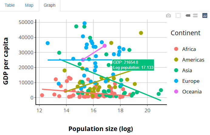
input. Let’s make it a scatterplot of GDP vs. log(population) for 2007,
with each continent getting a different color too. Additionally, we’ll
plot a best-fit line for each continent’s data. And, to top it off,
we’ll customize the appearance of the graph in several ways.
This probably sounds like it’ll be a complicated graph, and
that’s because it will be! I want you to see how ggplotly()
performs on a graph with many components:
R
##This code should be **added** to the bottom of your global.R file!

###FILTERED DATA SET FOR GRAPH
gap2007 = gap %>%
  filter(year == 2007)

###BASE GGPLOT FOR CONVERSION TO PLOTLY
#IF GGPLOT IS FAMILIAR TO YOU, STUDY THE SPECIFICS HERE TO GET A SENSE OF THE GRAPH WE'RE BUILDING. IF NOT, DON'T WORRY ABOUT THE DETAILS! JUST COPY-PASTE THIS CODE INTO PLACE.
p1 = ggplot(
  gap2007,
  aes(
    x = log(pop),
    y = gdpPercap,
    color = continent,
    group = continent
  )
) +
  geom_point(size = 3) +
  geom_smooth(method = "lm", se = F) +
  theme(
    text = element_text(
      size = 16,
      color = "black",
      face = "bold"
    ),
    panel.background = element_rect(fill = "white"),
    panel.grid.major = element_line(color = "gray"),
    panel.grid.minor = element_blank(),
    axis.line = element_line(color = "black", linewidth = 1.5)
  ) +
  scale_y_continuous("GDP per capita\n") +
  scale_x_continuous("\nPopulation size (log)") +
  scale_color_discrete("Continent\n")
If you don’t know ggplot2, the above code will probably
look daunting! If so, don’t worry; you don’t need to know what
it’s doing at all! Just copy-paste it into your app’s
global.R file.
For those who do know ggplot2, you’ll hopefully
agree that this graph looks halfway decent:
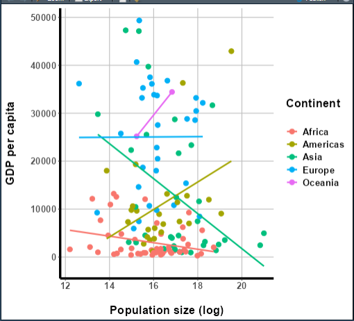
More importantly, though, it’s complex enough to be a good test for
ggplotly(). Let’s see how it does at converting it to a
plotly graph:
R
##This code should be **added** to the bottom of your global.R file!
p2 = ggplotly(p1)
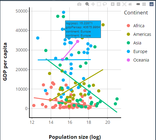
Now that we have our plotly version, I hope you’ll agree
it looks pretty similar to our original ggplot, although
there are some differences—we’ll talk about those in a moment.
First, though, let’s insert this graph into our app. For this, it
hopefully won’t surprise you that there are
renderPlotly({}) and plotlyOutput() functions
we can use:
R
##This code should **swapped** for the the "main panel" content in the BODY section of your ui.R file!

##... other UI code...
###MAIN PANEL CELL
column(width = 8, tabsetPanel(
      tabPanel(title = "Table", dataTableOutput("table1")),
      tabPanel(title = "Map", leafletOutput("basic_map")),
      tabPanel(title = "Graph",
               plotlyOutput("basic_graph")) #<--ADD THE RENDERED GRAPH HERE.
    )),
##... other UI code...
R
##This code should be **added to** your server.R file, underneath all other contents but inside of your server function!

 ##... other server code...
###GRAPH
output$basic_graph = renderPlotly({

    p2 #<--PUT PRE-GENERATED PLOTLY GRAPH HERE.

})
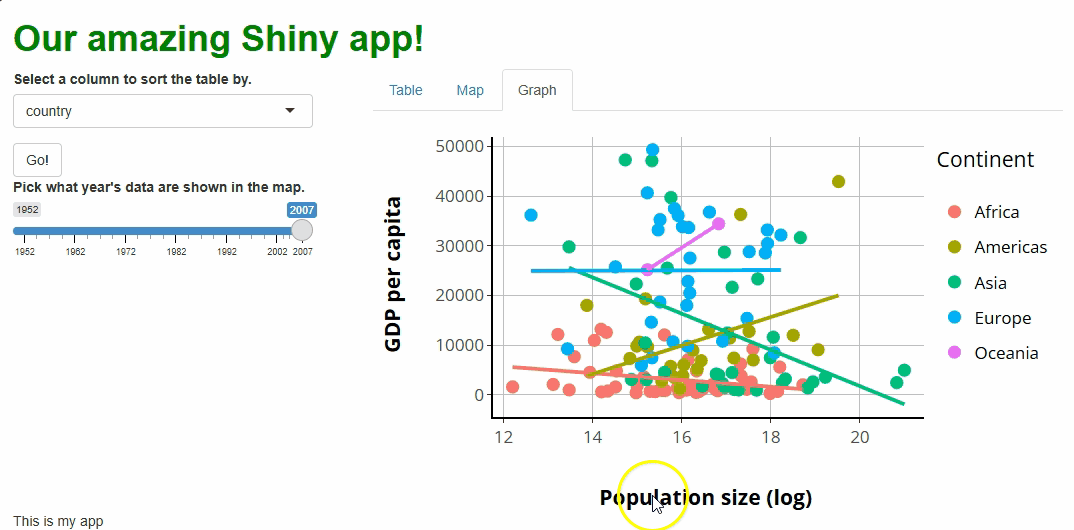
If we launch our app, we should see our new plotly graph
on the Graph tab panel:
The only aesthetic difference between our original
ggplot and our new plotly graph that stands
out to me is the legend’s placement; while ggplots
vertically center their legends by default, plotly graphs
top-align them instead.
We’ll fix that in a moment! Beforehand, let’s focus on all the new interactive features this graph comes with that the old one lacks (it’s a lot!):
Tooltips: If you hover over a point, you’ll get a tooltip showing the point’s associated
x,y, andgroup(continent) values. These tooltips aren’t super human-readable by default, but that too we’ll soon change.Click+drag to zoom: If you click anywhere, drag your cursor to highlight a region, and let go, you will zoom the graph to show only the highlighted region and data. Double-clicking will restore the original zoom level.
Interactive “modebar:”
plotlygraphs come with a toolbar in the upper-right that features several buttons. These allow you to download an image of the graph, zoom and pan, select specific data, reset the graph, and change how tooltips work.Legend group filtering: If you click any of the legend keys (such as “Asia”), all data points from that group will be redacted, and the axes will readjust as though those data weren’t present. Double-clicking a legend key, meanwhile, will exclude all data but those from that group.
That’s a lot of interactivity!
More (or less) basic graph
…which means we should discuss how to disable some of these features.
Unfortunately, disabling features in plotly is not
as easy as in DT or leaflet; to do
so, we must engage with two of the core functions used to build
plotly graphs from scratch: layout() and
config().
layout() is sort of like ggplot2’s
scale_*() functions in that it controls how much of the
plot’s mapped aesthetics work. Inside layout() are
xaxis and yaxis parameters; if we give both a
list containing the instruction fixedrange = TRUE, this
will disable zooming functionality:
R
##This code should **replace** the renderPlotly({}) code in your server.R file, inside of your server function!

 ##... other server code...
###GRAPH
  output$basic_graph = renderPlotly({
    p2 %>%
      layout(
        #PLOTLY CODE LOOKS VERY JS-Y, HENCE LOTSA LISTS!
        xaxis = list(fixedrange = TRUE),
        yaxis = list(fixedrange = TRUE))

  })
In my experience, zooming isn’t a useful feature in most contexts, and some users find it hard to figure out how to reverse an accidental zoom, so it’s one of the first features I tend to disable.
We can also use layout() to adjust how the legend
responds to clicks. For example, if we want to turn off the
functionality that redacts a group when its legend key is clicked, we
can set the itemclick instruction for the
legend parameter to FALSE:
R
##This code should **replace** the renderPlotly({}) code in your server.R file, inside of your server function!

 ##... other server code...
###GRAPH
  output$basic_graph = renderPlotly({

    p2 %>%
      layout(
        xaxis = list(fixedrange = TRUE),
        yaxis = list(fixedrange = TRUE),
        legend = list(itemclick = FALSE) #<--TURN OFF GROUP REDACTION UPON CLICKING LEGEND KEYS.
      )

  })
The double-click functionality can be similarly disabled. In my experience, though it seems useful, I’ve struggled to adequately explain the legend key filtering functionality to my users, so it’s another feature I regularly disable.
The config() function, meanwhile, can remove buttons
from the modebar, although you may need to Google for the names of the
specific buttons you want to remove:
R
##This code should **replace** the renderPlotly({}) code in your server.R file, inside of your server function!

 ##... other server
###GRAPH
  output$basic_graph = renderPlotly({

    p2 %>%
      layout(
        xaxis = list(fixedrange = TRUE),
        yaxis = list(fixedrange = TRUE),
        legend = list(itemclick = FALSE)
      ) %>%
      config(modeBarButtonsToRemove = list("lasso2d")) #<--REMOVING THE "LASSO" SELECTION BUTTON.

  })
Callout
I’ll stress here again that, when considering UX, “less” is often “more.” If your users might not understand it or won’t use it, consider removing or disabling it.
Making some adjustments
Earlier, I identified two dissatisfying aspects about our graph. First, the legend isn’t centered vertically, like in our original graph and, second, the tooltip text could be easier to read.
The first issue is solved using the legend parameter
inside of layout(), which we’ve already dabbled with:
R
##This code should **replace** the renderPlotly({}) code in your server.R file, inside of your server function!

 ##... other server code...
###GRAPH
  output$basic_graph = renderPlotly({

    p2 %>%
      layout(
        xaxis = list(fixedrange = TRUE),
        yaxis = list(fixedrange = TRUE),
        legend = list(itemclick = FALSE,
                      y = 0.5, #<--PUT THE LEGEND HALFWAY DOWN.
                      yanchor = "middle" #<--SPECIFICALLY, PUT THE *CENTER* OF IT HALFWAY DOWN.
                      )
      ) %>%
      config(modeBarButtonsToRemove = list("lasso2d"))

  })
The best way to beautify our tooltips’ contents, meanwhile, will be
to use a third core plotly function:
style().
This’ll be a multi-step process:
First, let’s “pre-generate” the text we want each tooltip to contain (using
dplyr’smutate()).Second, let’s pass this text into our original
ggplotcall so it gets packaged up with everything else passed toggplotly().Lastly, let’s use
style()to make the contents of our tooltips only the custom text we’ve cooked up:
R
##This code should **replace** the previous plotly-related code in your global.R file!

 ##... other global code...
###FILTERED DATA SET FOR GRAPH
gap2007 = gap %>%
  filter(year == 2007) %>%
  mutate(tooltip_text = paste0( #<--HERE, GENERATE A NEW COLUMN CALLED tooltip_text USING paste0() TO MAKE A TEXT STRING CONTAINING THE GDP AND POPULATION DATA IN A MORE READABLE FORMAT.
    "GDP: ",
    round(gdpPercap, 1),
    "<br>",
    "Log population: ",
    round(log(pop), 3)
  ))

###BASE GGPLOT FOR CONVERSION TO PLOTLY
p1 = ggplot(
  gap2007,
  aes(
    x = log(pop),
    y = gdpPercap,
    color = continent,
    group = continent,
    text = tooltip_text #<--HERE, PASS OUR CUSTOM TOOLTIP TEXT TO THE TEXT AESTHETIC. EVEN THOUGH OUR GGPLOT NEVER USES THIS AESTHETIC, IT'LL PASS IT TO OUR PLOTLY GRAPH ANYHOW.
  )
) +
  geom_point(size = 3) +
  geom_smooth(method = "lm", se = F) +
  theme(
    text = element_text(
      size = 16,
      color = "black",
      face = "bold"
    ),
    panel.background = element_rect(fill = "white"),
    panel.grid.major = element_line(color = "gray"),
    panel.grid.minor = element_blank(),
    axis.line = element_line(color = "black", linewidth = 1.5)
  ) +
  scale_y_continuous("GDP per capita\n") +
  scale_x_continuous("\nPopulation size (log)") +
  scale_color_discrete("Continent\n")

###PLOTLY CONVERSION
p2 = ggplotly(p1,
              tooltip = "text") %>% #<--HERE, TELL GGPLOTLY() TO POPULATE TOOLTIPS WITH ONLY TEXT DATA, NOT ALSO X/Y/GROUP DATA
  style(hoverinfo = "text") #<--HERE, USE style() TO REQUEST THAT ONLY OUR CUSTOM TOOLTIPS BE SHOWN, OR ELSE WE'D GET PLOTLY'S DEFAULTS ALSO!
Now our tooltips are looking great:
The morale of the story is that, between layout(),
style(), and config(), you can adjust
virtually any aspect of a plotly graph, much as in
ggplot2 using theme() and the
scale_*() functions. However, it may require some Googling
and experimentation to figure out exactly how to do any
specific thing!
Update, don’t remake, plotly edition!
Once again, it’s time to see how to update a plotly
graph “on the fly” in response to user actions without re-rendering
it!
That again first means giving users a fun way to affect the graph. Let’s create a drop-down widget that lets users pick a new color palette for the graph:
R
##This code should **replace** the "sidebar panel" cell's content within the BODY section of your ui.R file!

##... other UI code...
###SIDEBAR CELL
    column(width = 4,
           selectInput(
             inputId = "sorted_column",
             label = "Select a column to sort the table by.",
             choices = names(gap)
           ),
           actionButton(
             inputId = "go_button",
             label = "Go!"),
           sliderInput(
             inputId = "year_slider",
             label = "Pick what year's data are shown in the map.",
             value = 2007,
             min = min(gap$year),
             max = max(gap$year),
             step = 5,
             sep = ""
           ),
           selectInput( #ADD A COLOR PALETTE SELECTOR
             inputId = "color_scheme",
             label = "Pick a color palette for the graph.",
             choices = c("viridis", "plasma", "Spectral", "Dark2")
           )
    ),
##... other UI code...
In plotly, color scheme is generally specified inside
the plot_ly() call (the equivalent of ggplot()
in ggplot2) or inside an add_*() function call
(the equivalent of a geom_* call in ggplot2).
However, one can be specified or modified using style()
too.
To update rather than remake our graph, we’ll use the
plotly functions plotlyProxy() and
plotlyProxyInvoke(), which are like
dataTableProxy() and its helper functions like
replaceData(). They are a “package deal;” both are needed
to accomplish the task. Specifically, we’ll use the
"restyle" method inside plotProxyInvoke() to
trigger a re-styling of the graph.
As before, we make a new observer that watches
input$color_scheme and triggers restyling using
plotlyProxy(), leaving renderPlotly({}) to
produce only the version of the graph we see on start-up:
R
##This code should **replace** all your plotly-related code to date in your server.R file!

##... other server code...

###GRAPH OBSERVER (COLOR SCHEME SELECTOR)
  #THIS OBSERVER UPDATES THE GRAPH WHEN EVENTS ARE TRIGGERED.
  observeEvent(input$color_scheme, {

    #WE FIRST DESIGN AN APPROPRIATE COLOR PALETTE FOR THE DATA, GIVEN THE USER'S COLOR SCHEME CHOICE
    new_pal = colorFactor(palette = input$color_scheme,
                          domain = unique(gap2007$continent))

    plotlyProxy("basic_graph", session) %>% #<--WE HAVE TO INCLUDE session HERE TOO.
      plotlyProxyInvoke("restyle", #<-THE TYPE OF CHANGE WE WANT
                        list(marker = list(
                          color = new_pal(gap2007$continent), #FOR OUR MARKERS, USE THESE NEW COLORS.
                          size = 11.3 #AND THIS POINT SIZE.
      )),
      0:4) #APPLY THIS CHANGE TO ALL 5 GROUPS OF MARKERS WE HAVE.

  })
The inputs to plotlyProxyInvoke() are a little
complicated, so let’s go over them. The first is the name of a
method the proxy should use. Here, we use the
"restyle" method because we want to adjust things the
style() function regulates, such as the graph’s color
scheme. There’s also a "relayout" method for adjusting
things that layout() controls, such as the legend.
The second input is a list of lists—this is where we’re very
nearly writing JavaScript code; if there’s one thing JS loves, it’s
lists! The outermost list contains the aspects of the graph we want to
re-style (here, markers are the only such thing).
Then, we provide a list to each such aspect—what specific
features do we want to change about that aspect? Here, we’re changing
the colors of our markers, setting them equal to the new
colors we’ve generated using colorFactor() from
leaflet.
However, we also specify point sizes. Why? If
plotlyProxy() is asked to redraw our graph’s markers, it’ll
do so “from scratch,” using plotly default values for any
properties we don’t specifically specify. Since our original graph
featured custom-sized points, we need to “override the defaults” to get
the same point sizes after the redraw as we had before it.
The last input to plotlyProxyInvoke() is a set of
trace numbers. A plotly
trace is one “set” of data being graphed. In our case,
we have five traces, one for each continent, and we’re modifying all
five, so you’d think we’d need to put 1:5 here.
However, JS starts counting things at 0, not 1 (it’s a “zero-indexed
language,” whereas R is a “one-indexed language”), so we actually need
0:4 instead.
You’ll notice that, with this new proxy in place, our points change colors as we adjust our new selector. However, our lines don’t, and our legend keys do change but to the wrong colors:
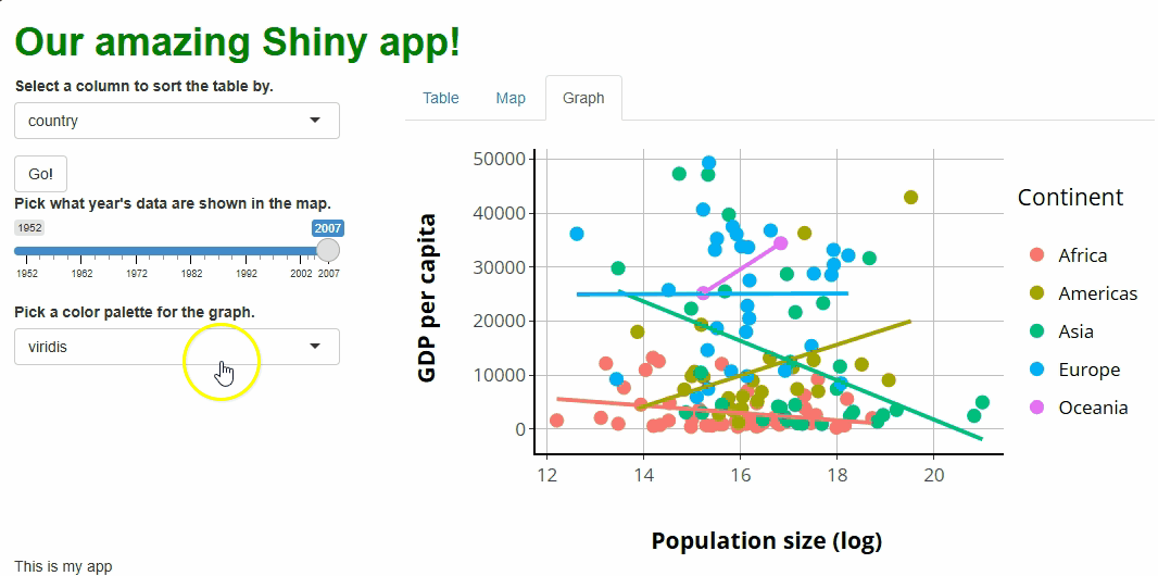
These are fixable problems, but not without some
grief—in simple terms, the graph conversion performed by
ggplotly() comes with baggage that we’re running into here.
If we really want to allow users to choose our graph’s color palette,
we’d have an easier time if we rebuilt our graph in
plotly.
Point and click
As with all other widgets, user interactions with plotly
graphs can trigger events.
However, plotly is unusual in that info about events is
not passed from the UI to the server via input.
Instead, plotly has an alternative (but equivalent) system
that uses the functions event_register() to specify which
events to track and event_data() to pass the relevant event
data to the server as a reactive object. This
sounds more complicated than what we’re used to, but it’s
really the same idea with differently named parts.
First, let’s create a textOutput() in our UI, beneath
our graph. We will report a message to the user there abiut the point
they’ve clicked that we will build server-side:
R
##This code should **replace** the "main panel" cell's content within the BODY section of your ui.R file!

##... other UI code...
###MAIN PANEL CELL
    column(width = 8, tabsetPanel(
      tabPanel(title = "Table", dataTableOutput("table1")),
      tabPanel(title = "Map", leafletOutput("basic_map")),
      tabPanel(title = "Graph",
               plotlyOutput("basic_graph"),
               textOutput("point_clicked")) #<--ADD TEXTOUTPUT TO UI.
    ))
##... other UI code...
Next, let’s “register” with our graph that we want to watch for mouse
click events. At the same time, we’ll give our graph a special attribute
(a source) that is used just to make this system work, sort
of how an inputId is used for tracking event data
normally:
R
##This code should **replace** the ggplotly() call within your global.R file!

##... other global code...
###PLOTLY CONVERSION
p2 = ggplotly(p1,
              tooltip = "text",
              source = "our_graph") %>% #<--A SPECIAL ID JUST FOR THIS SYSTEM.
  style(hoverinfo = "text") %>%
  event_register("plotly_click") #<--WATCH FOR USER CLICK EVENTS
Lastly, let’s create a new observer in our server.R file
to watch for clicks, referencing the source and event type
data we just established. When a user clicks a point in our graph, a
text message will appear telling them the raw population count for that
point, which might be helpful given that we are currently
log-transforming those data:
R
##This code should **added to** the bottom of your server.R file, within the server function!

##... other server code...

  #WE USE THE event_data() CALL LIKE ANY OTHER REACTIVE OBJECT.
  observeEvent(event_data(event = "plotly_click",
                          source = "our_graph"), {

    output$point_clicked = renderText({
      paste0(
        "The exact population for this point was: ",
        prettyNum(round(exp(
          event_data(event = "plotly_click", source = "our_graph")$x
          )), big.mark = ",") #<--WE CAN ACCESS THE X VALUE OF THE POINT CLICKED THIS WAY.
      )

    })

  })
If you run the app at this point and click on any of the points, you should see something like this:
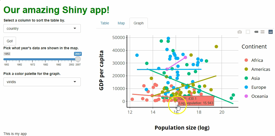
In this setup, we aren’t using input like we have
before, but we are creating something equivalent—a single reactive
object that passes one type of event data for one UI component to the
server for use in event handling.
Whenever an event triggers, we use renderText({}) and
textOutput() to show the population datum of the point
clicked. This is admittedly not a thrilling use of this functionality,
but it hopefully shows what’s possible, and it could be of value to some
users.
Ultimately, this system of event watching and handling is not
much harder to learn and use than the typical one involving
input; it’s more difficult only in that it’s
different.
Key Points
- The
DT,leaflet, andplotlypackages can be used to produce web-enabled, interactive tables, maps, and graphs for incorporation into Shiny apps. - Each of the graphics these packages create come with tons of interactive features. Because some of this functionality might be confusing or unnecessary for some users or contexts, it’s valuable to know how to adjust or disable them. It’s better to have only as many features as are needed and that your users can handle.
- The aesthetics of these graphics can be adjusted or customized, but the specifics of how to do this (and how easy or intuitive it will be) varies widely.
- We should strive to update graphics, changing only the aspects that
need changing, rather than remaking graphics from scratch. This
generally means handling events using observers and proxies rather than
using
render*({})functions. - Like with other widgets, user interactions with these graphics can
be tracked by the UI and passed to the server for handling. This passing
happens with the
inputobject forDTandleaflet, but an equivalent system must be used forplotly.