Content from Welcome to the Web! Web Development with Shiny 101
Last updated on 2025-04-15 | Edit this page
Overview
Questions
- How is a website built?
- How is building a website using R Shiny similar to/different from the “usual” way?
- What does a website “look like,” under the hood?
- What are the most common website “building blocks?”
Objectives
- Meet the web development languages.
- Describe how R Shiny relates to other web development frameworks.
- Picture a typical website’s underlying structure.
- List several typical website components.
- Establish a working familiarity with HTML and CSS.
Important: This course assumes you have working knowledge of the R programming language and of the RStudio Integrated Development Environment (IDE). If either is unfamiliar, you could struggle with this lesson (although the “normal R code” used is relatively basic). By contrast, this course assumes no web development experience. If you have some, this course may be too introductory/simplified to hold your attention, though you may still find it useful as an overview of the R Shiny framework.
The web’s languages
R is a programming language, a system with which we direct a computer to do things for us.
Just like a human language, R possesses:
“Nouns” (objects or variables),
“Verbs” (functions),
“Punctuation” (operators like
<-and%>%),“Questions” (logical tests like
x == 1),“Adjectives” (the types and classes possessed by objects) and “adverbs” (optional parameters of functions), and
“Grammar/syntax” (rules like
1abeing an unacceptable object name buta1being valid).
To have a successful “R conversation,” we must form valid “sentences” (commands) in which we create and manipulate nouns, subject them to verbs, and follow all the rules, just as we would with a human language.
R Shiny, meanwhile, is not a programming language. Instead, it (in combination with R) is what a web developer would call a framework: a suite of tools for building a website. Specifically, it leverages R and its conventions/grammar/syntax to accomplish that task as opposed to using other, comparable tools.
To appreciate how R Shiny is distinct from other frameworks, and to understand how to use it well, we need to understand a few basic things about “normal” web development:
The languages typically used to build websites, what each is for, and how each basically works.
The structure of a typical website (the “wheres”).
The typical components (the “whats”) of a website.
These will be this lesson’s first set of topics.
How to weave the web
To generalize, a website is typically constructed using several languages, each specializing in a particular role. The most notable of these are HTML, CSS, and JavaScript (JS for short):
HTML structures a website. It’s how web developers specify what elements a user can see and where these go on a page.
CSS styles a website. It’s how web developers specify how each element should look (colors, size, borders, fonts, etc.).
-
JavaScript codes a website’s behaviors. We’ll dissect this further later, but a website is in many ways an application that runs inside your browser (e.g., Edge or Safari). Any changes to the website while its open are likely coded in JS.
- For example, if a webpage contains a button, and if the button disappears when pressed (a shift in the site’s HTML), the page turns green (a shift in the site’s CSS), and some data you provided are sent to a database (a shift in the app’s relationship with the wider internet), JS is likely orchestrating all three shifts.
Together, HTML, CSS, and JS are the languages most commonly used to assemble the “front end,” “user interface,” or “client side” half of a website. A website’s user interface (UI for short) is what a user sees and interacts with. As far as most users are concerned, the UI is the website. Most assume a website is just that “one thing” and that the website lives somewhere “out there,” on the internet, and we just use our browsers to visit that “other place.”
However, the truth is a bit more complicated! First, yes, there is always a second “half” to a website, and, in defense of the average person’s intuition, it is “somewhere else.” Somewhere in the world, a server (a computer, basically, but more automated than a personal computer) acts as a website’s host, receiving requests for information and sending that information out to users. A server might also store private data, such as passwords, or do complex operations that’d be awkward to have a user’s computer do. It also may perform security checks to ensure users aren’t trafficking malware or spam.
For all these purposes and more, websites have “back ends” or “server sides” that run on a server. Here, the SQL language might be used to carefully store or read data from large databases, and a whole host of other programming languages might be used to perform complex operations and other tasks. These include JS but also PHP, Python, Ruby, and C#, just to name a few!
When a web developer talks about a framework, they are referring to the entire set of languages/constructs needed to build both halves of a website. So, for example, HTML + CSS + JS (front end) + PHP + SQL (back end) is a framework.
Now that we know of the two “halves” of a website, we can consider how a website actually works:
When you “visit” a website by typing its URL into your browser, your browser sends a request out to a server for permission to “see the website.”
The server responds by sending your browser a packet of files (a bunch of HTML, CSS, and JS files, perhaps).
These are opened by your browser and deciphered (it’s fluent in these languages).
Your browser then builds the website you then see and interact with per the instructions provided in the files the server sent. The website is not “out there somewhere;” it’s “alive” and running on your computer!
When the website needs “further instructions” for how to behave in response to your actions or what content to show you next, the dialogue with the server continues—new requests are sent, and new files are received and deciphered.
Discussion
Have you ever had to clear your browser’s cache? What do you think gets deleted when you do that?
A good portion of your cache (in terms of numbers of files, anyway) will be HTML, CSS, and JS files sent to you by servers to build websites you’ve visited! However, there will also be image and video files (which can be very bulky), files for special fonts that website wanted you to use (perhaps because their logo uses them), and JSON files (text files that can store data), among others.
Where R Shiny sits
When you build a website using R Shiny, you’ll write (primarily) two styles of code:
“Normal” R code, and
What I’ll call “R-like,” or “R Shiny” code.
The latter will look a lot like R code (that’s the point!). However, it won’t remain R code. When a Shiny app is compiled, its R Shiny code is translated into the equivalent HTML, CSS, and JS code so a browser can decipher it. This means we can use R Shiny and it’s “R-like” code to build the entire UI side of a website without needing to know much, if any*, HTML, CSS, or JS (*sort of)!
The “normal” R code you’ll write, meanwhile, will largely sit within your website’s “back end’ (or”server side”), where it may manipulate data sets, perform operations, generate graphs, etc. You know—typical R stuff! This means we use R+R Shiny to build the entire server side of a website without needing to know much, if any, JS, PHP, Ruby, Python, SQL, etc!
So, the R + R Shiny framework enables us to build both halves of a fully interactive, complex website without necessarily knowing any other web development languages or frameworks! In particular, R admirably takes the place of other, general programming languages typically used for handling server-side tasks, such as Python or PHP, especially when those tasks revolve around data manipulation, management, or display—R excels at all things “data!”
Discussion
Hopefully, you now recognize that websites can be built both with and without R Shiny. What is different about building a website using R Shiny, then?
A few things are different about building a website using R Shiny, but I think the two most important are:
Whereas writing HTML, CSS, and JS code is often necessary to build a website’s UI, (deep) knowledge of these languages is not required to build a website using R Shiny. Instead, you will write R code + R Shiny code, and these get “translated” into the equivalent HTML, CSS, and JS code for you.
Granted, this means you still need to learn how to write “R Shiny code,” and you may or may not find this code all that familiar-feeling even though it “looks like” R code. More on that in a sec…Normally, to construct the “back end” of a website, a general programming language like PHP or Python is used. These languages are quite different from JS, so designing a conventional website often requires programming in (at least) two different general programming languages (e.g., JS and PHP), at least one of which you may not have encountered before (JS and PHP are not widely used for other purposes).
With R Shiny, you can code both the front and back ends of a website using the “look and feel,” at least, of just one general programming language.
Let’s meet HTML and CSS
I said above that R Shiny ensures you don’t need to learn HTML and CSS to build a website. That statement is no lie!
…However, because your R Shiny code must be translated into HTML/CSS code for a browser to understand it, there is a forced similarity between the two systems—much of the time, you’ll really be writing just thinly veiled HTML/CSS code when you’re writing “Shiny code.” The latter may look “R-like,” but it won’t always feel “R-like” because of all the ways it will be beholden to these other two languages.
As such, to build a really nice Shiny app, and to feel like you know not just what your code is doing but why it looks the way it does, it’s helpful to understand the basics of HTML and CSS.
If the prospect of learning two more languages is daunting, don’t panic! Compared to learning R, learning the basics of HTML and CSS is much easier; these aren’t general programming languages like R. They have much narrower purposes, so they need a lot fewer “words” and “rules” to do their jobs than R does. Knowing even a little about these two languages goes a long way, I promise!
HTML 101
We’ll start with HTML, since it’s a website’s foundation. Pretty much everything an R Shiny developer really needs to understand about HTML falls under four key concepts:
Key concept #1: All websites are “boxes within boxes”
At its core, every website is just a box containing one or more additional boxes, each of which might contain yet more boxes, and so on all the way down. By “box” here, I mean “a container that holds stuff,” not “a rectangle” (though a lot of website boxes are rectangles!). All HTML does is tell your browser which boxes go inside which other boxes and what every box contains. Besides other boxes, HTML boxes can hold text, pictures, links, menus, lists, and much more.
In terms of code, every HTML box looks something like this:
Thus, (almost) every HTML box has:
An opening tag (e.g.,
<div...>), which tells the browser where the box “starts.”A closing tag (e.g.,
</div>), which tells the browser where a box “ends.”Space for contents (here, that’s the text
My box's contents), found between the opening tag’s>and the closing tag’s<.-
Space inside the opening tag for attributes, which are adjectives that make a box “special.”
- Here, we gave our box a unique
id,"my_box", usingattribute = "value"format.
- Here, we gave our box a unique
In R Shiny, you can build the exact same box using its “R-like code:”
R
div(id = "my box",
    "My box's contents")
Here, we’ve replaced HTML’s tag notation involving
<>s with R’s function notation and
its ( )s, and we specify attributes and box contents using
R’s traditional function arguments instead.
Importantly, as I said above, one thing every HTML box can contain is one or more additional HTML boxes. In fact, most websites contain nested layers of boxes, each with their own unique properties, that go many, many layers deep:
R
div(id = "my box",
    div(id = "layer2",
        div(id = "layer3", ...)))
It’s through this nesting of boxes that the complex visual structure of a typical website is born.
The above code contains one outer HTML box with both an
id attribute and a class attribute. R Shiny
has equivalent function parameters for those two
attributes in its div() function:
R
div(id = "main-container",
    class = "container",
    #...contents go here.
    )
In this example, this outer div’s contents are another
div, which itself has a class and some text contents:
R
div(id = "main-container",
    class = "container",
    div(class = "content",
        "Welcome to our app!") #Text strings need to be quoted in R even though they don't in HTML.
    )
While nesting many function calls inside one another is not an uncommon practice among everyday R users, it’s certainly not universal, but it’s essential to coding in HTML, so some find the amount of nesting found in R Shiny UI code to be unfamiliar.
Key concept #2: Websites have heads and bodies
To oversimplify, every website is an HTML box
(<HTML>...</HTML>) containing two smaller
boxes: a “head” (<head>...</head>) and a “body”
(<body>...</body>).
The head’s contents are (mostly) invisible to users; the head contains instructions for how the browser should construct the website. The body box, meanwhile, contains everything the user can see and interact with.
In R Shiny, we don’t need to build the HTML, head, or body boxes—those are made for us. Instead, we’d spend most of our time specifying only the stuff that goes inside the body box.
However, we can (and sometimes need to) put things in the head box to
provide our users’ browsers with more guidance. This is done using the R
Shiny tags$head() function:
Key concept #3: HTML boxes are either inline or block
Broadly, there are two kinds of HTML boxes: inline and block. The difference is how each is displayed when a website is built.
A block element takes up the entire horizontal “row” it is placed on. In other words, it’ll occupy the entire width of the browser window (if allowed), and it’ll force the next item to go below rather than next to it, as though the browser was forced to hit the “Enter” key.
For example, the <p>...</p> element (created
in Shiny using the p() R Shiny function) creates
“paragraph” boxes (or, more accurately, boxes for text blocks, which can
any amount of text). If you put several consecutive paragraph boxes
inside your body box, they would display in a column, with the first at
the top and the last at the bottom, and each would occupy the full width
of the box that contains them:
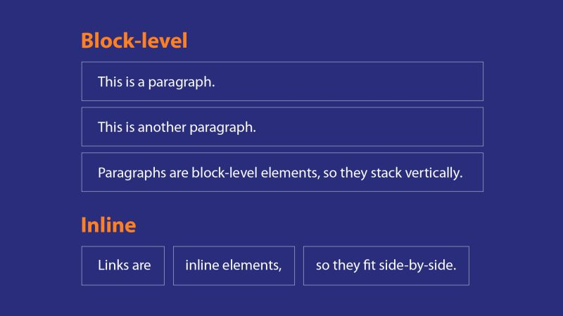
Inline elements, meanwhile, only take up as much horizontal space as they have to (by default) to accommodate their contents’ size, and thus they go next to each other on the same line (if there’s room); they don’t force new lines.
For example, the <a>...</a> element (made in
R using the a() R Shiny function) is a box that holds a
link to a URL or file. You could use several such boxes within a single
paragraph box without spawning a new line after each one.
HTML
<!-- HERE'S HOW YOU'D RECREATE THE IMAGE ABOVE IN HTML -->
<div>
<h1>Block-level</h1>
<p>This is a paragraph.</p>
<p>This is another paragraph.</p>
<p>Paragraphs are block elements, so they stack vertically.</p>
<h1>Inline</h1>
<a>Links are</a>
<a>Inline elements,</a>
<a>so they fit side-by-side.</a>
</div>
R
#And here's the exact same code, only written in R Shiny code instead:
div(
  h1("Block-level"),
  p("This is a paragraph."),
  p("This is another paragraph."),
  p("Paragraphs are block elements, so they stack vertically."),
  h1("Inline"),
  a("Links are"),
  a("Inline elements,"),
  a("so they fit side-by-side")
)

#Note that text contents are quoted. Note also that commas separate every UI element from the next.

#Lastly, note that the line breaks between elements here (and in the HTML code above) are irrelevant with respect to the code's effects--paragraph and heading boxes would still stack vertically without them, and links still will fit side-by-side with them.
This dichotomy means every element of every website falls into one of two aesthetic camps. Certain elements tend to “stand alone” or “stand apart” from others visually and logically, such as headings and navigation bars. These are generally block elements. Other elements “fit together” and “co-mingle,” such as links and images. These are generally inline elements.
Key concept #4: The Flow
These days, a user might view your website on a very wide screen (like that of a projector) or a very narrow screen (like that of a cell phone in portrait mode, or even the screen of a smart watch!).
If your website has, say, five elements, it may not make sense to arrange those elements the same way on a narrow screen as on a wide screen, just as you probably wouldn’t arrange the same furniture in a tiny room the same as you would in a huge room.
Careless arrangement of elements is often obvious to even casual web surfers. On narrow screens, elements that are too big might “spill” out of the containers meant to hold them, and when too many elements are stacked side by side, tedious scroll bars may be the only way to see elements that are otherwise obviously extending “off-screen.”
On wide screens, meanwhile, small elements (especially small block elements) may look silly without constraints, such as when a single sentence spans the entire width of the screen. As another example, font sizes that feel appropriate on a small screen might be far too big or small when viewed on a computer monitor.
It’s hard enough to craft one great website—it’d be a nightmare to design a different-looking website for every possible screen size your users might have!
Thankfully, then, most websites are designed to follow some paradigm of “flow.” This means they’ll semi-automatically reorganize their contents according to the size of the user’s screen. For example:
Elements that sit side by side on a wide screen shift to stack vertically.
Elements (such as images) that might be permitted to stay large for wide screens may shrink to fit comfortably inside their boxes on narrow screens.
Some elements may “teleport” to new locations on the page as a screen narrows such that, if all elements are arranged vertically, their order is more logical to a user encountering them in that way.
Challenge
Try it: Go to dictionary.com and vary the width of your browser window by pulling its edges inward. How does this website “flow?”
For me, I saw a number of changes as I shrunk my browser screen: The menu at the top became a collapsed “hamburger” menu (a button with three lines that opens to reveal options), the links section slid below the search bar, the word of the day box shrank to take up less room, and the games sidebar teleported to much further down on the page. You may have noticed many other changes!
In line with this, R Shiny comes with custom boxes that are “fluid,” meaning their size is flexible and changes automatically to fit the size of their contents. Like inline elements, these boxes will only take up as much space as necessary. However, their contents will also automatically stack vertically if the screen becomes too narrow, sort of like block elements. Additionally, these boxes includes ones that will divide a space into a table of “rows” and “columns” so that elements can be arranged in a grid-like fashion whenever the screen is wide enough to accommodate it:
The first step of building a great Shiny app is to plot out your app’s layout. What elements should exist, and where should they go? How big does each need to be? What kinds of devices will your users be on? How will elements be nested to achieve a pleasing “flow” of elements, no matter the device your user is using? It’s important to remember that your app may not be able to look the exact same for every user and to design it with that in mind!
CSS 101
If HTML tells a browser what to display and where to display it, then CSS tells a browser how to display things.
Compared to HTML, CSS is even easier to learn (at least, that’s my opinion!). CSS code consists of functional units called rules. Each rule consists of a selector and a list of one or more property-value pairs:
The selector tells the browser which box(es) to adjust the appearance of.
The properties tell the browser which characteristics of those boxes to change.
The values tell the browser the new values to set for each of those characteristics.
Here is an example CSS rule:
On the first line prior to the opening brace, {, we have
our selector, which here is targeting two different
groups of boxes simultaneously, with those two targets separated with a
comma:
- The first target is paragraph boxes (
p()s), but only those with theintroclass attribute. A class is actually an HTML attribute that allows many boxes to be controlled and styled as one group. A period connects an HTML element type with a class name in a CSS selector (e.g.,p.intro).
-
Our second target is
divs (a highly generic HTML box), but only the one with the id attribute offirstintro.ids allow us to control or style just a specific element. A hashtag connects an HTML element type with anidname in a CSS selector (e.g.,div#firstintro).To target all elements of a type (e.g., all
div()s), write only the element name without any periods or hashtags (e.g.,div)If multiple different element types (such as
divs andps) have the same class, you can omit an element type and just specify the class to target all those elements with the same CSS rule (e.g.,.intro).
Challenge
Consider the following elements. Which ones do you think would be
affected by a CSS selector of p.intro?
R
p(class = "intro")
p(class = "intro special")
p(class = "body")
p(id = "intro")
a(class = "intro")
Answers can be found embedded in the code below:
R
p(class = "intro", "This p element has the intro class and would be affected by a CSS selector of p.intro.")
p(class = "intro special", "This p element actually has two classes, 'intro' and 'special' (multiple classes can be applied if they are separated with a space). Since one of those classes is 'intro', this element would be affected by the selector p.intro.")
p(class = "body", "This p element does not have the specific class 'intro' and would thus be unaffected by the selector p.intro.")
p(id = "intro", "ids and classes are different attributes, so this p element would be unaffected by the selector p.intro, but it would be affected by the selector p#intro.")
a(class = "intro", "An a (link) element is different from a p element, so the selector p.intro won't affect this element even though the element does have the 'intro' class. It would be affected by the selectors .intro and a.intro though.")
Inside of our rule’s braces, meanwhile, we have a list. Each list
item is a property name (e.g.,
font-style) and a new value
(e.g., italic) to set for that property. These are
separated with a colon and end with a semi-colon. If you get the
punctuation or spelling of a CSS rule wrong (easy to do!), it won’t do
anything, so mind the rules carefully!
CSS rules get more complex than this one, but they can be simpler than this one too, so if this rule makes sense to you, you’re in great shape!
Challenge
Try it: W3Schools is a fantastic resource for learning HTML and CSS. Go to their CSS page and check out some of the tutorial pages on the left-hand side.
Using the “CSS Text” tutorial, write a CSS rule that would change the font color of all paragraph boxes to red and make all their text be center-aligned.
Here’s how you’d write this rule:
Notice that we can target all p elements by not
appending any classes or ids. Don’t forget your colons, braces, commas
(if needed), or semi-colons! Also, notice that, unlike in R, text values
in CSS (like “red” and “center”) aren’t
quoted.
If you’re thinking “This sounds complicated/tedious/off-topic! Why are we bothering to learn any CSS, when R is going to translate my Shiny code to CSS for me??”
That’s a good and fair question! The truth is that, unfortunately, understanding CSS to some degree is still essential for crafting an attractive R Shiny app. Without specifying your own CSS, you’ll need to:
Accept the very basic styling employed by R Shiny by default, or
Use generic-looking themes available from packages like
bslibthat might leave your app looking like “every other website” in ways that can be difficult to customize.
Don’t get me wrong—these are perfectly acceptable options if your apps are simple or have limited user bases that may be indifferent to looks. However, in my experience, even in those instances, neither option is nearly as satisfying as learning to style your app yourself, even if you’re not a design whiz!
So, while we won’t pause to style our app much in this series of lessons, we will do so occasionally so that you can see the difference it makes.
Nothing is new on the web
We’ve talked about how a website is built, and we’ve looked at the specific roles played by HTML and CSS in that process. In particular, we’ve discussed the concept of HTML boxes and how a website is just a series of these boxes, stacked next to, below, and inside each other. Then, we’ve seen that the style of those boxes and their contents can be customized using CSS.
But what typically goes inside all those boxes, besides other boxes?!
With the internet now over 30 years old, most people have been interacting with the web a long time! We’ve developed collective expectations for how websites should look and feel as a result and, as such, most websites contain a set of immediately-recognizable components, including:
A header (a box permanently hooked to the top of the screen/page or to the top of a page section). This could contain other elements like a title, a logo, a navigation menu, etc.
A footer (similar to a header but at the bottom of a screen/page/section). This might contain elements such as text boxes for contact info or legal information, links, disclaimers, version information, etc.
A “main content area,” which might be a single rectangle or multiple rectangles of (un)equal size (such as a smaller “sidebar” and a larger “main panel”). This area may contain blocks of text, media such as videos, articles, graphics, etc.
Text blocks, which might themselves contain paragraph blocks, links, quotes, code, articles, lists, headings, etc.
Forms containing information-gathering widgets—elements users interact with to provide the page with information or direction, such as drop-down menus or sliders.
Modals (which you may know as “pop-ups”), which partially or wholly obscure the webpage and may contain additional information, options, or alerts.
Background tiles, which may hold images or instead be solid colors, gradients, or patterns.
Navigation systems, such as buttons, scroll bars, or drop-down menus, that allow users to move around a site.
All these elements (and more!) can be added to the websites designed using R Shiny. As such, some of the first, and most important, decisions you’ll make when building a Shiny app are deciding:
What elements your app will contain,
Where they will go, and
What they’ll enable a user to do.
While the list above is not exhaustive, it should help you begin to make those decisions.
Challenge
Consider the webpage below:

Like all webpages, this one is just a series of “boxes inside of other boxes.” Draw an abstracted version of this site as only a set of nested boxes. Label each box based on what it seems designed to hold (don’t bother drawing every box, just the “major” ones).
As you do, list the different components housed in these boxes you recognize (buttons, text blocks, etc.).
Here’s what I noticed and identified:
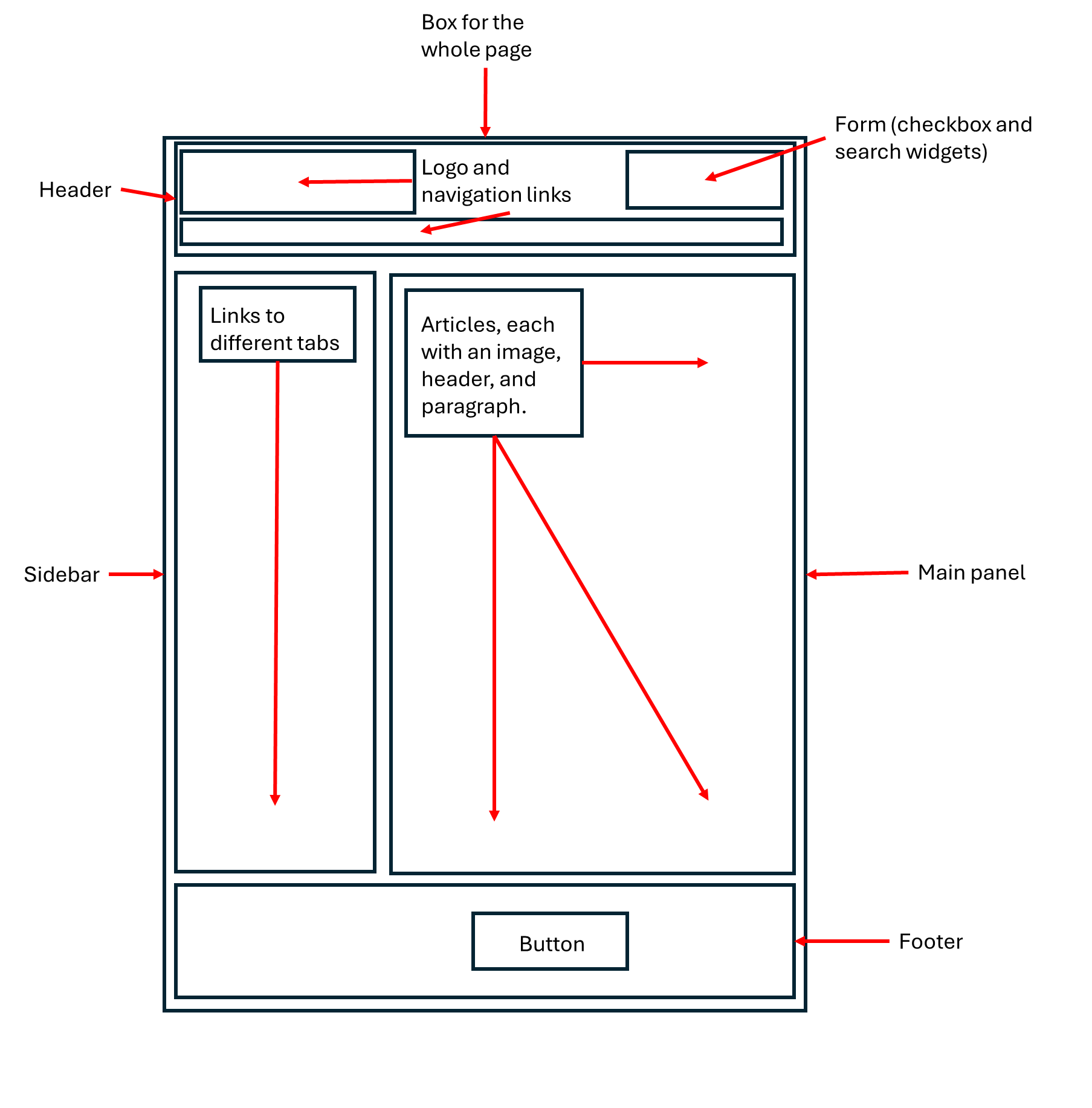
You may have noticed more, fewer, or different things—that’s ok!
Key Points
- Classically, websites are built using HTML, CSS, and JavaScript to construct the “client side” of the site, which runs in a user’s browser on their local computer, and by using SQL plus a general programming language like Python to construct the “server side” of the website, which runs remotely on a server that communicates back and forth with the user’s browser to ensure the site is constructed and displayed to the user as intended.
- R Shiny allows you to build a website using just R + R Shiny code, such that deep understanding of other web development languages like PHP and JavaScript is not required.
- However, some familiarity with HTML and CSS is practically essential to build a great app and to really understand what you are doing when writing “R Shiny” code.
- That’s ok—HTML and CSS are very approachable languages compared to general programming languages like R.
- HTML tells a browser what to put where when building a website. Websites are just “HTML boxes holding stuff and/or other boxes.” Some boxes force new lines after them; others don’t. How boxes will “flow” on wide versus narrow screens is an important design consideration.
- CSS tells a browser how to display each element on a website. It consists of rules targeting specific HTML boxes that specify new values for those boxes’ aesthetic properties.
- Website design has matured such that most websites look and feel broadly similar and share many elements, such as buttons, links, widgets, articles, media, and so on. R Shiny lets us add these same elements to our apps.
Content from Building the Ground Floor of a Shiny App
Last updated on 2025-04-15 | Edit this page
Overview
Questions
- How should I start building a Shiny app?
- What code’s required to get a Shiny app to start?
- What goes in my
server.Rfile? Myui.Rfile? Myglobal.Rfile? - How do I design an app that’ll look nice on any device?
Objectives
- Build the files and folders needed to house a Shiny app and name them according to Shiny’s conventions.
- Value the convenience afforded by a
global.Rfile. - Link a stylesheet to your app.
- Structure your app’s UI in its
ui.Rfile by nesting (Shiny) HTML boxes, as you might more or less do using HTML code. - Use your browser’s developer tools to examine and troubleshoot your app’s HTML and CSS.
Preface
In the next lesson, we’ll start building a Shiny app together. In this lesson, we’ll tackle several important steps that’ll set us up for success in that endeavor.
(Detour: Installing packages)
In this lesson, we’ll begin to use some of R’s packages. If you haven’t already, install those now:
R
##RUN THIS CODE IN YOUR CONSOLE PANE--**DON'T** INCLUDE IT INSIDE YOUR SHINY FILES. YOU ONLY NEED TO INSTALL PACKAGES **ONCE**.
install.packages(c("shiny", "dplyr", "ggplot2", "leaflet", "DT", "plotly", "gapminder", "sf"))
Of course, to access their features, we need to turn these packages on too, but there are some other things we must do first.
Establishing our Shiny app’s Project Folder
It’s useful to make a single folder (our “root directory,” or root for short) to house all our app’s files and then make that folder an R Project folder. You don’t need to know what all that means if you don’t already—just know it’s valuable.
Here’s how to do it:
In RStudio, go to
File, then select the second option,New Project.In the pop-up that appears, select the first option,
New Directory.Next, we’ll select the type of project we’re creating. One of the options you’ll be presented is
Shiny application, but don’t pick that one! Instead, select the first option,New Project.-
On the next screen, use the
Browsebutton to find a location on your computer to place your project folder. Then, give the project a name, such asshiny_workshop, that befits your current project.- There are other options on this screen that, if you’re familiar with
Git or
renv, you might consider as well (both are recommended but outside the scope of these lessons).
- There are other options on this screen that, if you’re familiar with
Git or
Once you’re satisfied, click
Create Project.
Important: Once you’ve created your Project, you
should see a .Rproj file appear inside that folder. From
now on, to work on your Shiny app, launch this file to start an RStudio
session connected to your Project. Doing so will save you time and
energy!
Creating the necessary files
I recommend building Shiny apps using the so-called three-file system:
Go to
File, selectNew File, then selectR Script. Repeat this process two more times to create three scripts in total.-
Then, give them these exact names (in all lowercase):
ui.Rserver.Rglobal.R
These files will hold our app’s client side (user interface) code, back-end (server) code, and setup code, respectively.
R Shiny will recognize these exact names as “special,” so using them enables handy features. One of these is that, in the top-right corner of the Script Pane, you should see a “Run App” button with a green play arrow whenever you are viewing any of these three files in the Script Pane.
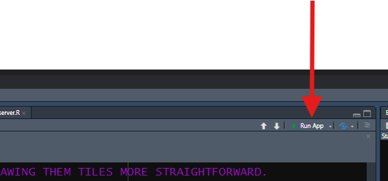
This button will allow you to start your app at any time to check it out or test it (something you should do constantly, both during these lessons and when developing your real apps!).
We need to start populating these three files with essential code, but before we do, let’s first create some more folders and files every R Shiny project should have:
-
In the “Files, Plots, Packages, etc.” Pane in your RStudio window, while viewing your Project Folder, click the
New Folderbutton. Name it exactlywww. R Shiny will automatically look inside a folder by this name in your root directory for many things, including media files (like images), custom font files, and CSS files referenced by your app.- Speaking of which: Click
File,New File, thenCSS file. Give this new file the namestyles.cssand save it in yourwwwfolder. We’ll put custom CSS code in this file to style our app’s aesthetics.
- Speaking of which: Click
Callout
If you plan to build complex Shiny apps, you may also want
to create a file for custom JavaScript code called
behaviors.js and place this file in www as
well. We won’t use such a file in these lessons, but because there is
more you can do using JS than R Shiny will easily do for you, there are
many instances where a little custom JS code can
significantly enhance your app’s behaviors, and having a
specific file in which to put that code is tidy.
For complex apps, I’d also recommend a folder inside your Project
folder called inputs. Use this folder to store input files
your app needs to start up, like data sets, that aren’t media
like pictures or fonts. We won’t use such a sub-folder in these lessons,
but, for real projects, it useful to have such a folder to stay
organized.
Similarly, I’d recommend a third new folder inside your Project
folder called Rcode. As an app’s code base gets larger, you
may want to divide your app’s code into smaller, more manageable chunks
(such as by building custom functions to perform repeated tasks or by
dividing your app’s code into “modules”). At that stage, you can place R
files for each chunk in this folder, then source those files in your
global.R file. We won’t use any such sub-folder, but I use
one for all my apps.
We now have all the files and folders we’ll need, so let’s work on getting our app to where it’ll actually start up.
Starting our global.R file
We’ll start with global.R. R will run this file
first when booting your app, so it’s job is to load and/or
build everything needed to enable the rest of the app to boot
successfully.
When your app gets large and complex, this file will hold many
different things. To start, though, at a minimum, it’ll likely contain
two: 1) library() calls to load required add-on packages
and 2) read*() calls to load required data sets:
R
##Place this code in your global.R file!

### LOAD PACKAGES <--CREATE HEADERS IN YOUR FILES TO KEEP LIKE CODE TOGETHER AND TO STAY ORGANIZED!
library(shiny)
library(dplyr)
library(ggplot2)
library(plotly)
library(DT)
library(leaflet)
library(gapminder)
library(sf)

### LOAD DATA SETS
gap = gapminder
By having a global.R file, we can place things like
library() calls and code for loading data sets in a single
place for the entire app. Without it, we’d need to place these commands
inside every app file in which they are needed—what a pain!
Starting our server.R file
Setting up server.R is relatively easy because
there’s only one block of code needed there to start:
R
##Place this code in your server.R file!

server = function(input, output, session) {

  #ALL OUR EVENTUAL SERVER-SIDE CODE WILL GO INSIDE HERE.

}
Notice: server.R will hold just one
object: a function called
exactly server. This function will have three
parameters called exactly input,
output, and session. R Shiny will look for the
function by this name when it starts an app, and it’ll create objects
called input, output, and session
to feed to that function as inputs during the start-up process. Using
these exact names is mandatory!
It makes sense, if you think about it, that our app’s server file creates a function (a verb) because it’s the “half” of the app that does stuff. By contrast, the UI of our app mostly “sits there and looks pretty” for the user, only changing in really profound ways when directed by the server.
Starting our ui.R file
Even less code is needed in ui.R to start
with—we need to place just a single HTML box into it, into which we’ll
eventually place all other such boxes we’ll build:
R
##Place this code in your ui.R file!

ui = fluidPage(

  #ALL OUR EVENTUAL CLIENT-SIDE CODE WILL GO INTO ONE OF THE TWO SECTIONS BELOW INSIDE OF THIS OUTERMOST SHINY HTML BOX.

  ### HEAD SECTION


  ### BODY SECTION

)
Here, we use an R Shiny HTML box called fluidPage() to
create a stretchy box that will hold the entirety of the webpage we’ll
build. We’ll soon fill this box with a bunch more boxes to give our app
it’s ultimate structure.
However, first, let’s link up our app’s stylesheet,
the styles.css file we made earlier. Because the UI is the
“visual” part of a website, and because CSS controls a website’s looks,
it makes sense we’d load a CSS file in ui.R instead of in
global.R or somewhere else. It also makes sense we’d put
this linkage in our app’s head HTML box because it’s
instructions for a user’s browser to consider, not something a user
themselves needs to see.
Here’s how to do this:
R
##Place this code INSIDE your app's fluidPage container in the HEAD sub-section!
tags$head(

  tags$link(href = "styles.css",
            rel = "stylesheet")
), #<--YOU'LL NEED A COMMA TO SEPARATE EVERY NEW ELEMENT IN YOUR UI FROM THE PREVIOUS/NEXT ONE, SO YOU WILL SOON NEED A COMMA HERE, WHETHER YOU ADD IT NOW OR NOT.
Here, we’ve told the app there is a specific stylesheet, a
CSS file, by the name of styles.css we want a user’s
browser to use when constructing our website. Note that we link
to this file rather than load it—that’s an HTML thing!
By default, the app will look for CSS stylesheets in the
www sub-folder, so as long as that’s where we put it,
we don’t need to provide more details than this to the href
parameter.
Jumpstarting our UI
Now, we can add some additional boxes to our fluidPage()
to start giving our app structure. In this series of lessons, we’ll
sort of practice a UI design approach called
mobile-first design. This means designing apps with
mobile users in mind first and all other users
second.
The logic of this approach is that, if an app looks and feels good on a narrow-screened, mouseless device, it should look and feel just as good, if not better, on a wider, mouse-enabled device more or less automatically. By contrast, ensuring that a website designed for a computer also works well on mobile devices tends to be harder.
This approach means, among other things, placing our UI elements with the assumption that they will need to adopt a “vertical” or “stacked” layout for mobile users. Pretty much every major element will get to use the screen’s full available width if it needs to, and each subsequent element will flow below rather than next to the previous one.
However, we’ll also set up our UI such that, if a user does have a wide enough screen, some things will arrange side by side instead. A wider layout will tend to look less quirky on a wider screen than a strictly vertical layout would because more content will fit on the screen at once and the added spatial constraints will keep elements from stretching too much horizontally.
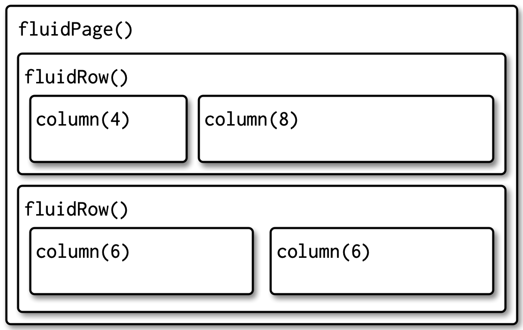
So, with all that in mind, let’s add the following boxes to our app’s UI:
A header, built using
h1(), with theidattribute of"header"(h1s are top-level headings in HTML).A footer, built using
div(), with theidattribute of"footer".-
In between, a
fluidRow().- Inside it, we’ll place two
column()s, which will act as “cells” in this 1 row by 2 column “table.”
- Inside it, we’ll place two
The R Shiny function column() has a required input,
width; all width values of
column()s inside a fluidRow() must be whole
numbers that sum to exactly 12. So, let’s set the widths of
these columns to 4 and 8, respectively. In
practice, this’ll make the second column twice as wide as the first. As
a result, the second column will take up 2/3rds of the available screen
width, creating the feel of a left-hand “side panel” and a
right-hand “main panel,” a standard layout found across the web.
However, as we’ve discussed, fluidRow()s are “smart”—on
narrow screens, elements in the same row will flow vertically if there
isn’t enough room for them to fit side-by-side. This means that our
“side panel” will actually go above our main panel on a narrow
screen automatically (because it’s specified first), which will
be more intuitive for users encountering our elements vertically:
R
##Place this code INSIDE your app's fluidPage container in the BODY section!
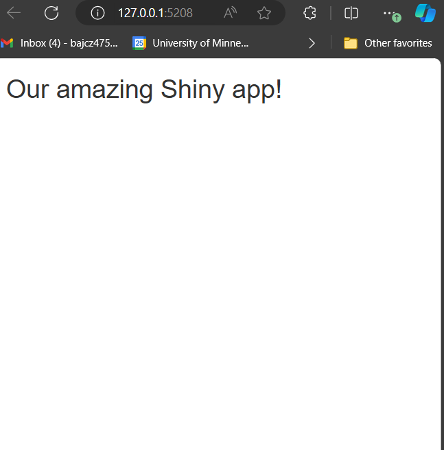
h1("Our amazing Shiny app!",
id = "header"), #<--EVERY NEW UI ELEMENT IS SEPARATED FROM EVERY OTHER BY COMMAS.
fluidRow(
###SIDEBAR CELL
column(width = 4),
###MAIN PANEL CELL
column(width = 8)
),
div(id = "footer")A couple more things to note about R Shiny boxes at this point:
Most Shiny boxes have a
classparameter and anidparameter, just like their HTML analogs. These two parameters are always optional, and their purpose is to be targets in CSS selectors.However, if a Shiny box has an
inputIdoroutputIdparameter (and we’ll meet many that do!), those are mandatory; those serve Shiny-specific purposes (in addition to serving as CSS targets)—more on those attributes in the next lesson!Every Shiny UI element is separated from every other using commas, just like inputs inside a function call are. Forgetting these commas is a very common mistake for Shiny beginners!
Because R Shiny UI code is really just thinly-veiled HTML code, writing it involves nesting a lot of function calls inside other calls. For many, this can be confusing! Keeping your code organized using comments to create sub-sections can help you keep things straight.
Callout
Start up your app at this point by pressing the “Run App” button in
the upper-right corner of the Script Pane when viewing any of your
.R files.
I recommend using the drop-down menu on the side of the “Run App” button to select the “Run External” option, which will cause your app to launch in your default web browser instead of in RStudio’s Viewer pane or in a separate R window. In general, apps will perform better when run in a web browser, so you will get a more actionable impression of how your app is doing this way.
Discussion
What do you see when you start up your app? Explain why the app looks the way it does so far.
Besides our title we placed as contents inside our header, our app will actually look completely empty!
This is because we have introduced several HTML boxes (a footer, a side panel, a main panel, and a box holding the latter two), but we haven’t actually put anything in those boxes that isn’t just other boxes!
That is to say that HTML boxes are empty until we provide them with contents that aren’t other boxes. That’s what we will do in the next lesson!
By most standards, our app also looks very basic—just a white screen with a generic-looking title. This is because the default CSS applied to Shiny apps is very basic, as I warned in the previous lesson! This is why I argued that learning some CSS is essential to craft attractive apps.
What about our CSS file we linked in, though? Sure, we’ve linked to our CSS stylesheet, but we haven’t actually put any code in it yet. Until we do, Shiny’s default, bland rules will be used.
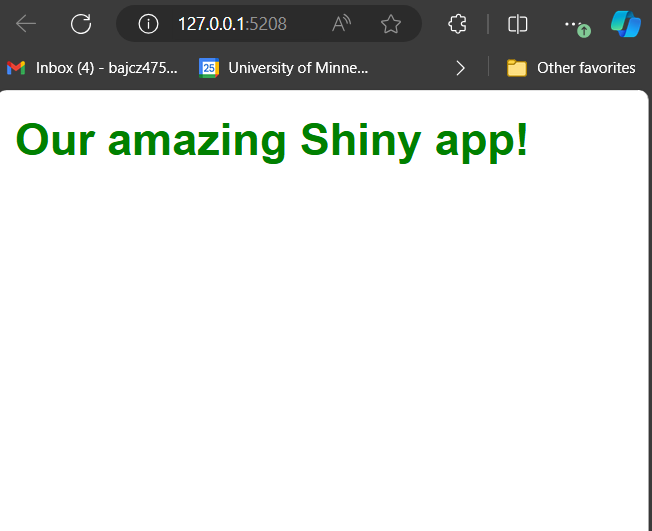
Challenge
Let’s make our first style rules! Since there’s nothing else to style
yet, though, let’s style our title. In your styles.css file
(which you can open in RStudio), write a rule that will
make the title of our app green and bold.
The first property to set here is called
font-weight, and the new value for this property should be
bold. I’ll leave you to figure out what the second
property-value pairing should be! Run your app to make sure your rule is
working.
Here’s what our CSS rule should look like:
CSS
h1#header {
font-weight: bold;
color: green;
}
/* You could also have simply put #header in the selector, as no two HTML containers are allowed to have the same id anyhow!
And this is what our app should look like once you apply the change:
If your app doesn’t look like this, there are two things you should try:
Perform a hard refresh on your browser. In Edge, this can be done using Control + F5. This will refresh the page and clear your browser’s cache for your app. This is sometimes necessary to clear out old CSS your browser may be using and apply new CSS.
Ensure that your CSS file is properly linked to your app (see earlier in this lesson).
If neither of these suggestions resolves your issue, read on to learn about another tool you might be able to use to troubleshoot CSS issues like this!
Meeting the Developers Tools dashboard
In this lesson, we gave our header an id, which made it
easier to target it with a CSS selector. What happens
if you want to target a specific element of your app, but you
aren’t sure what selector to use to do that?
Good question: Let’s introduce you to every web developer’s secret weapon—your browser’s developers tools.
Every browser has a slightly different way of launching its
developers tools. Personally, I use Microsoft Edge as my browser. To
access developers tools in Edge, right-click any element on any website
and select the last option in the resulting menu,
Inspect.
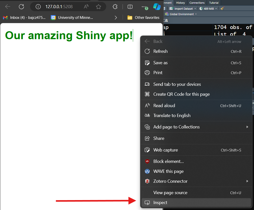
The workflow you might need to use for your browser of choice might be different.
Once you figure out how to open up your browser’s developer tools, you’ll see that it’s a frankly intimidating window showing, among other things, the HTML of the website you’re on (usually on the top or left) and the CSS of the element you’re inspecting (usually on the bottom or right):
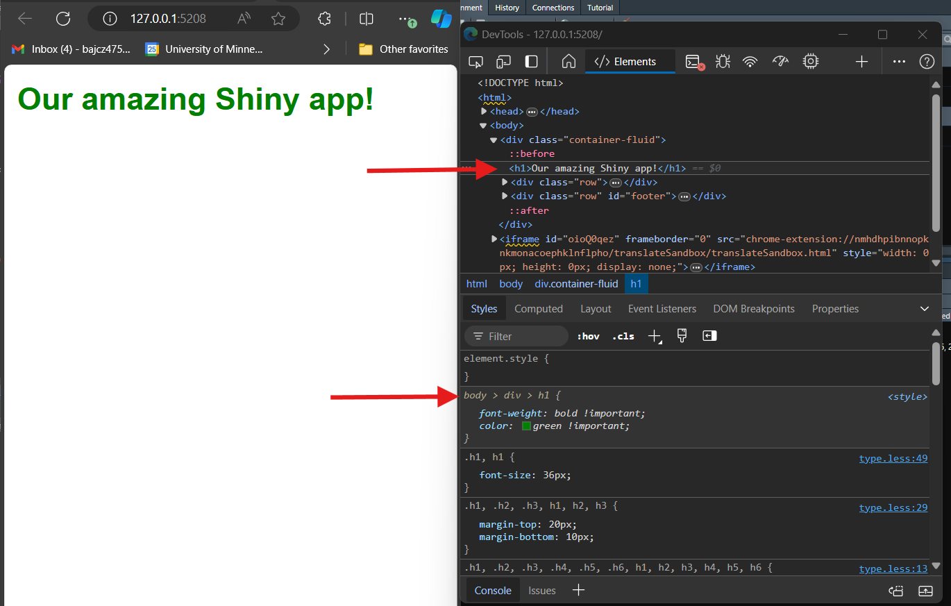
If I didn’t know the right selector to use to target an element, I
could right-click on that element in the HTML (see picture above), go to
Copy in the resulting menu, and then select
Copy selector from the resulting sub-menu:
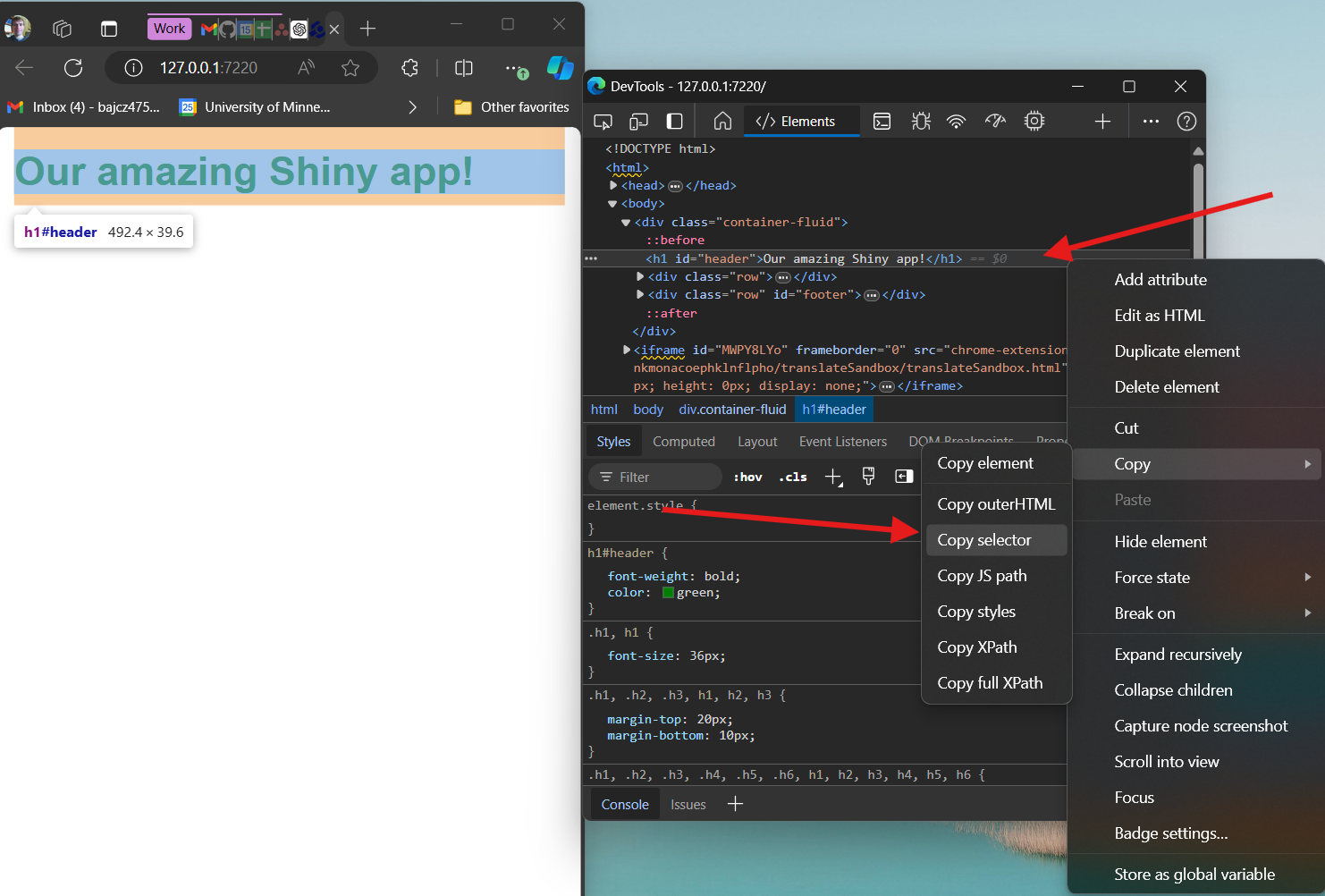
Doing this would put #header into your clipboard, in
this case, which could then be used in a CSS rule as a selector moving
forward.
The CSS section of the developers tools will also list all the rules that are currently affecting a given element, which properties are being modified, and which new values are being set. If your CSS code isn’t working as intended, you can check here to ensure your code is being recognized and applied correctly.
These are just two of the many ways that developer tools is a useful web development tool. I won’t mention it again in these lessons, but it’s essential you know how to access it!
Key Points
- Use the three-file system to organize your app’s code to benefit from several R Shiny features within RStudio.
- A
global.Rfile is handy for storing all the code needed to fuel your app’s start-up and any other code your app needs that only needs to run once. - A CSS stylesheet holds CSS code for dictating your app’s aesthetics.
One can be linked to an app inside of
ui.Rusingtags$head(). - UI elements get nested inside one another and must all be placed
inside our UI object’s outermost container (here, a
fluidPage()). - Most UI elements can be given
idandclassattributes use in CSS selectors. UI elements must be separated from one another in the UI with commas. -
fluidRow()andcolumn()can be used to create a “grid,” within which elements may arrange next to each other on wide screens but vertically on narrow screens, creating a responsive, mobile-first design with little fuss. - CSS styling requires using the right selector to target the right element(s). If you aren’t sure of the right selector to use, you can retrieve it using your browser’s developer tools.
Content from R Shiny's Core Concepts: Rendering and Outputting, Input Widgets, and Reactivity
Last updated on 2025-04-15 | Edit this page
Overview
Questions
- How do I add cool features to my app?
- How do I give my users meaningful things to do on my app?
- How do I get my app to respond meaningfully to user actions?
- How do I give users control over when/how my app responds?
- How do I give myself control over when/how my app responds?
- How is R Shiny server code different than code I may have written before?
Objectives
- Present data to users by adding a table to your UI.
- Allow users to adjust how the table looks, and give them control over when it changes.
- Define reactive context, event, event handling, declarative coding, and imperative coding.
- Explain how and why R Shiny server code executes differently than R code.
- Use isolation and observers to control event handling.
- Expand your UI’s “real estate” by adding a tab set panel.
Going from nothing to something
As we saw at the end of the last lesson, our app doesn’t look like much…yet! It is just a title (and a footer, if you added one on your own) on an otherwise empty page.
In this lesson, we’ll fix that! As we add content to our app’s UI, we’ll learn three core concepts of using Shiny to build a website: 1) rendering and outputting UI elements, 2) input widgets, and 3) reactivity.
Our app will showcase the gapminder data set, which
contains population, life expectancy, and economic data over time for
most of the world’s countries:
R
gap = gapminder
ERROR
Error in eval(expr, envir, enclos): object 'gapminder' not foundR
head(gap)
ERROR
Error in eval(expr, envir, enclos): object 'gap' not foundOur goal will be to give users interesting ways to engage with these data. As we go, imagine how you might do the same for your own data sets!
Let’s start by giving users a table with which to view the raw
gapminder data set.
If you think about it, a table is just a bunch of boxes (cells) within larger boxes (rows and columns) all within one outermost box (the table itself).
So, it makes sense that a table should be build-able in HTML, a language all about nested boxes! However, depending on the number of cells, it would require typing out a LOT of boxes to build such a table from scratch in HTML.
Fortunately, we don’t have to; we can have R do it! To build an element (like a table) complex enough that building it programmatically instead of “by hand” is appealing, and then to insert that complex element into our UI where a user can see it, we must:
-
Make (i.e., render) that element on the server side of our app.
- This involves first doing whatever “heavy lifting” is needed to assemble the underlying R object. For a table, e.g., we might use R to do some data manipulation, like joining two smaller tables together.
Then, we convert (behind the scenes) that R object into its functional HTML equivalent, a process Shiny calls rendering.
Lastly, we pass the rendered entity to the UI side. In the process, we indicate where in our UI we’d like the finished element to display, a process Shiny calls outputting.
For virtually every complex element you’d want to build in Shiny,
there is a pair of functions designed to do those latter two steps. In
this case, that pair is renderTable({}) on the server side
and tableOutput() on the UI side. [Notice that most Shiny
functions have camelCase names.]
Let’s use these two functions to add a basic table of the
gapminder data set to our app’s UI:
R
##Place this code INSIDE your app's server function INSIDE your server.R file!

###TABLE
output$basic_table = renderTable({
  gap #<--OR WHATEVER YOU NAMED THIS DATA SET OBJECT IN YOUR GLOBAL.R
})
Above, we told R to render an “HTML-ized” version of
the raw gapminder data frame. Because we wanted to render the raw data
set with no modifications, we put just the data frame’s name inside
renderTable{})’s braces. If we had wanted to do any
operations on this data set first (such as filtering it or adding
columns to it), though, we could have those operations using normal R
code inside those braces. So long as it’s a table-like object, the last
thing produced inside the braces is what gets rendered (placing anything
else last will trigger an error).
Once we have a rendered, HTML-ized table on the server side, how do we pass it from the server to the UI? Remember that users only see what the server instructs a user’s browser to build in the UI, so we must tell R to “hand over” this rendered table to the UI somehow…
Last lesson, recall that the app creates an object called
output when the app boots up. Passing rendered elements
from the server to the UI is output’s job. If an app is
like a restaurant, then rendering is the process of “cooking” elements
in the kitchen, and output is the waiter that brings
finished elements into the dining room where users/customers can
experience them.
For this to work, though, we need to give the rendered element a
nickname (an outputId). Then, we use that
outputId to “stick” the rendered element to
output using the $ operator. Here, the
outputId we set was basic_table.
Now, we just need to code the equivalent of “dropping our prepared
element off at the right table.” We tell the app where to place
the element with our placement of the tableOutput() call in
our UI:
R
##This code should **replace** the "main" fluidRow() contained within the BODY section of your ui.R file!

##... other UI code...

fluidRow(
  ###SIDEBAR CELL
  column(width = 4),
  ###MAIN PANEL CELL
  column(width = 8,
         tableOutput("basic_table")#<--PUTTING OUR RENDERED TABLE IN OUR "MAIN PANEL" CELL USING tableOutput(), WITH THE outputId OF THE RENDERED PRODUCT AS INPUT.
         )
),

##... other UI code...
Here, we’ve placed our outputted table inside the “main panel” cell.
Why do we need to use our outputId as the input for
tableOutput()? Wouldn’t it be enough to place an empty
tableOutput() call here? Well, a single app might render
and display many different tables. How would the app know which
table should be displayed where, if all it had to go on was
where tableOutput() calls were?
This ambiguity is cleared up by specifying the outputId
of the specific table we want displayed in a specific
location. In our restaurant analogy, the outputId is like
the order ticket the waiter filled out when a table ordered food.
output (our “waiter”) then uses that code later to figure
out which prepared food belongs to which tables.
If we run the app now, it should look like this:
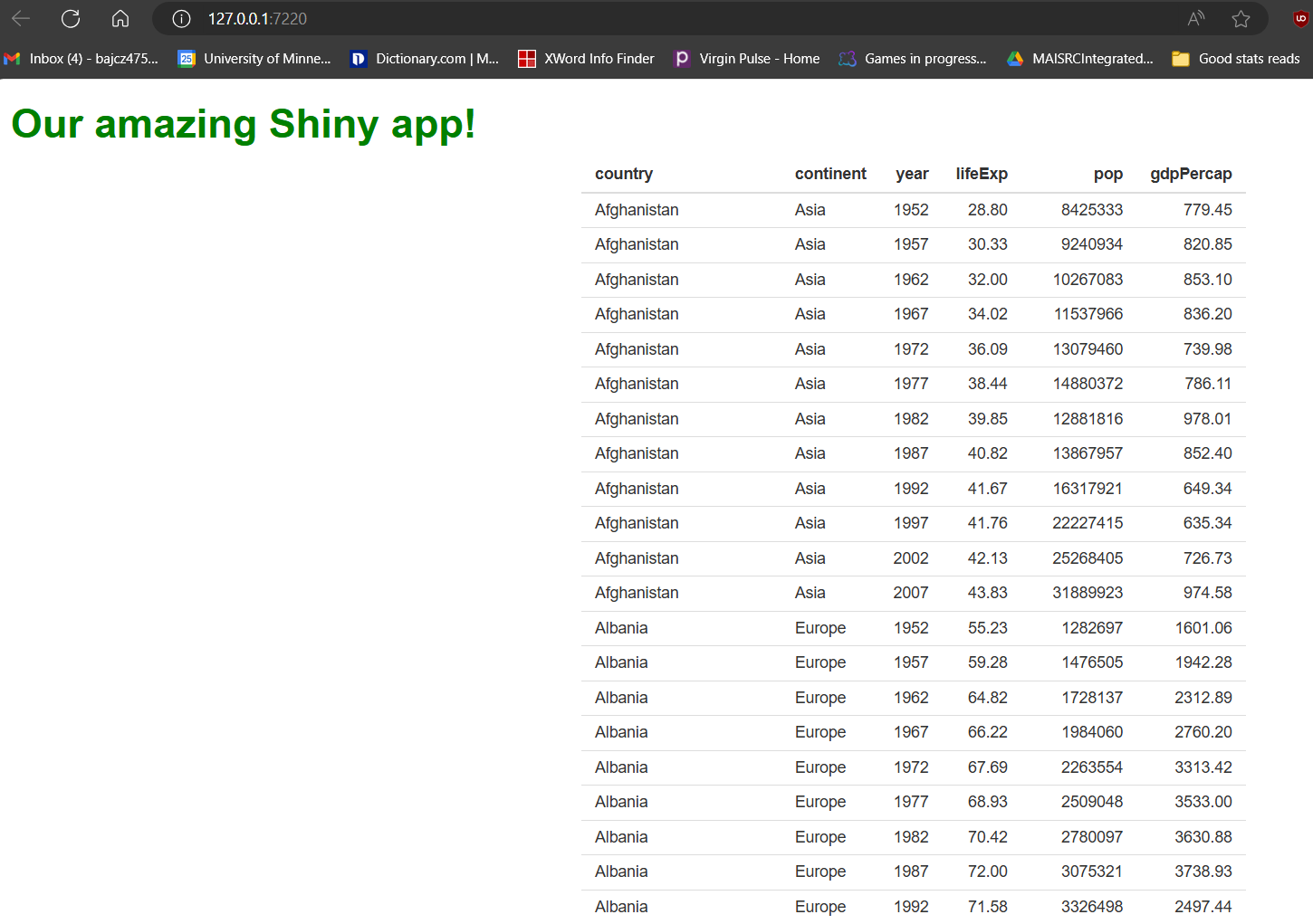
Our table is cool! But not terribly exciting…it looks a little drab (and long!), and users can’t actually do anything with it except look at it. The first problem we’ll fix later by swapping it for a fancier one. However, we can fix the second problem now.
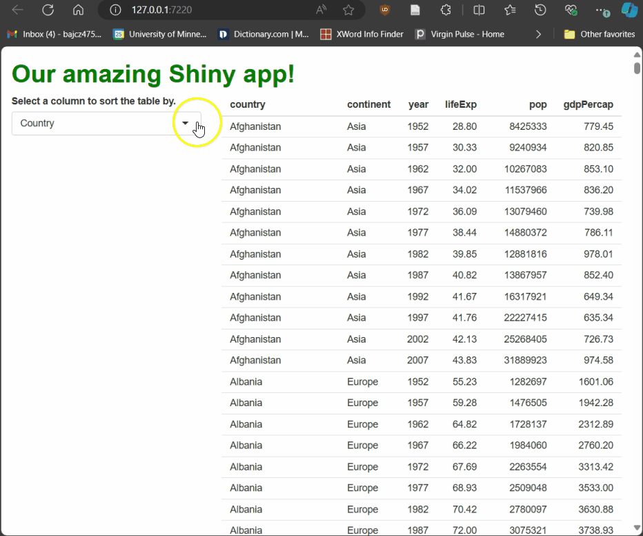
Giving your users input
The value of a Shiny app can be measured in terms of how much it lets users do. To enable meaningful user interactions, we can add widgets. A widget is any element users can interact with and thus provide data to the app that it could use to respond in some way. In web development, user actions a webpage can watch for are called events; responding to an event (or choosing to not respond!) is called event handling.
Let’s start by adding an input widget to our UI so
that new events are possible. Specifically, let’s add a
selectInput() to our “sidebar.” This will produce a
“drop-down menu”-style element that allows users to pick a choice from a
pre-defined list. We’ll populate the list with the column names from the
gapminder data set:
R
##This code should **replace** the "sidebar" cell contained within the main fluidRow() of your ui.R file!

##... other UI code...

###SIDEBAR CELL
    column(
      width = 4,
      ##ADDING A DROP-DOWN MENU WIDGET TO THE SIDEBAR.
      selectInput(
        inputId = "sorted_column",
        label = "Select a column to sort the table by.",
        choices = names(gap) #<--OR WHATEVER YOU NAMED THIS OBJECT IN GLOBAL.R
      )
    ),

##... other UI code...
Notice we provided selectInput() three inputs:
An
inputIdis both anidfor CSS as well as a nickname the app uses to pass this widget’s current value from the UI to the server. We’ll see how that works in a minute.The text we provide to
labelwill accompany the widget in the UI and, usually, should explain to the user what the widget does (when it isn’t obvious).For
choices, we provide a vector of values that’ll be the options in our drop-down menu.
While there are a few variations, most Shiny input widgets work a lot
like selectInput(), so it’s a good first example.
Now, our app should look like this:
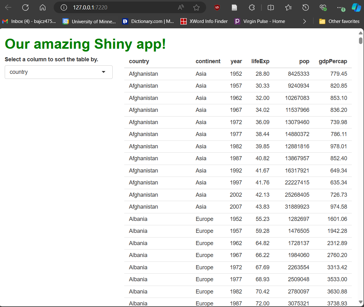
Very nice!
…Except for two things. First, the choices in the drop-down menu are…ugly. Some are abbreviations that lack spaces between words and some also lack capital letters.
How could we fix this? Well, we could rename the columns in the data set, but while column names in R can contain spaces, at best, it’s annoying. Plus, longer and more complex names require more typing.
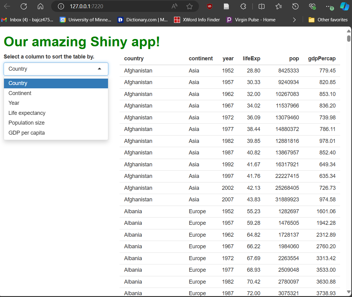
Instead, we can provide a named vector to
choices. The names we give (left of the =)
will be displayed in the drop-down menu, whereas the original column
names (right of the =) will be retained internally for the
app to use in operations:
R
##This code should **replace** the "sidebar" cell contained within the main fluidRow() of your ui.R file!

##... other UI code...

###SIDEBAR CELL
    column(
      width = 4,
      selectInput(
        inputId = "sorted_column",
        label = "Select a column to sort the table by.",
        choices = c(
          #BY USING A NAMED VECTOR, WE CAN HAVE HUMAN-READABLE CHOICES AND COMPUTER-READABLE VALUES. TYPE CAREFULLY HERE!
          "Country" = "country",
          "Continent" = "continent",
          "Year" = "year",
          "Life expectancy" = "lifeExp",
          "Population size" = "pop",
          "GDP per capita" = "gdpPercap"
        )
      )
    ),

##... other UI code...
With that change made, our drop-down menu widget is looking much cleaner!
The more serious issue is that fiddling with the drop-down doesn’t do anything…yet. We’ve created something a user can interact with, triggering events, but we haven’t told the app how to handle them yet.
R’ll handle that
Let’s do that next. We’ll give users the ability to re-sort the table by the column they’ve selected using our drop-down widget. This requires only a modest adjustment to our server code:
R
##This code should **replace** the renderTable({}) call in your server.R file!

###BASIC GAPMINDER TABLE
output$basic_table = renderTable({

  gap %>%
    #USE dplyr's arrange() TO SORT BY THE PICKED COLUMN.
    arrange(!!sym(input$sorted_column)) #!! (PRONOUNCED "BANG-BANG") AND sym() ARE dplyr HACKS HERE, NOT R SHINY THINGS. DON'T WORRY ABOUT WHAT THEY DO.
})
Run the app and try it! As you select different columns using the drop-down menu, the table rebuilds, sorted by the column you’ve picked:
Earlier, we met output, which passes rendered elements
from the server to the UI. Here, we meet input, which
passes event data from the UI to the server. Here,
input is passing the current value of the widget
with the inputId of sorted_column over to the
server every time that value changes. Our server code can use that value
in operations, such as deciding how to sort the data in our rendered
table.
More importantly, though, Shiny knows that
input$sorted_column’s value could change at any
moment. Objects with values that could change as a result of events
are called reactive objects—at any time, they could
change in reaction to something the user did.
Because we’ve used input$sorted_column in some of our
server code, and because R knows that input$sorted_column’s
value could change at any time, Shiny knows to be watching for
such changes. Whenever it spots one, it’ll run any code that includes
input$sorted_column again. The logic for this
holds up: If input$sorted_column has changed, any outputs
produced using its previous value as an input may now be “outdated,” so
re-running the associated code and producing new outputs makes
sense!
Because the code inside renderTable({}) contains
input$sorted_column, that code will re-run every time
input$sorted_column changes, which happens every time the
user selects a new column from the drop-down menu. We’re successfully
handling events triggered by our
user’s interactions with our input widget!
Reactivity
There is just one small but important technical detail: Shiny can’t watch for changes in reactive objects everywhere—it can only do so within reactive contexts. A reactive context is a code block that R knows to watch for changes because reactive objects can be there and those might change. It makes sense that we can only put these kinds of “changeable” objects inside code blocks that R knows might contain such objects!
Challenge
Try it: Pause here to prove the previous point. Copy
input$sorted_column and paste it anywhere inside
your server function but outside of
renderTable({})’s braces. Then, run your app. It should
immediately crash! Note the R error that prints in your
R Console when it does; rephrase that error messages in your own
words.
You’ll get an error that looks like this:Error in $: Can't access reactive value 'sorted_column' outside of reactive consumer. ℹ Do you need to wrap inside reactive() or observe()?
This error notes that input$sorted_column is a
reactive object (R is calling it a reactive value; the
distinction isn’t important) and that you’ve tried to reference it
outside of a reactive context (R is calling it a reactive consumer,
which is also not an important distinction). R is not prepared to be
watching for such an object in the place we’ve put it.
How do we recognize reactive contexts so we know where we can and
can’t put entities like input$sorted_column? Generally
speaking, when an R Shiny server-side function takes, as an input,
an expression bounded by braces ( {} ),
that expression becomes a reactive context (this isn’t strictly
true, as we’ll soon see, but it’s a good first assumption).
Maybe you’ve noticed the curly braces inside
renderTable({}) and wondered what they’re for? The main
input to every render*() function is an
expression for creating a reactive
context!
That means R assumes that every complex element we render
server-side might need to be re-rendered because the user
changes something. The code we provide to renderTable({})
is treated as a general set of instructions for how to handle
changing values of input$sorted_column, no matter what new
value gets picked or when. And the solution Shiny uses in those cases
will always be “re-run this expression.”
How R Shiny differs from “normal R”
You’re hopefully realizing that coding in R Shiny (on both the UI and server sides) is different from coding in “normal R” in some key ways.
For many regular R users, the “nestedness” of UI code probably feels strange (it should—we’re really writing thinly veiled HTML!). Meanwhile, server-side, having to anticipate ways users might interact with our app and then code generalized instructions for how the app should respond, no matter when or under what circumstances, also probably feels strange.
It should—R Shiny server code is not like normal R code! In fact, it’s an entirely different paradigm of programming than the one you might be most familiar with. Normal R code is generally executed imperatively. That is, it is run from the first command provided to the last one, as fast as possible, as soon as we (the user) hit “run.”
Server-side Shiny code, meanwhile, is executed declaratively. That is, it generally runs once when the app starts up, but, after that, it never runs again unless and until it is triggered to run by one or more specific events.
[Caveat: The above is true when R is deciding which reactive contexts to run and when; however, the R code within those contexts still runs imperatively, once the reactive context it’s within is chosen to run.]
These two different paradigms can be compared with an analogy: Imagine you are in a sandwich shop ordering a sandwich. You probably expect the employees to begin making your sandwich as soon after you’ve place your order as possible, based on particulars you’ve specified (what you want to order). In that analogy, the relationship between you and the shop is imperative; you gave a “command” and the sandwich shop “executed” that command as quickly as it could based on the inputs you’ve provided.
Meanwhile, the relationship between the shop’s manager and their employees is declarative. The manager can’t know which customers will come in on a given day, when those customers will show up, or which sandwiches they’ll order. So, they can’t give their employees precise “commands” and specific instructions of when to execute them or in what order. Instead, they have to tell their employees to “watch for customers” and, when those customers arrive and place orders, they should use a generalized set of guidelines to handle whatever orders have been placed with whatever inputs were provided.
As web developers, our relationship with our users is similar. We can’t know who will show up and what exactly they might decide to do and when. However, we can anticipate actions they might be likely to take (in fact, we can steer them towards specific actions with our design!) and then give the app generalized enough instructions that it can take care of all those different requests whenever (or if ever) they occur.
Another way to think about this distinction between imperative evaluation in R and directive evaluation in R Shiny is that, in the former, you are the user, and you are present now, so R should strive to meet your needs immediately, and you can be highly precise about what those needs are and how they should be met. In the latter, though, your users are the visitors to your website, and even though you’re writing the code for your website now, its users won’t arrive until later. So, your code needs to let R know what it should do later on, when you’re not around, but your users are.
Discussion
Check for understanding: How does the code we’ve
written so far in our server.R file execute differently
than code we’d write in a traditional R script? How does the code inside
of renderTable({})’s braces differ from traditional R code
we might write?
Server-side R code is broken up into many commands that create reactive contexts, each of which is tasked with generating one or more complex UI elements and/or handling user actions. Unlike traditional R code, these reactive contexts execute not when we hit “run” but instead when a user performs a triggering action. So, they each might run many times, or once when the app starts and then never again.
Plus, reactive contexts will (re)-run based on user actions, not based on their placement within the file. So, your server-side will often run in an “order” very different than the “top-down” order we usually expect R code to run in.
Inside a reactive context, meanwhile, things are more traditional; code inside a reactive context will run just once, from top to bottom, as quickly as possible, as soon as that context is triggered to (re)run. However, the difference is that these contexts might contain reactive objects whose values might frequently change, so our code needs to be set up to accommodate any potential value they may take.
Buttoning this up
By this point, R now knows that:
Users might select new columns in our input widget (events),
It should watch out for any such events, specifically those affecting reactive objects (like
input$sorted_column) inside ofrenderTable({})’s reactive context, andIf any events occur, it should re-execute the code inside
renderTable({})’s braces, re-generating the table in line with the generalized instructions we’ve provided, including those that influence how the table is sorted.
In this circumstance (a simple table that users can adjust via just one input widget), this setup is probably fine.
However, imagine that users have access to several input widgets instead of one. If we used this same approach to handle events from all those inputs, a user adjusting any one input would trigger the table re-rendering process.
That might make our table undesirably reactive! Users often expect to have a say in when exactly an app changes states. Maybe they expect to be able to experiment with all available widgets to find the combination of selections they are most interested in. Maybe the table loads slowly, so users would prefer not to wait through the rebuilding process until they’re “ready.” Maybe some users just want to be “in control” because they’d find the updating process distracting when it happens not on their terms.
In any case, we can give users greater control by adding another
input widget: an actionButton().
R
##This code should **replace** the "sidebar" cell contained within the main fluidRow() of your ui.R file!

##... other UI code...

###SIDEBAR CELL
    column(
      width = 4,
      selectInput(
        inputId = "sorted_column",
        label = "Select a column to sort the table by.",
        choices = c(
          "Country" = "country",
          "Continent" = "continent",
          "Year" = "year",
          "Life expectancy" = "lifeExp",
          "Population size" = "pop",
          "GDP per capita" = "gdpPercap"
        )
      ),
      ##ADD AN actionButton(). PAY ATTENTION TO COMMAS/PARENTHESES AROUND THIS NEW CODE!
      actionButton(inputId = "go_button", label = "Go!")
    ),

##... other UI code...
The code we’ve added above adds a simple, button-style widget to our
app’s sidebar. It says Go! on it (label), and
it’s current value (a number equal to the number of times it’s been
pressed, or NULL if it hasn’t been pressed yet) will be
passed from the UI to the server via input$go_button.
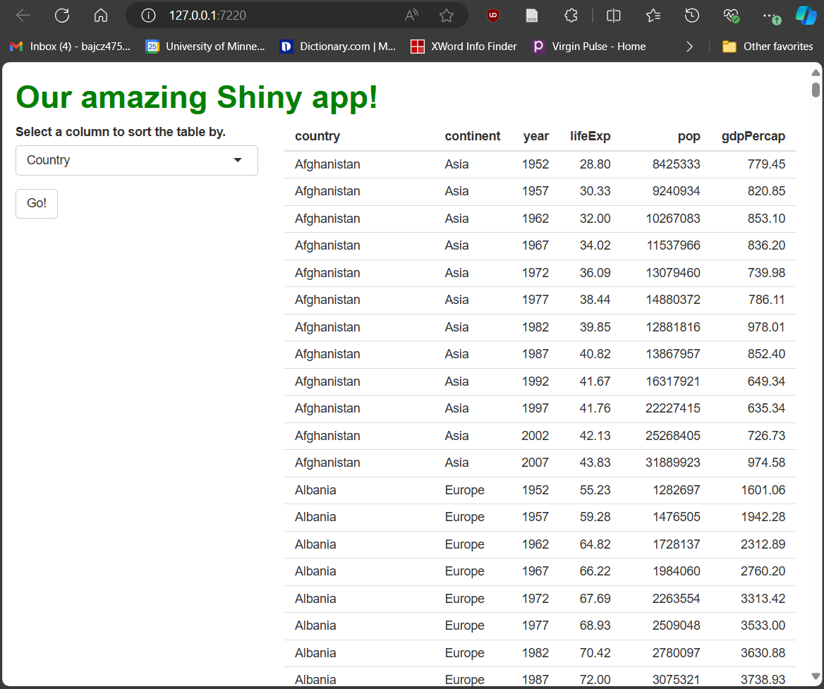
Now, we need to tell R how to handle presses of our button (until then, pressing it won’t do anything!).
Here, we want the table to update only whenever the button
is pressed (i.e., whenever input$go_button’s value
changes). We also no longer want changes to
input$sorted_column to cause the table to update.
Here’s where we hit a snag: renderTable({})’s reactive
context is “indiscriminate;” any change in any
reactive object it contains will trigger the reactive context to rerun.
So, simply adding input$go_button to that reactive context
will not prevent changes in input$sorted_column
from triggering a rerun too. But we can’t just remove
input$sorted_column from the reactive context because,
then, we couldn’t use its current value to decide what column to sort by
when we the context does re-run.
Are we stuck? No. Thankfully, Shiny has a function for these kinds of
situations: isolate(). Wrapping any reactive object with
isolate() allows R to use that object’s current value to do
work, but that object loses its ability to trigger events in that
context.
Here’s how we can use isolate() to achieve the desired
outcome:
R
##This code should **replace** the renderTable({}) call contained within your server.R file!

output$basic_table = renderTable({

  #SIMPLY BY PLACING input$go_button ANYWHERE INSIDE THIS REACTIVE EXPRESSION (EVEN IF IT'S VALUE IS NOT USED IN ANY MEANINGFUL WAY), THIS REACTIVE CONTEXT WILL RE-RUN EVERY TIME input$go_button CHANGES.
  input$go_button

  #USING isolate() PREVENTS input$sorted_column FROM TRIGGERING EVENTS, BUT STILL ALLOWS US TO USE ITS CURRENT VALUE TO DO WORK.
  gap %>%
    arrange(!!sym(isolate(input$sorted_column)))

})
Now, when users fiddle with the drop-down widget, nothing happens…until they press the button. Then, and only then, does the table re-render, using their most recent selection in the drop-down as an input to that process.
Being observant
This approach works just fine in this simplistic situation. It can get unwieldy, however, if you have many inputs you’d need to find and isolate inside a complex reactive context.
For situations in which you want your app to respond in a
specific way only when a single specific
reactive object changes, especially when the response involves a bunch
of other reactive objects you don’t want to trigger events, we
can make our event handling more precise using
observeEvent({},{}):
R
##This code should **replace** the renderTable({}) call contained within your server.R file!

#FIRST, WE REDUCE OUR renderTable({}) CALL BACK TO ITS BASIC FORM SO IT PRODUCE THE DEFAULT VERSION OF OUR TABLE WHEN THE APP STARTS. THIS CODE WILL NEVER RUN AGAIN THEREAFTER BECAUSE IT CONTAINS NO REACTIVE OBJECTS.
output$basic_table = renderTable({
  gap
})

#NEXT, WE CREATE AN OBSERVER TO WATCH FOR EVENTS AND TO UPDATE THAT DEFAULT TABLE.
#observeEvent({},{}) TAKES TWO EXPRESSIONS. IT WATCHES THE FIRST FOR EVENTS AND, WHEN IT SPOTS ONE, RESPONDS BY RUNNING THE SECOND.
#SO, ONLY THE **FIRST** EXPRESSION IS REACTIVE, BUT ONLY THE **SECOND** EVER RUNS!
observeEvent(input$go_button, {

  output$basic_table = renderTable({
  gap %>%
    arrange(!!sym(input$sorted_column)) #NO NEED FOR isolate() ANY LONGER
  })

})
If you restart your app having made the adjustments above to your server code, you will be able to confirm that the app works exactly the same as before, showing that both approaches work to accomplish the same goal.
Note that we wrote observeEvent({},{}) with two
sets of braces. That’s because we give it, as inputs, two
expressions. These have a particular relationship:
R watches only the first for events (it’s the only reactive expression of the two).
-
R only ever executes the second expression, and only due to changes in the first).
- In a sense, it’s like the entire second expression has been
isolate()d, and the entire first expression has been “muted” in that it can’t produce outputs!
- In a sense, it’s like the entire second expression has been
So, observeEvent({},{}) is the equivalent of telling R
“if [first expression] changes, do [second expression],” a level of
precision in our event handling that we very often want! It’s for this
reason I use observeEvent({},{} often in my apps—they make
an app’s responses to user actions much more predictable than other
approaches.
Totally tabular
We now have all the conceptual tools to build a really cool app! In the next lesson, we’ll replace our current table with a cooler one, and we’ll add map and graph widgets too. To keep all this new content organized, let’s add tabs to our main panel, one for each complex interactive feature.
We can do this using the Shiny functions tabsetPanel(),
which creates a box to hold all the tabs, and tabPanel(),
which creates a box for the contents of one tab:
R
##This code should **replace** the content of the "main panel" cell within the BODY section of your ui.R file!

##... other UI code...

###MAIN PANEL CELL
##NEST UI ELEMENTS HERE **CAREFULLY**!
    column(width = 8,
     tabsetPanel(
      ###TABLE TAB
      tabPanel(title = "Table",
               tableOutput("basic_table")),#RELOCATE THE TABLE INTO THIS NEW TAB.
      ###MAP TAB
      tabPanel(title = "Map"),
      ###GRAPH TAB
      tabPanel(title = "Graph")
     )
    ),

##... other UI code...
Now, if we look at our app, we’ll see we have three tabs in our main
panel area, with titles in their tab headings that we
provided in our UI code:
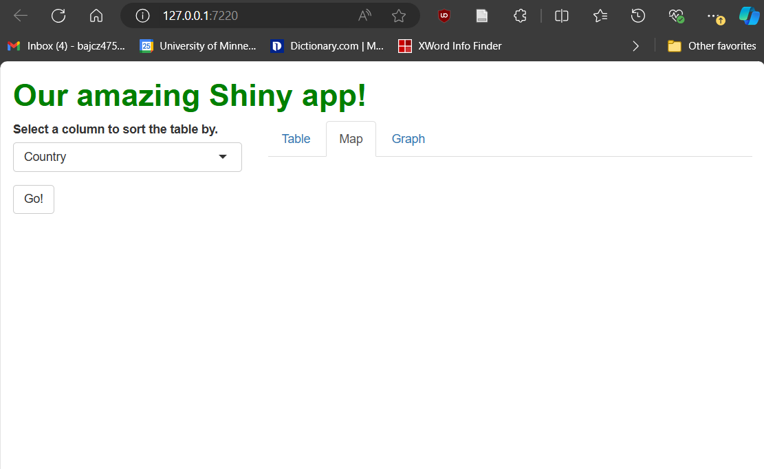
We can swap between tabs using each tab panel’s tab (the terminology here is awkward!), just like in a browser. The second and third tab panels are currently empty, but not for long! We’ll add new features to them in the next lesson.
Discussion
Imagine you have two observers that are watching the same reactive object such that, when that reactive object changes, both observers should begin to execute. What do you think will happen?
In complex applications, the scenario described here is surprisingly common, and it can actually be a problem!
In Shiny, both observers would invalidate, meaning they have both been “scheduled” to re-run. Shiny then selects to re-run one of them first (somewhat arbitrarily) and allows it to finish completely before allowing the next one to re-run. Shiny does not (by default) allow observers to run at the same time (“in parallel”), so they will always run in some sequence instead.
If the two observers have completely independent roles, this circumstance is maybe fine. However, if the observers depend upon one another (e.g., observer 1 is meant to use up-to-date outputs from observer 2’s operations), then the order in which the observers run matters. If observer 1 runs first, it may use outdated inputs.
When the exact order in which observers )or other reactive contexts) re-run matters, developers refer to this as a race condition, as though the two reactive contexts are “racing” each other. Race conditions are a common source of bugs in directive evaluation contexts.
While it’s best to design apps such that observers are independent or
don’t need to watch the same reactive objects, it’s sometimes
unavoidable. In those instances, observeEvent({},{})’s
priority parameter can be used—R will use the values
specified to priority to decide the order “racing”
observers should execute in-.
Key Points
- Complex UI elements, like tables, first need to be
rendered server-side using a
render*({})function and then placed within our UI using an*Output()function. - Rendered entities are passed from the server to the UI via the
outputobject using theoutputIds we provided them when we rendered them. -
Input widgets are UI elements that allow users to
interact with our app in pre-defined and familiar ways. The current
values of these widgets are passed from the UI to the server via the
inputobject using theinputIds we provided them when we created them. - R knows to watch reactive objects (like those
attached to
input) for changes. Any such changes are events. Event handling is coding how the app should respond to an event. - The primary way Shiny handles events is by re-running any
reactive contexts containing the reactive object(s)
that just changed (unless those objects have been
isolate()d, in which case they can’t trigger events but they can be used in operations). - Server-side, reactive contexts are triggered to run directively (when a precipitating event occurs), not imperatively (when a coder hits “run”). They might run in any order, many times, or never—it all depends on what the user does.
- However, once a reactive context begins executing, its contents are executed imperatively, like “normal,” until they complete (even if that takes a long time!), during which time the app will be unresponsive.
-
Observers (like
observeEvent({},{})) allow for more precise event-handling;observeEvent({},{})s only rerun their second expression and only in response to events that occur in their first expression, so they enable precise “If X, then Y” event handling. -
tabPanel()andtabsetPanel()create a “tabular layout,” dividing one UI space into several, only one of which is visible at a time.
Content from Shiny Showstoppers: DTs and Leaflets and Plotlys, Oh My!
Last updated on 2025-04-15 | Edit this page
Overview
Questions
- How do I add an interactive map/table/graph to my app?
- What features do these widgets have?
- How do I adjust their appearance?
- How can I modify these widgets to handle events without simply rebuilding them each time?
- What events related to these widgets can I watch for?
Objectives
- Name the essential functions of the
DT,leafletandplotlypackages. - Experiment with the standard interactive features of the plots/tables/maps produced by these packages, and recognize how to disable them.
- Customize the look and feel of these graphics.
- Update complex interactive graphics instead of remaking them using proxies.
- Recognize some events a user might trigger on these complex interactive graphics and how to watch for them.
Disclaimer
At a few point, this lesson’s code may produce warnings when executed. Ignore these—the code works as intended!
Catching up
In case you need it, here is the complete ui.R,
global.R, and server.R code up to this
point:
R
#ui.r
ui = fluidPage(

  tags$head(
    tags$link(href = "styles.css",
              rel = "stylesheet"),
    tags$title("Check this out!")
  ),

  h1("Our amazing Shiny app!",
     id = "header"),

  fluidRow(
    column(width = 4,
           selectInput(
             inputId = "sorted_column",
             label = "Select a column to sort the table by.",
             choices = names(gap)
           ),
           actionButton(
             inputId = "go_button",
             label = "Go!")
    ),
    column(width = 8, tabsetPanel(
      tabPanel(title = "Table", tableOutput("table1")),
      tabPanel(title = "Map"),
      tabPanel(title = "Graph")
    ))
  ),

  tags$footer("This is my app")
)
R
#global.R
library(shiny)
library(dplyr)
library(ggplot2)
library(plotly)
library(DT)
library(leaflet)
library(gapminder)
library(sf)

gap = as.data.frame(gapminder)
R
#server.R
server = function(input, output, session) {

  #INITIAL TABLE
  output$table1 = renderTable({
    gap
  })

  #UPDATE UPON BUTTON PRESS USING PROXY
  observeEvent(input$go_button,
               ignoreInit = FALSE, {

      output$table1 = renderTable({

        gap %>%
        arrange(!!sym(input$sorted_column))

    })
  })

}
Introduction
While input widgets like drop-down menus and buttons are powerful ways to give users control of your app and enable many powerful forms of interactive engagement, they aren’t always transformative by themselves. There are much more powerful widgets!
And, since our app’s server is powered by R—a programming language built for data work—it make senses we’d be able to include widgets that put data at our users’ fingertips in cool ways. Of all the data-centered widgets, few are more familiar and enlightening than tables, maps, and graphs. Because these graphics are so ubiquitous, it probably won’t surprise you that there are JavaScript packages for creating web-enabled, interactive versions of these graphic types.
While there are others, in this lesson we’ll use the DT
(tables), leaflet (maps), and plotly (graphs)
packages to produce these graphics; each has been ported into R + R
Shiny via packages of the same names. Each package could easily
be a course unto itself! As such, we’ll look only at the basic
idea that cut across them all—greater depth can be found elsewhere.
Learning leaflet and plotly, specifically,
come with challenges we’ll have to negotiate:
leafletbuilds maps, which represent spatial data. These, and the packages that work with them (e.g.,sf), are complicated! I’ll gloss over the details, but we’ll need to occasionally borrow tools fromsfto accomplish anything.If you’re familiar with
ggplot2(or a comparable data visualization suite), you already know that learning programmatic graph-making can have a steep learning curve.plotlyhas the same curve (perhaps a steeper one for R users, since it’s very JavaScript-like). Again, I’ll gloss over the details, but even the basics may be a lift.
Let’s start simple, then, with DT, which will feature
constructs most like those we’re already familiar with. Let’s swap out
our functional but drab table for a better, DT table. Along
the way, we can learn all the key concepts we’ll need to tackle
leaflet and plotly too.
Turning the tables
Basic table
All we must do to swap out our old table for a new one (besides
loading DT by executing library(DT), if you
haven’t done so!) is to change our renderTable({}) and
tableOutput() calls to renderDT({}) and
dataTableOutput() calls:
R
##This code should **replace** ALL table-related code contained within your server.R file!

#INITIAL TABLE
  output$table1 = renderDT({ #<--CHANGE FUNCTION
    gap
  })

  #UPDATE UPON BUTTON PRESS
  observeEvent({input$go_button},
               ignoreInit = FALSE, {

   output$table1 = renderDT({ #<--CHANGE FUNCTION
      gap %>%
      arrange(!!sym(input$sorted_column))

   })
  })
R
##This code should **replace** the content of the "main panel" cell within the BODY section of your ui.R file!

##... other UI code...

###MAIN PANEL CELL
    column(width = 8, tabsetPanel(
      ###TABLE TAB
      tabPanel(title = "Table",
        dataTableOutput(outputId = "table1")), #<--CHANGE FUNCTION
      ###MAP TAB
      tabPanel(title = "Map"),
      ###GRAPH TAB
      tabPanel(title = "Graph")
    )
   )

##... other UI code...
Once you’ve made the changes represented above, restart your app. When you do, you’ll notice our new table looks very different:
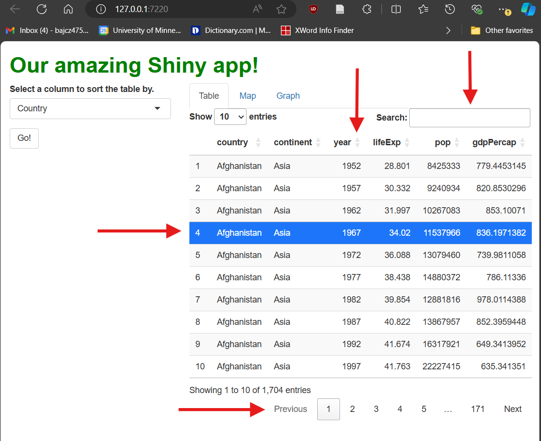
Our table is now paginated, i.e., divided into pages. Users can flip between pages using numbered buttons as well as “Next” and “Previous” buttons in the bottom-right. Users can also change page length in the upper-left. These features limit how much data is shown at once when a data set has many rows, and they also keep the table a more consistent height in your UI.
It’s searchable—users can type strings (chunks of letters/numbers/symbols) into the search box in the upper-right; the table will filter to only rows containing that string anywhere.
It’s sortable—users can click the up/down arrows next to each column’s name to sort the table by that column. [You’ll note this functionality makes our drop-down menu widget redundant!]
It’s (modestly) styled—it’s visually more appealing than our previous table because it comes with some automatic CSS (bold column names and “zebra striping,” e.g.).
[Side-note: Web developers call elements with pre-set CSS rules opinionated. Opinionated elements are nice in that they require less styling, but if you do choose to restyle them, it can be hard to overcome their “opinions.”]It’s selectable—users can click to highlight rows. This event doesn’t actually do anything by default besides change the table’s appearance, but it could be handled in some clever way.
Now that we have a DT table (or any complex interactive
graphic), there are four things we’ll very commonly want to do
to it:
Simplify its functionality.
Customize its style.
Watch for relevant events.
Update it to handle those events.
Let’s tackle the first two items first.
More (or less) basic DT
As we saw, DT tables come with many interactive
features! However, “more” is not always “better” from a
UX (user experience) standpoint. Some
users might find certain features confusing, especially if they aren’t
necessary, are poorly explained, or don’t result in obvious reactions.
Others may find having a lot of features overwhelming, even if they do
understand them all.
The datatable() function’s options
parameter allows us to reduce the features our table:
R
##This code should **replace** ALL table-related code contained within your server.R file!

#INITIAL TABLE
  output$table1 = renderDT({
    gap %>%
      datatable(
        selection = "none", #<--TURNS OFF ROW SELECTION
        options = list(
          info = FALSE, #<--NO BOTTOM-LEFT INFO
          ordering = FALSE, #<--NO SORTING
          searching = FALSE #<--NO SEARCH BAR
        )
      )
  })

#UPDATE UPON BUTTON PRESS
  observeEvent(input$go_button, {

    output$table1 = renderDT({
      gap %>%
        arrange(!!sym(input$sorted_column)) %>%
        #SAME AS ABOVE
        datatable(
          selection = "none",
          options = list(
            info = FALSE,
            ordering = FALSE,
            searching = FALSE
          )
        )
    })

  })
That’s better! Potentially, this version is more digestible and intuitive for our users (and could be easier for us to explain and handle too!):
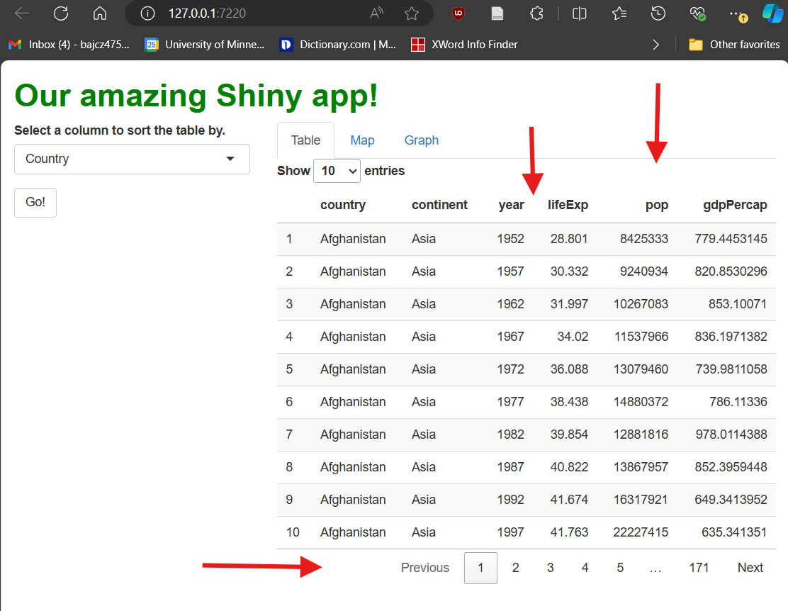
More broadly, if a DT table (or any other complex
interactive graphic) has a feature, you should assume you can turn it
off (you may simply have to Google for the way to do it).
Next, let’s tinker with our table’s aesthetics. Let’s make three changes that demonstrate what’s possible:
Let’s round the
gdpPercapcolumn.Let’s make the
continentcolumn center-aligned.Let’s highlight all rows with
lifeExpvalues >70in pink.
We’ll use functions from the format*() and
style*() families—specifically, formatRound(),
formatStyle(), and styleEqual():
R
##This code should **replace** ALL table-related code contained within your server.R file!

#INITIAL TABLE
  output$table1 = renderDT({
    gap %>%
      datatable(
        selection = "none",
        options = list(
          info = FALSE,
          ordering = FALSE,
          searching = FALSE
        )
      ) %>%
      #IN THE SECOND ARGUMENTS OF THESE FUNCTIONS, WE WRITE 'R-LIKE' CSS. WE USE camelCase FOR PROPERTIES, QUOTED STRINGS FOR VALUES, AND = INSTEAD OF : AND ;.
      formatRound(columns = "gdpPercap",
                  digits = 2) %>%
      formatStyle(columns = "continent",
                  textAlign = "center") %>% #<--COMPARE WITH text-align: center; FORMAT
      formatStyle(
        columns = "lifeExp", #<--wHAT COLUMN WILL WE CONDITIONALLY FORMAT BY?
        target = "row", #<--WILL WE STYLE THE WHOLE ROWS OR JUST INDIVIDUAL CELLS?
        backgroundColor = styleEqual(
          levels = gap$lifeExp,
          values = ifelse(gap$lifeExp > 70, "lightpink", "white") #WHAT RULE WILL WE USE, AND WHAT NEW CSS VALUES WILL WE SET FOR EACH POSSIBILITY?
        )
      )
  })

  #UPDATE UPON BUTTON PRESS
  observeEvent({input$go_button},
               ignoreInit = FALSE, {

                 output$table1 = renderDT({
                   gap %>%
                     arrange(!!sym(input$sorted_column)) %>%
                     datatable(
                       selection = "none",
                       options = list(
                         info = FALSE,
                         ordering = FALSE,
                         searching = FALSE
                       )
                     ) %>%
      #SAME AS ABOVE
      formatRound(columns = "gdpPercap", digits = 2) %>%
      formatStyle(columns = "continent", textAlign = "center") %>%
      formatStyle(
        columns = "lifeExp",
        target = "row",
        backgroundColor = styleEqual(
          levels = gap$lifeExp,
          values = ifelse(gap$lifeExp > 70, "lightpink", "white")
        )
      )

    })
  })
format*() functions ask us to pick one or more columns
to restyle. Then, we provide property and
value pairings as inputs, just as we would in CSS, but
using “R-like” syntax, e.g., textAlign = center
versus text-align: center;.
If we want to format columns, rows, or cells
conditionally, i.e., formatting only
some rows according to a rule, we use the style*()
functions. In the example above, we used styleEqual() to
apply a light pink background to only rows with life expectancy values
greater than 70. These rows might then stand out better to
users, enabling new workflows.
Update, don’t remake, DT edition!
So far, when user actions have spurred a change to our table (e.g., how it’s sorted), we’ve re-rendered the entire table to handle those events.
This approach works, but it’s undesirable for (at least) four reasons:
With large data sets, it could be slow! Remember that, as R code executes server-side, the app must remain unresponsive until that execution finishes, so users will have to wait in the meantime.
-
To the user, the table may “flicker” out and in again as it’s remade (if the process is fast), which might look “glitch-y.”
- If the process is slow, however, the table will instead “gray out” and the whole app will appear to “freeze” while the underlying code executes.
If the user has customized the table in any way (they’ve navigated to a specific page, e.g.), those customizations are lost (unless we store that information and re-apply it, which is possible but tedious).
As we’ve seen, rebuilding the table often necessitates repeating the same table-building code in multiple places—first when we build the initial table and again when we re-build it. This “code bloat” makes your code harder to manage and makes it more likely you will introduce inconsistencies.
If you think about it, if all we’re doing is changing the data our table is displaying, there’s no need to remake the whole table—why rebuild all rows, columns, and cells when we just need to change their contents?
Callout
Whenever possible, we should update a complex interactive graphic rather than remake it.
To update complex interactive graphics “on the fly,” we can use a construct called a proxy. A proxy is a connection that our app’s server makes with the client’s UI with respect to a specific element—it’s like a phone call between a specific reactive context and the element the user is currently seeing.
Through the proxy, our server code can describe what
specific changes need to be made, and the user’s browser can
make just those changes without redrawing the table, requesting
all the data again, or disabling the user’s control over the app. Such a
“direct line of communication” enables cleaner and snappier adjustment
of complex elements than using a render*({}) function.
DT’s proxy function, dataTableProxy(),
takes as input the outputId of the table to update. We then
pipe that proxy into a helper function to specify which specific changes
we’re requesting. For example, we’ll use the helper function
replaceData() to targetedly swap out some (or all) of the
data contained with the table’s cells, leaving all else unchanged.
Up until now, we handled column re-sorting using
renderDT({}). Let’s switch to using
dataTableProxy() to handle these events instead:
R
##This code should **replace** ALL table-related code contained within your server.R file!

##... other server code...

#INITIAL TABLE
  output$table1 = renderDT({
    gap %>%
      datatable(
        selection = "none",
        options = list(
          info = FALSE,
          ordering = FALSE,
          searching = FALSE
        )
      ) %>%
      formatRound(columns = "gdpPercap", digits = 2) %>%
      formatStyle(columns = "continent", textAlign = "center") %>%
      formatStyle(
        columns = "lifeExp",
        target = "row",
        backgroundColor = styleEqual(
          levels = gap$lifeExp,
          values = ifelse(gap$lifeExp > 70, "lightpink", "white")
        )
      )
  })

  #UPDATE UPON BUTTON PRESS USING PROXY
  observeEvent({input$go_button},
               ignoreInit = FALSE, {

  #MAKE THE NEW, SORTED VERSION OF OUR DATA SET.
  sorted_gap = gap %>%
    arrange(!!sym(input$sorted_column))

  #THEN, USE OUR PROXY TO SWAP OUT THE DATA.
  dataTableProxy(outputId = "table1") %>%
    replaceData(data = sorted_gap,
                resetPaging = FALSE) #<--OPTIONAL, BUT NICE.
  #NO OTHER CODE IS NEEDED--EVERYTHING ABOUT THE ORIGINAL TABLE IS MAINTAINED EXCEPT FOR JUST THE PART(S) WE WANT TO ALTER.

  })

  ##... other server code...
If you try the app with the changes outlined above made, it won’t look or behave all that different. However, that’s only because this particular table is so quick to rebuild! With a more complex table and a larger data set, this approach would be cleaner, faster, and less disruptive for the user. Their page choice and row selection could be maintained between updates, and they could continue to use the app while the table updated if they wanted to (it wouldn’t freeze). And, importantly, this approach requires far less code overall and eliminates the duplicate code we’ve had so far!
Watch and learn
Interactive graphics like our DT table aren’t just a
cool way to show data—they’re widgets in their own
right, and user interactions with them can trigger events we could
handle, just as with any other widget.
Let’s see an example. First, recall that row selection doesn’t
trigger events by default. Let’s turn selection back on by changing the
selection parameter inside datatable() from
"none" to
list(mode = "single", target = "cell"), which’ll enable
users to select one cell at a time:
R
##This code should **replace** the code that creates your initial table within your server.R file!

##... other server code...

  #INITIAL TABLE
  output$table1 = renderDT({
    gap %>%
      datatable(
        selection = list(mode = "single", target = "cell"), #<--TURN SELECTION ON, TARGETING INDIVIDUAL CELLS.
        options = list(
          info = FALSE,
          ordering = FALSE,
          searching = FALSE
        )
      ) %>%
      formatRound(columns = "gdpPercap", digits = 2) %>%
      formatStyle(columns = "continent", textAlign = "center") %>%
      formatStyle(
        columns = "lifeExp",
        target = "row",
        backgroundColor = styleEqual(
          levels = gap$lifeExp,
          values = ifelse(gap$lifeExp > 70, "lightpink", "white")
        )
      )
  })

##... other server code...
Next, let’s create a new observer that will watch for cell selection.
Event information regarding cell selection will be passed from the UI to
the server via the input object using
input$[outputId]_cells_selected format, so
input$table1_cells_selected is the reactive object our
observer will watch. For now, we’ll make this observer’s only operation
to print the value of input$table1_cells_selected to the R
Console every time a new cell is clicked so we can see what this object
looks like:
R
##This code should be **added to** your server.R file within the server function!

##... other server code...

#WATCH FOR CELL SELECTIONS
observeEvent({input$table1_cells_selected}, {

  print(input$table1_cells_selected)

})

##... other server code...
If you run the app now and select some cells, you’ll observe that
input$table1_cells_selected returns a matrix. Either this
matrix has no rows (when no cell is selected, such as at app start-up)
or one row with two values: row and column numbers for the selected
cell.
Of course, we aren’t handling these cell selection events right now; the app doesn’t yet respond in any new way.
Let’s change that. First, let’s add a renderText({})
call inside our new observer and a textOutput() call to our
UI, beneath our table:
R
##This code should **replace** the observeEvent that watches for cell selections in your server.R file!

##... other server code...

#WATCH FOR CELL SELECTIONS
  observeEvent({input$table1_cells_selected}, {

    output$selection_text = renderText({

      ###WE'LL PUT CODE HERE IN A MOMENT.

    })

  })

  ##... other server code...
R
##This code should **replace** the content of the "main panel" cell within the BODY section of your ui.R file!

##... other UI code...

###MAIN PANEL CELL
    column(width = 8, tabsetPanel(
      ###TABLE TAB
      tabPanel(title = "Table",
        dataTableOutput(outputId = "table1"),
        textOutput("selection_text")), #<--ADD textOutput HERE.
      ###MAP TAB
      tabPanel(title = "Map"),
      ###GRAPH TAB
      tabPanel(title = "Graph")
    )
   )

##... other UI code...
renderText({}) and textOutput() create and
display text blocks, as you might guess from their names! We can use
them to programmatically generate text and display it to users. Let’s
use these functions to generate text whenever a life expectancy, GDP per
capita, or population value is selected. Let’s have that text reference
the selected value as well as the associated country and year. This will
require a little “R elbow grease,” but no new Shiny code:
R
##This code should **replace** the observeEvent that watches for cell selections in your server.R file!

##... other server code...

#WATCH FOR CELL SELECTIONS
  observeEvent({input$table1_cells_selected}, {

    #MAKE SURE A CELL HAS BEEN SELECTED AT ALL--OTHERWISE, ABORT.
    if(length(input$table1_cells_selected) > 0) {

    #CREATE CONVENIENCE OBJECTS THAT ARE SHORTER TO TYPE.
    row_num = input$table1_cells_selected[1]
    col_num = input$table1_cells_selected[2]

    #MAKE SURE THE SELECTED CELL WAS IN COLUMNS 4-6--OTHERWISE, ABORT.
    if(col_num >= 4 & col_num <= 6) {

    #GET THE YEAR AND COUNTRY OF THE ROW SELECTED.
    country = gap$country[row_num]
    year = gap$year[row_num]

    #GET THE VALUE IN THE SELECTED CELL.
    datum = gap[row_num, col_num]

    #DETERMINE THE RIGHT TEXT STRING TO USE DEPENDING ON THE COLUMN SELECTED.
      if(col_num == 4) {
        col_string = "life expectancy"
      }
      if(col_num == 5) {
        col_string = "population"
      }
      if(col_num == 6) {
        col_string = "GDP per capita"
      }

      #RENDER OUR TEXT MESSAGE.
    output$selection_text = renderText({

      #PASTE TOGETHER ALL THE CONTENT ASSEMBLED ABOVE!
      paste0("In ", year, ", ", country, " had a ",
             col_string, " of ", datum, ".")
     })
    }
   }
  })
ERROR
Error in observeEvent({: could not find function "observeEvent"R
##... other server code...
If you make all the changes outlined above, you should see something like this when you run the app and select cells:
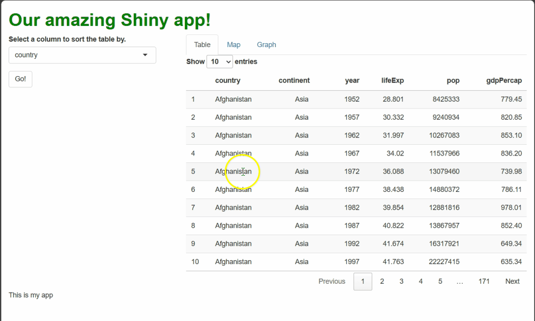
By using renderText({}) and textOutput() to
handle these events, we generate dynamic text that a user might feel is
personal to them and their actions, even though it’s procedurally
generated!
Challenge
If you’ve been extra observant, you might realize there are two issues with our new cell selection observer.
First, if you watch the end of the clip above, you’ll notice that, while selecting a cell will cause the rendered text message to appear or change, de-selecting a selected cell does not cause the rendered text to disappear, as the user might expect.
How would you adjust the code to remove the message when a user
de-selects a cell (or selects an inappropriate cell, such as one in the
first three columns)? Hint: If you leave a render*({})
function’s expression blank, an empty box will get rendered.
Our current code uses if()s to determine if a user has
selected a cell at all and, if so, if that cell is appropriate. We can
pair these two if()s with elses that eliminate
the rendered text whenever no (appropriate) cell has been selected:
R
##This code should **replace** the observeEvent that watches for cell selections in your server.R file!

##... other server code...

  observeEvent({input$table1_cells_selected}, {

    else_condition = renderText({}) #OUR ELSE CONDITION WILL BE TO RENDER NOTHING.

    if(length(input$table1_cells_selected) > 0) {

      row_num = input$table1_cells_selected[1]
      col_num = input$table1_cells_selected[2]

      if(col_num >= 4 & col_num <= 6) {

        country = gap$country[row_num]
        year = gap$year[row_num]

        datum = gap[row_num, col_num]

        if(col_num == 4) {
          col_string = "life expectancy"
        }
        if(col_num == 5) {
          col_string = "population"
        }
        if(col_num == 6) {
          col_string = "GDP per capita"
        }

        output$selection_text = renderText({

          paste0("In ", year, ", ", country, " had a ",
                 col_string, " of ", datum, ".")
        })
        #ADD IN OUR ELSE CONDITIONS
      } else {
        output$selection_text = else_condition
      }
    } else {
      output$selection_text = else_condition
    }
  })

  ##... other server code...
Now, if you start your app and select a cell that yields our procedurally generated text, then click that cell again to de-select it, the text will also disappear.
Challenge
EXTRA CREDIT–THIS QUESTION IS CHALLENGING!
Second, our current code does not acknowledge the possibility that
the table the user is clicking on may have been sorted by a column other
than country (the default).
If it has been otherwise sorted, a user will click cells based on the sorted data set they see, but our code currently assumes the row and column numbers are to be used for the unsorted data set. As such, it’ll most likely grab values from the wrong row if the table has been re-sorted!
How could you adjust the code to first determine if the table is sorted differently than the raw data set is and, if so, reference the sorted data set instead?
This question is a purposeful trap; it doesn’t actually have a simple solution you’re intended to know yet!
Allow me to explain: By default, the app doesn’t track if the table is sorted and, if so, how. We can’t simply ask “Hey Shiny, what column is the table sorted by, and is that different than what we started with?” At best, we’d need to use context clues and logic to figure out how the table the user can currently see is sorted and proceed accordingly.
The first solution that came to mind for me was to take the row and column numbers of the cell the user has selected and get the value in that cell in both the original data set and in a version of the data set sorted according to the current selection in our drop-down menu widget. If these two values don’t match, then the table is probably sorted by a different column than the original data set was:
R
##This code should **replace** the observeEvent that watches for cell selections in your server.R file!

##... other server code...

  observeEvent({input$table1_cells_selected}, {

    else_condition = renderText({})

    if(length(input$table1_cells_selected) > 0) {

      row_num = input$table1_cells_selected[1]
      col_num = input$table1_cells_selected[2]

      if(col_num >= 4 & col_num <= 6) {

        #GET BASELINE DATUM FIRST
        datum = gap[row_num, col_num]

        #GENERATE A SORTED VERSION OF THE DATA SET, BASED ON THE CURRENT SELECTION
        sorted_gap = gap %>%
          arrange(!!sym(input$sorted_column))

        #GET THAT VERSION'S DATUM TOO.
        sorted_datum = sorted_gap[row_num, col_num]

        #COMPARE THEM. IF THEY'RE THE SAME, THE TABLE *PROBABLY* ISN'T SORTED.
        if(sorted_datum == datum) {
          datum = datum
          country = gap$country[row_num]
          year = gap$year[row_num]
          #IF THEY'RE DIFFERENT, THE TABLE *PROBABLY* HAS BEEN SORTED, AND WE SHOULD USE THE SORTED VERSION.
        } else {
          datum = sorted_datum
          country = sorted_gap$country[row_num]
          year = sorted_gap$year[row_num]
        }

        if(col_num == 4) {
          col_string = "life expectancy"
        }
        if(col_num == 5) {
          col_string = "population"
        }
        if(col_num == 6) {
          col_string = "GDP per capita"
        }

        output$selection_text = renderText({

          paste0("In ", year, ", ", country, " had a ",
                 col_string, " of ", datum, ".")
        })
      } else {
        output$selection_text = else_condition
      }
    } else {
      output$selection_text = else_condition
    }
  })

  ##... other server code...
Now, this solution certainly works better than what we had before—the app seems to successfully acknowledge when the table has been sorted versus when it hasn’t:
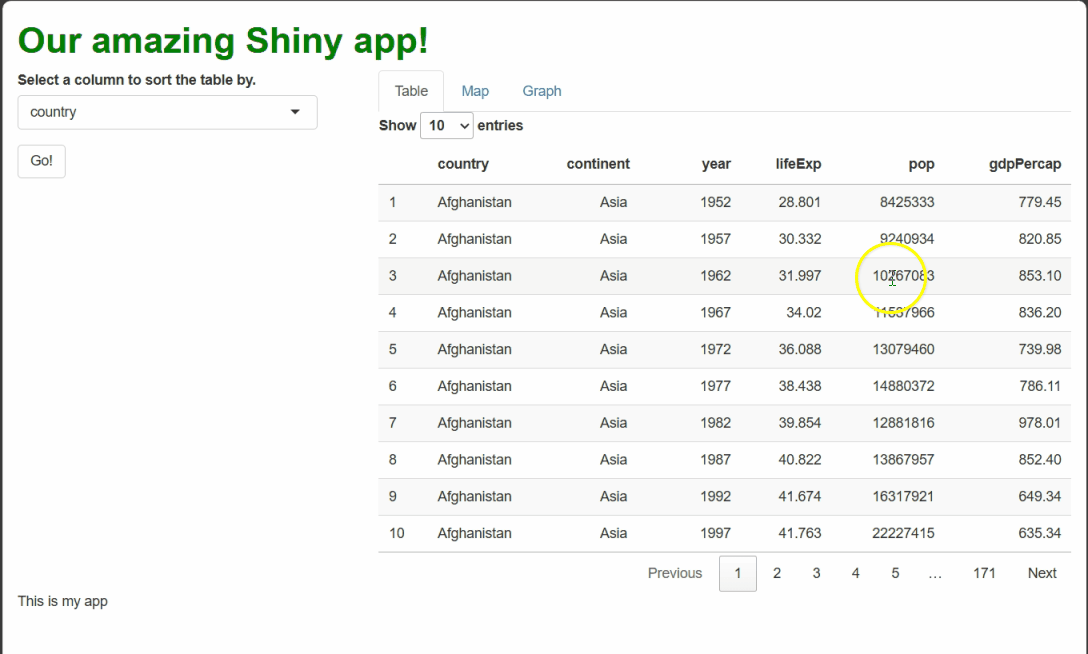
This solution seems to work—when the table is sorted by a new column, such as by year, our procedural text references the right row when procedurally generating text.
However, there’s a very likely scenario in which this “solution” would fail! Consider that a user can select a new column to sort by at any time, but they must hit “go” before the sorting actually happens. If they ever select a new column and then select a cell before hitting “go,” they will “trick” our code into thinking the table has been re-sorted when, in fact, it hasn’t:
There’s another problem with our “solution:” What about duplicate values? If the table has been sorted, but the two values we compare just so happen to be equal, our code will assume the table has not been sorted when perhaps it has!
Yikes! This is a challenging problem. Luckily, there is at least one
solution, but it’s outside the scope of this lesson (to use
reactive({}) to create a new reactive object that serves as
a tracker for what column the table has been sorted by most recently
that we can update and access whenever we want).
However, we can nonetheless learn a valuable lesson from this example:
Callout
Every time you give users a new way to interact with your app, you vastly increase the number of permutations of actions users could perform. Will they do this, and then that? Or the reverse?
That means far more potential circumstances to anticipate and then handle with your code. This is why designing your app ahead of time and adding interactivity judiciously is essential.
Putting us on the map
Setup
leaflet is a JS (and now R) package for creating
web-enabled, interactive maps of spatial data, such as
latitude-longitude coordinates. So, we need some spatial data! In the
setup instructions, we asked you to download a version of the
gapminder data set we’ve prepared containing spatial data
using this link: Link
to the gapminder data set with attached spatial data. If you haven’t
downloaded that yet, do so now.
Once you’ve downloaded it, move it to your R Project folder and then load it into R using the following command:
R
##Add this code in your global.R file!

##... other global code...
gap_map = readRDS("gapminder_spatial.rds")
The rest of this lesson assumes you have gap_map; the
code shown will not work without it!
Preface
In this section we switch from making tables to making maps, but
we’ll use the same workflow we followed for DT in the last
section:
We’ll start by making a basic map.
Then, we’ll adjust some of the map’s interactive features and dress up its aesthetics a bit.
Lastly, we’ll learn about map-specific events and how to handle them without redrawing the entire map.
The specifics will be different, but we’ve already seen all the concepts, so this section will hopefully feel like a chance to practice of familiar concepts rather than an introduction to entirely new ones.
Basic map
Let’s make a leaflet map showing the countries in our
data set marked by a colored outline.
Every leaflet map has three building blocks:
A
leaflet()call. This is likeggplot()from theggplot2package—it “sets the stage” for the rest of the graphic, and you can specify some settings here that’ll apply to all subsequent components.An
addTiles()call. This places a tile, or background image, into your map. This is the familiar component that indicates where all the lakes and roads and country boundaries and such are! We’ll use the default tile, but there are many other free ones available.-
At least one
add*()function call for adding our spatial data. There are several others, but the three most commonly usedadd*()functions are:addMarkers()for adding point (0-dimensional) spatial data (like restaurant locations).addPolylines()for adding line/curve (1-dimensional) spatial data (like roads or rivers).addPolygons()for adding polygonal (2-dimensional) spatial data (like country boundaries).
Here, we’ll use addPolygons():
R
##This code should **swapped** for the the "main panel" content in the BODY section of your ui.R file!

##... other UI code...

###MAIN PANEL CELL
    column(width = 8, tabsetPanel(
      ###TABLE TAB
      tabPanel(title = "Table", dataTableOutput("table1")),
      ###MAP TAB
      tabPanel(title = "Map", leafletOutput("basic_map")), #<--OUTPUT NEW MAP.
      ###GRAPH TAB
      tabPanel(title = "Graph")
    )),
  ##... other UI code...
R
##This code should be **added to** your server.R file, below all other contents but inside of your server function!

 ##... other server code...

###MAP
  output$basic_map = renderLeaflet({

    ##FILTER TO ONLY 2007 DATA.
    gap_map2007 = gap_map %>%
      filter(year == 2007)

    leaflet() %>% #<--GET THINGS STARTED
      addTiles() %>% #<--ADD BACKGROUND TILE
      addPolygons(
        data = gap_map2007$geometry) #SPECIFY OUR SPATIAL DATA (geometry IS AN sf PACKAGE WAY OF STORING SUCH DATA)

  })
This code creates a nice, if somewhat fuzzy-looking, interactive map showing the countries for which we have data outlined in blue:
Note that you can pan the map by clicking anywhere on it, holding the click, and moving your mouse. Note you can also zoom the map using your mouse wheel (if you have one), or by using the plus/minus buttons in the upper-left. Double-clicking the map also zooms in.
If you zoom in, you’ll see the tile automatically change to show greater detail. If you zoom in really far, you can actually lose any sense of where you are and, if you zoom way out, you’ll see the world repeat several times left-to-right, which looks pretty weird!
More (or less) basic map
As we just saw, it often doesn’t make sense to allow users to pan and zoom a map with no guardrails—they can get lost by zooming in or out too far or panning the map around too much, and they can create weird visual quirks, such as making the world repeat.
The leaflet() function can be used to set min and max
zoom levels like so:
R
##This code should be **swapped for** the renderLeaflet({}) code provided previously, inside of your server function!

 ##... other server code...

###MAP
  output$basic_map = renderLeaflet({

    gap_map2007 = gap_map %>%
      filter(year == 2007)

    ##THE leaflet() FUNCTION HAS MANY OPTIONS, SUCH AS THE MIN AND MAX ZOOM LEVELS.
    leaflet(options = tileOptions(maxZoom = 6, minZoom = 2)) %>%
      addTiles() %>%
      addPolygons(
        data = gap_map2007$geometry)

  })
A minZoom of 2 makes it so almost
the entire world is visible at once (on my laptop screen, anyway!).
Meanwhile, a maxZoom of 6 allows users to zoom
into continental regions but no further. These adjustments should keep
users from zooming in or out more than makes sense for our data.
We can also set maximum bounds—these are an invisible box that users cannot pan the map beyond. If they try, the map will snap the focus (center of the map) back inside the bounds:
R
##This code should be **swapped for** the renderLeaflet({}) code provided previously, inside of your server function!

 ##... other server code...

###MAP
  output$basic_map = renderLeaflet({

    gap_map2007 = gap_map %>%
      filter(year == 2007)

    #sf'S st_bbox() FUNCTION RETRIEVES THE FOUR POINTS THAT WOULD CREATE A BOX THAT WOULD FULLY SURROUND THE SPATIAL DATA GIVEN AS INPUTS.
    bounds = unname(sf::st_bbox(gap_map2007))

    leaflet(options = tileOptions(maxZoom = 6, minZoom = 2)) %>%
      addTiles() %>%
      addPolygons(
        data = gap_map2007$geometry) %>%
      ##CONVENIENTLY, setMaxBounds() TAKES THOSE EXACT FOUR POINTS IN THE SAME ORDER.
      setMaxBounds(bounds[1], bounds[2], bounds[3], bounds[4])

  })
When a user tries to pan past the bounds we’ve set, the map now “snaps back” to within them:
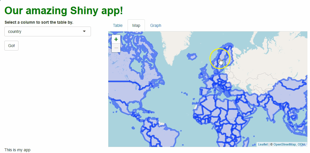
While there are other features we could adjust or disable, setting
bounds and minimum and maximum zoom levels are two things you’ll often
want to do to every leaflet map.
Adding some pizzazz
Our map’s aesthetics leave something to be desired right now. In particular, the default, fuzzy-blue strokes (outlines) are hard to look at.
Let’s start by cleaning those up. A lot of basic aesthetics related
to your spatial data can be controlled with parameters of the specific
add*() function you’re using. Here, we need to set new
values for color, weight, and
opacity inside addPolygons() to change the
color, thickness, and transparency of the strokes:
R
##This code should be **swapped for** the renderLeaflet({}) code provided previously, inside of your server function!

 ##... other server code...

  ###MAP
  output$basic_map = renderLeaflet({

    gap_map2007 = gap_map %>%
      filter(year == 2007)

    bounds = unname(sf::st_bbox(gap_map2007))

    leaflet(options = tileOptions(maxZoom = 6, minZoom = 2)) %>%
      addTiles() %>%
      addPolygons(
        data = gap_map2007$geometry,
        color = "black", #CHANGE STROKE COLOR TO BLACK
        weight = 2, #INCREASE STROKE THICKNESS
        opacity = 1 #MAKE FULLY OPAQUE
        ) %>%
      setMaxBounds(bounds[1], bounds[2], bounds[3], bounds[4])

  })

   ##... other server code...
These couple of changes make the graph much cleaner:
But the map still won’t engage our users very much because it’s not showing any data. Let’s have it show our life expectancy data by mapping those values to the fill color of each country’s polygon.
This’ll be a two-step process. First, we need to set up a
color palette function, which leaflet can
use to determine which colors go with which values (it can’t do this
itself). We can build this color palette function using the
colorNumeric() function, which needs two inputs: a
palette, the name of an R color palette we’d like to use,
and a domain, the entire set of values we’ll need to assign
colors to:
R
##This code should be **swapped for** the renderLeaflet({}) code provided previously, inside of your server function!

 ##... other server code...
###MAP
  output$basic_map = renderLeaflet({

    gap_map2007 = gap_map %>%
      filter(year == 2007)

    bounds = unname(sf::st_bbox(gap_map2007))

    #ESTABLISH A COLOR SCHEME TO USE FOR OUR FILL COLORS.
    map_palette = colorNumeric(palette = "Blues",
                               domain = unique(gap_map2007$lifeExp))

    leaflet(options = tileOptions(maxZoom = 6, minZoom = 2)) %>%
      addTiles() %>%
      addPolygons(
        data = gap_map2007$geometry,
        color = "black",
        weight = 2,
        opacity = 1
        ) %>%
      setMaxBounds(bounds[1], bounds[2], bounds[3], bounds[4])

  })
Then, we can add the polygon-coloring instructions and the life
expectancy data to addPolygons():
R
##This code should be **swapped for** the renderLeaflet({}) code provided previously, inside of your server function!

 ##... other server code...

###MAP
  output$basic_map = renderLeaflet({

    gap_map2007 = gap_map %>%
      filter(year == 2007)

    bounds = unname(sf::st_bbox(gap_map2007))

    map_palette = colorNumeric(palette = "Blues", domain = unique(gap_map2007$lifeExp))

    leaflet(options = tileOptions(maxZoom = 6, minZoom = 2)) %>%
      addTiles() %>%
      addPolygons(
        data = gap_map2007$geometry,
        color = "black",
        weight = 2,
        opacity = 1,
        fillColor = map_palette(gap_map2007$lifeExp), #<--WE USE OUR NEW COLOR PALETTE FUNCTION, SPECIFYING OUR DATA AS ITS INPUTS.
        fillOpacity = 0.75) %>%  #<--THE DEFAULT HERE, 0.5, WOULD WASH OUT THE COLORS TOO MUCH.
      setMaxBounds(bounds[1], bounds[2], bounds[3], bounds[4])

  })
This is already a much cooler and more engaging map:
…But shouldn’t there be a legend that clarifies what
colors go with what values? We can add one using
addLegend():
R
##This code should be **swapped for** the renderLeaflet({}) code provided previously, inside of your server function!

 ##... other server code...
###MAP
  output$basic_map = renderLeaflet({

    gap_map2007 = gap_map %>%
      filter(year == 2007)

    bounds = unname(sf::st_bbox(gap_map2007))

   map_palette = colorNumeric(palette = "Blues", domain = unique(gap_map2007$lifeExp))

    leaflet(options = tileOptions(maxZoom = 6, minZoom = 2)) %>%
      addTiles() %>%
      addPolygons(
        data = gap_map2007$geometry,
        color = "black",
        weight = 2,
        opacity = 1,
        fillColor = map_palette(gap_map2007$lifeExp),
        fillOpacity = 0.75) %>%
      setMaxBounds(bounds[1], bounds[2], bounds[3], bounds[4]) %>%
      #ADD LEGEND
      addLegend(
        position = "bottomleft", #<--WHERE TO PUT IT.
        pal = map_palette, #<--COLOR PALETTE FUNCTION TO USE (AGAIN).
        values = gap_map2007$lifeExp, #WHAT SCALE BREAKS TO USE.
        opacity = 0.75, #TRANSPARENCY.
        bins = 5, #NUMBER OF BREAKS.
        title = "Life<br>expectancy ('07)" #TITLE.
      )

  })
Now that’s a nice map!
…But what if our users don’t know much geography, so they don’t know which countries are which? Or what if they want to know the exact life expectancy value for a given country? Can we somehow add even more data to this map cleanly?
Yes! Adding tooltips would address both aims. A
tooltip is a small pop-up container that appears on
mouse hover (in leaflet, these variants are called
“labels”), on mouse click (leaflet calls these “popups”),
or some other action.
Using the popup parameter of addPolygons(),
we can add tooltips that appear and disappear on mouse click. Inside
them, we’ll put the name of the country being clicked:
R
##This code should be **swapped for** the renderLeaflet({}) code provided previously, inside of your server function!

 ##... other server code...
###MAP
  output$basic_map = renderLeaflet({

    gap_map2007 = gap_map %>%
      filter(year == 2007)

    bounds = unname(sf::st_bbox(gap_map2007))

    map_palette = colorNumeric(palette = "Blues", domain = unique(gap_map2007$lifeExp))

    leaflet(options = tileOptions(maxZoom = 6, minZoom = 2)) %>%
      addTiles() %>%
      addPolygons(
        data = gap_map2007$geometry,
        color = "black",
        weight = 2,
        opacity = 1,
        fillColor = map_palette(gap_map2007$lifeExp),
        fillOpacity = 0.75,
        popup = gap_map2007$country) %>% #<--MAKE A TOOLTIP HOLDING THE COUNTRY NAME THAT APPEARS/DISAPPEARS ON MOUSE CLICK.
      setMaxBounds(bounds[1], bounds[2], bounds[3], bounds[4]) %>%
      addLegend(
        position = "bottomleft",
        pal = map_palette,
        values = gap_map2007$lifeExp,
        opacity = 0.75,
        bins = 5,
        title = "Life<br>expectancy ('07)"
      )

  })
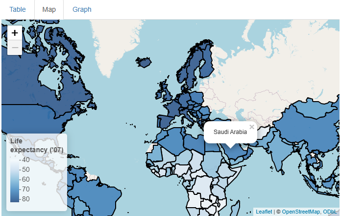
This is a nice addition, but what if we wanted to add life expectancy
values too and also keep the result human-readable? There are many
approaches we could take, but using R’s versatile paste0()
function plus the HTML line break element (<br>)
works pretty well:
R
##This code should be **swapped for** the renderLeaflet({}) code provided previously, inside of your server function!

 ##... other server code...
###MAP
  output$basic_map = renderLeaflet({

    gap_map2007 = gap_map %>%
      filter(year == 2007)

    bounds = unname(sf::st_bbox(gap_map2007))

    map_palette = colorNumeric(palette = "Blues", domain = unique(gap_map2007$lifeExp))

    leaflet(options = tileOptions(maxZoom = 6, minZoom = 2)) %>%
      addTiles() %>%
      addPolygons(
        data = gap_map2007$geometry,
        color = "black",
        weight = 2,
        opacity = 1,
        fillColor = map_palette(gap_map2007$lifeExp),
        fillOpacity = 0.75,
        #EXPANDING THE INFO PRESENTED IN THE TOOLTIPS.
        popup = paste0("Country: ",
                       gap_map2007$country,
                       "<br>Life expectancy: ",
                       gap_map2007$lifeExp)
      ) %>%
      setMaxBounds(bounds[1], bounds[2], bounds[3], bounds[4]) %>%
      addLegend(
        position = "bottomleft",
        pal = map_palette,
        values = gap_map2007$lifeExp,
        opacity = 0.75,
        bins = 5,
        title = "Life<br>expectancy ('07)"
      )

  })
Now, our map is both snazzy and extra informative:
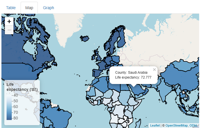
Challenge
In the previous example, we used popup to build our
tooltips. Try using the label parameter instead. For
whatever reason, this requires more wrangling, so here’s the
exact code you’ll need:
R
label = lapply(1:nrow(gap_map2007), function(x){
                    HTML(paste0("Country: ",
                                 gap_map2007$country[x],
                                 "<br>Life Expectancy: ",
                                gap_map2007$lifeExp[x]))})
What changes? Which do you prefer? Which option would be better if a lot of users will use mobile devices, do you think?
If we use label, we get tooltips that appears on mouse
hover instead of on mouse click.
This behavior is probably more intuitive for most users; many will not expect a click to do anything cool and so they may only discover our on-click tooltips by accident!
On the other hand, tooltips that appear on hover can be annoying if a user is trying to, e.g., trace a path with their mouse, and irrelevant tooltips keep getting in the way.
Another advantage of on-click tooltips is that they don’t disappear until a user is ready for them to do so, whereas tooltips that appear on hover also disappear when the mouse is moved, which can prevent users from consulting a tooltip while also using their mouse somewhere else on the page.
However, the biggest disadvantage of on-hover tooltips is that, while there is an equivalent event to a mouse click on touchscreen devices (a finger press), there is no universal equivalent to a mouse hover (some mobile device browsers and platforms use a “long press” for this, but not all, and many users are not accustomed to performing long presses!).
So, mobile users won’t generally see tooltips if they appear
only on hover. If we’re aiming for “mobile-first” design, the
popup option is better (which is why I picked it)!
This hypothetical also demonstrates why there is no substitute for asking your users for input when building your app; without it, you’ll just be guessing as to what their needs, expectations, and workflows will be!
Update, don’t remake, leaflet edition!
At this stage, our users have no control over our map. Let’s adds a slider input widget that will let users select which year’s data get plotted:
R
##This code should **replace** the "sidebar" cell's content within the BODY section of your ui.R file!

##... other UI code...

###SIDEBAR CELL
    column(width = 4,
           selectInput(
             inputId = "sorted_column",
             label = "Select a column to sort the table by.",
             choices = names(gap)
            ),
           actionButton(
             inputId = "go_button",
             label = "Go!"),
           sliderInput(
             inputId = "year_slider",
             label = "Pick what year's data are shown in the map.",
             value = 2007, #<--THE DEFAULT CHOICE
             min = min(gap$year), #<--MIN AND MAX CHOICES
             max = max(gap$year),
             step = 5, #<--HOW FAR APART ARE CHOICES?
             sep = "" #<--DON'T USE COMMAS AS SEPARATORS)
           )
    )
  ##... other UI code...
This adds the UI component of our input widget to our app’s sidebar cell:
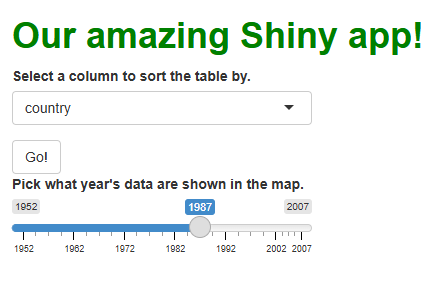
But, as we now appreciate, adding the widget to the UI isn’t
enough—we also need to incorporate its reactive object
(input$year_slider) into a reactive
context in our server code somehow if we want to
handle this widget’s events.
In this case, that isn’t actually too hard; we already have code that filters the data set down to the year 2007; we can modify this code so it filters the data by whichever year has been chosen instead:
R
##This code should be **swapped for** the renderLeaflet({}) code provided previously, inside of your server function!

 ##... other server code...
###MAP
  output$basic_map = renderLeaflet({

    ##KEEP THE PRODUCT NAMED AFTER 2007 FOR NOW.
    gap_map2007 = gap_map %>%
      filter(year == as.numeric(input$year_slider)) #<--INTRODUCE THE SLIDER'S CURRENT VALUE TO FILTER BY WHATEVER YEAR IS CHOSEN.

    bounds = unname(sf::st_bbox(gap_map2007))

    map_palette = colorNumeric(palette = "Blues", domain = unique(gap_map2007$lifeExp))

    leaflet(options = tileOptions(maxZoom = 6, minZoom = 2)) %>%
      addTiles() %>%
      addPolygons(
        data = gap_map2007$geometry,
        color = "black",
        weight = 2,
        opacity = 1,
        fillColor = map_palette(gap_map2007$lifeExp),
        fillOpacity = 0.75,
        popup = paste0("Country: ",
                       gap_map2007$country,
                       "<br>Life expectancy: ",
                       gap_map2007$lifeExp)
      ) %>%
      setMaxBounds(bounds[1], bounds[2], bounds[3], bounds[4]) %>%
      addLegend(
        position = "bottomleft",
        pal = map_palette,
        values = gap_map2007$lifeExp,
        opacity = 0.75,
        bins = 5,
        #HERE, A LITTLE TRICK TO ENSURE THE LEGEND'S TITLE IS ALWAYS ACCURATE.
        title = paste0("Life<br>expectancy ('",
                       substr(input$year_slider, 3, 4),
                       ")")
      )

  })
Above, notice I made a change to the map’s legend title to make it
more “generic” and less specific to any one year. There’s another,
similar change we should make: We should make our
map_palette function more generic so that just one version
of it is used no matter which year is picked. Since the code to produce
this function will then need to run only once ever, this is a good
opportunity to relocate that code to global.R:
R
##This code should be **added to** your global.R file, below all other code!

 ##... other global code...

map_palette = colorNumeric(palette = "Blues",
                           domain = unique(gap_map$lifeExp)) #<--CHANGE TO REFERENCE THE WHOLE DATA SET INSTEAD OF JUST THOSE FROM ONE YEAR.
This new functionality gives users a new and exciting way to explore the data:
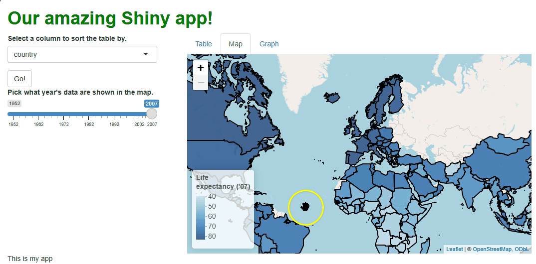
If you watch the video above closely, you’ll notice the “freeze” that
occurs every time a user selects a new year. As we saw with
DT, handling events by rebuilding our graphic is
not ideal. With maps, it can be especially problematic
because spatial data tend be voluminous, so re-rendering maps can cause
long loading times for our users and make the app look “buggy.”
Fortunately, just as with DT, leaflet
features a proxy that lets us update our rendered map
in real time, changing only those features that need
changing.
Let’s switch to that system the same way we did with
DT:
We’ll now use
renderLeaflet({})to produce just the version of the map that users sees at start-up.We use a new
observeEvent({},{})to watch for relevant events (here, our slider changing).Inside the observer, we use a proxy, built using
leafletProxy(), to make only the updates that need making:
R
##This code should be **swapped for** the renderLeaflet({}) code provided previously, inside of your server function!

 ##... other server code...

###MAP
  #RENDERLEAFLET GOES BACK TO MAKING JUST THE BASE, 2007 VERSION.
  output$basic_map = renderLeaflet({

    gap_map2007 = gap_map %>%
      filter(year == 2007) #<--CHANGE

    bounds = unname(sf::st_bbox(gap_map2007))

    leaflet(options = tileOptions(maxZoom = 6, minZoom = 2)) %>%
      addTiles() %>%
      addPolygons(
        data = gap_map2007$geometry,
        color = "black",
        weight = 2,
        opacity = 1,
        fillColor = map_palette(gap_map2007$lifeExp),
        fillOpacity = 0.75,
        popup = paste0("Country: ",
                       gap_map2007$country,
                       "<br>Life expectancy: ",
                       gap_map2007$lifeExp)
      ) %>%
      setMaxBounds(bounds[1], bounds[2], bounds[3], bounds[4]) %>%
      addLegend(
        position = "bottomleft",
        pal = map_palette,
        values = gap_map2007$lifeExp,
        opacity = 0.75,
        bins = 5,
        title = paste0("Life<br>expectancy ('07)") #<--CHANGE
      )

  })

  #A NEW OBSERVER WATCHES FOR EVENTS INVOLVING OUR SLIDER.
  observeEvent({input$year_slider}, {

    gap_map2007 = gap_map %>%
      filter(year == as.numeric(input$year_slider)) #FILTER BY SELECTED YEAR

    #WE USE leafletProxy({}) TO UPDATE OUR MAP INSTEAD OF RE-RENDERING IT.
    leafletProxy("basic_map") %>%
      clearMarkers() %>% #REMOVE THE OLD POLYGONS ("MARKERS")--THEIR FILLS MUST CHANGE.
      clearControls() %>% #REMOVE THE LEGEND ("CONTROL")--ITS TITLE MUST CHANGE.
      addPolygons( #REBUILD THE POLYGONS EXACTLY AS BEFORE.
        data = gap_map2007$geometry,
        color = "black",
        weight = 2,
        opacity = 1,
        fillColor = map_palette(gap_map2007$lifeExp),
        fillOpacity = 0.75,
        popup = paste0("Country: ",
                       gap_map2007$country,
                       "<br>Life expectancy: ",
                       gap_map2007$lifeExp)
      ) %>%
      addLegend( #REBUILD THE LEGEND EXACTLY AS BEFORE.
        position = "bottomleft",
        pal = map_palette,
        values = gap_map2007$lifeExp,
        opacity = 0.75,
        bins = 5,
        title = paste0("Life<br>expectancy ('",
                       substr(input$year_slider, 3, 4),
                       ")") #<-RETAIN OUR TRICK HERE.
      )

  })
In the code above, we still need to repeat quite a lot of code to handle these particular events, so the updating process isn’t much faster than before. However, we at least don’t need to touch the map window itself, its zoom behavior, or bounds because those aspects don’t need to change. The result is a cleaner, less buggy-looking transition between map versions:
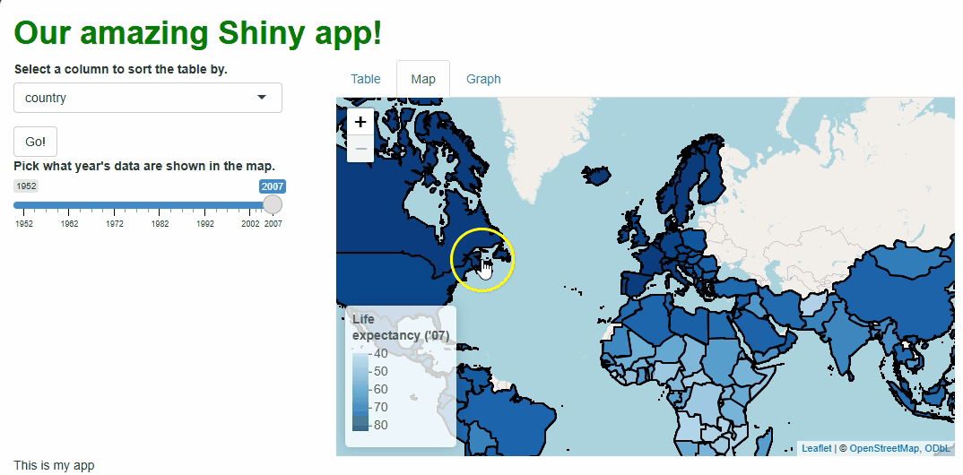
There are ways we could have made these updates even more efficient, such as:
Pre-building all possible filtered versions of the data set in
global.Rso we didn’t need to (re-)make them on the fly during each update.Making the legend title generic enough that it doesn’t need rebuilding each time.
Considering whether the user should be able to view and change the entire world’s data at once. Perhaps they should only be able to view and control a single continent’s data at a time.
Using a discrete rather than continuous color palette (e.g., only six possible colors), assigning every country’s polygon to a group (using the
groupparameter insideaddPolygons()) according to the “bin” their data falls into, determining whether a country’s “bin” should change during an update, and redrawing only those polygons whose “bins” do need to change.
However, you may deem the current solution “good enough” for your users—I would!
Watch and learn
leaflet maps are widgets like any
other, so information about user interactions with them are passed from
the UI to the server by input where they can be watched and
handled.
For example, whenever a user clicks a country’s
polygon, this could trigger a “click event,” and we can access
information about that event using
input$[outputId]_shape_click format server-side.
We can combine that functionality with another cool feature of
leaflet maps: flyTo(). This function will
pan and zoom the map to center on a
specific location, such as where the user clicked.
So, let’s create a new observer that watches for clicks, and, when
one happens, a leafletProxy() will fly our map to that
location:
R
##This code should be **added** to the bottom of your server.R file, but still within your server function!

###MAP OBSERVER (POLYGON CLICKS)
#WHEN A POLYGON CLICK EVENT OCCURS, WE USE A PROXY AND flyTo() TO ZOOM AND PAN THE MAP TO CENTER ON THE CLICKED LOCATION.
  observeEvent(input$basic_map_shape_click, {

    leafletProxy("basic_map") %>%
      flyTo(
        lat = input$basic_map_shape_click$lat, #LAT AND LONG DATA ON THE CLICKED LOCATION ARE ACCESSED THUSLY.
        lng = input$basic_map_shape_click$lng,
        zoom = 5
      )

  })
Now, when users click specific countries, they don’t just get additional info via a tooltip, they get an animation that zooms them in on that particular country:

Obviously, we should only add features like this if they enhance our UX, which this one arguably doesn’t, but this example demonstrates what’s possible.
Getting graphic
We’ll close out this lesson by considering plotly, a
package for producing interactive, web-enabled graphs,
similar in quality and complexity to the (static) ones produced by
ggplot2.
R users who know ggplot2 understand that learning
graphics packages is like learning a new language! The learning curve is
significant; because these packages give users all the
tools needed to design a complex graph piece by piece, there are lots of
functions and parameters and jargon to keep straight!
plotly is no different—you can create ultra-detailed,
publication-quality graphics with it, but you’ll need to learn a new
vernacular to do so, one that may only sometimes feel similar to
ggplot2’s.
As such, covering plotly in any depth is outside the
scope of this lesson. Thankfully, we don’t actually need to
learn plotly to appreciate what it can offer our users; it
comes with an incredible “cheat code” that, while imperfect,
will work suit our needs here wonderfully: the ggplotly()
function.
ggplotly() takes a complete ggplot, breaks
it down into its components, and rebuilds those components using
plotly’s system instead (as best it can). Because the two
systems are similar in many ways, you’ll get a similar graph as
a product, but one with all the interactive features of a
plotly graph.
However, because the two systems don’t map 1-to-1, the result will
rarely look exactly the same as the ggplot you put
in. In particular, complex customizations using ggplot’s
theme(), text-related components, advanced or new features
in ggplot’s dialect, and so on don’t generally transition
well.
So, it’s probably more correct to say that ggplotly()
produces a plotly graph in the spirit of the
ggplot2 graph used. Still, that means we don’t
need to learn how to produce a plotly graph using
plotly’s own system to be able to explore the package’s
features and use cases.
To start, let’s build a ggplot2 graph to use as an
input. Let’s make it a scatterplot of GDP vs. log(population) for 2007,
with each continent getting a different color too. Additionally, we’ll
plot a best-fit line for each continent’s data. And, to top it off,
we’ll customize the appearance of the graph in several ways.
This probably sounds like it’ll be a complicated graph, and
that’s because it will be! I want you to see how ggplotly()
performs on a graph with many components:
R
##This code should be **added** to the bottom of your global.R file!

###FILTERED DATA SET FOR GRAPH
gap2007 = gap %>%
  filter(year == 2007)

###BASE GGPLOT FOR CONVERSION TO PLOTLY
#IF GGPLOT IS FAMILIAR TO YOU, STUDY THE SPECIFICS HERE TO GET A SENSE OF THE GRAPH WE'RE BUILDING. IF NOT, DON'T WORRY ABOUT THE DETAILS! JUST COPY-PASTE THIS CODE INTO PLACE.
p1 = ggplot(
  gap2007,
  aes(
    x = log(pop),
    y = gdpPercap,
    color = continent,
    group = continent
  )
) +
  geom_point(size = 3) +
  geom_smooth(method = "lm", se = F) +
  theme(
    text = element_text(
      size = 16,
      color = "black",
      face = "bold"
    ),
    panel.background = element_rect(fill = "white"),
    panel.grid.major = element_line(color = "gray"),
    panel.grid.minor = element_blank(),
    axis.line = element_line(color = "black", linewidth = 1.5)
  ) +
  scale_y_continuous("GDP per capita\n") +
  scale_x_continuous("\nPopulation size (log)") +
  scale_color_discrete("Continent\n")
If you don’t know ggplot2, the above code will probably
look daunting! If so, don’t worry; you don’t need to know what
it’s doing at all! Just copy-paste it into your app’s
global.R file.
For those who do know ggplot2, you’ll hopefully
agree that this graph looks halfway decent:
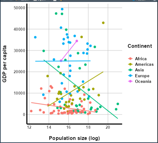
More importantly, though, it’s complex enough to be a good test for
ggplotly(). Let’s see how it does at converting it to a
plotly graph:
R
##This code should be **added** to the bottom of your global.R file!
p2 = ggplotly(p1)
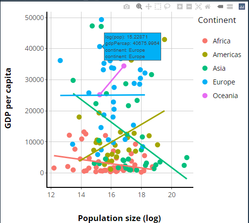
Now that we have our plotly version, I hope you’ll agree
it looks pretty similar to our original ggplot, although
there are some differences—we’ll talk about those in a moment.
First, though, let’s insert this graph into our app. For this, it
hopefully won’t surprise you that there are
renderPlotly({}) and plotlyOutput() functions
we can use:
R
##This code should **swapped** for the the "main panel" content in the BODY section of your ui.R file!

##... other UI code...
###MAIN PANEL CELL
column(width = 8, tabsetPanel(
      tabPanel(title = "Table", dataTableOutput("table1")),
      tabPanel(title = "Map", leafletOutput("basic_map")),
      tabPanel(title = "Graph",
               plotlyOutput("basic_graph")) #<--ADD THE RENDERED GRAPH HERE.
    )),
##... other UI code...
R
##This code should be **added to** your server.R file, underneath all other contents but inside of your server function!

 ##... other server code...
###GRAPH
output$basic_graph = renderPlotly({

    p2 #<--PUT PRE-GENERATED PLOTLY GRAPH HERE.

})
If we launch our app, we should see our new plotly graph
on the Graph tab panel:
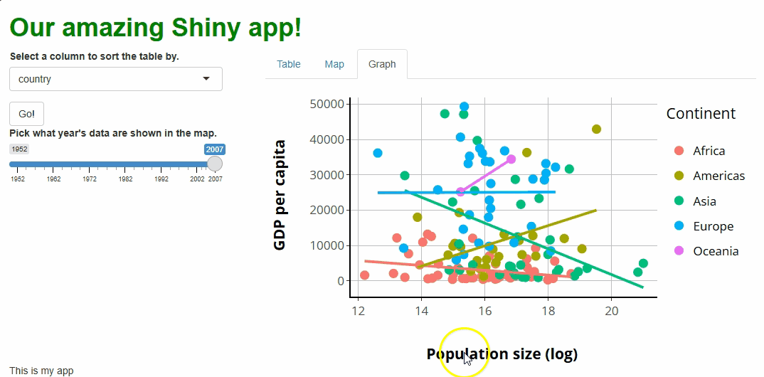
The only aesthetic difference between our original
ggplot and our new plotly graph that stands
out to me is the legend’s placement; while ggplots
vertically center their legends by default, plotly graphs
top-align them instead.
We’ll fix that in a moment! Beforehand, let’s focus on all the new interactive features this graph comes with that the old one lacks (it’s a lot!):
Tooltips: If you hover over a point, you’ll get a tooltip showing the point’s associated
x,y, andgroup(continent) values. These tooltips aren’t super human-readable by default, but that too we’ll soon change.Click+drag to zoom: If you click anywhere, drag your cursor to highlight a region, and let go, you will zoom the graph to show only the highlighted region and data. Double-clicking will restore the original zoom level.
Interactive “modebar:”
plotlygraphs come with a toolbar in the upper-right that features several buttons. These allow you to download an image of the graph, zoom and pan, select specific data, reset the graph, and change how tooltips work.Legend group filtering: If you click any of the legend keys (such as “Asia”), all data points from that group will be redacted, and the axes will readjust as though those data weren’t present. Double-clicking a legend key, meanwhile, will exclude all data but those from that group.
That’s a lot of interactivity!
More (or less) basic graph
…which means we should discuss how to disable some of these features.
Unfortunately, disabling features in plotly is not
as easy as in DT or leaflet; to do
so, we must engage with two of the core functions used to build
plotly graphs from scratch: layout() and
config().
layout() is sort of like ggplot2’s
scale_*() functions in that it controls how much of the
plot’s mapped aesthetics work. Inside layout() are
xaxis and yaxis parameters; if we give both a
list containing the instruction fixedrange = TRUE, this
will disable zooming functionality:
R
##This code should **replace** the renderPlotly({}) code in your server.R file, inside of your server function!

 ##... other server code...
###GRAPH
  output$basic_graph = renderPlotly({
    p2 %>%
      layout(
        #PLOTLY CODE LOOKS VERY JS-Y, HENCE LOTSA LISTS!
        xaxis = list(fixedrange = TRUE),
        yaxis = list(fixedrange = TRUE))

  })
In my experience, zooming isn’t a useful feature in most contexts, and some users find it hard to figure out how to reverse an accidental zoom, so it’s one of the first features I tend to disable.
We can also use layout() to adjust how the legend
responds to clicks. For example, if we want to turn off the
functionality that redacts a group when its legend key is clicked, we
can set the itemclick instruction for the
legend parameter to FALSE:
R
##This code should **replace** the renderPlotly({}) code in your server.R file, inside of your server function!

 ##... other server code...
###GRAPH
  output$basic_graph = renderPlotly({

    p2 %>%
      layout(
        xaxis = list(fixedrange = TRUE),
        yaxis = list(fixedrange = TRUE),
        legend = list(itemclick = FALSE) #<--TURN OFF GROUP REDACTION UPON CLICKING LEGEND KEYS.
      )

  })
The double-click functionality can be similarly disabled. In my experience, though it seems useful, I’ve struggled to adequately explain the legend key filtering functionality to my users, so it’s another feature I regularly disable.
The config() function, meanwhile, can remove buttons
from the modebar, although you may need to Google for the names of the
specific buttons you want to remove:
R
##This code should **replace** the renderPlotly({}) code in your server.R file, inside of your server function!

 ##... other server
###GRAPH
  output$basic_graph = renderPlotly({

    p2 %>%
      layout(
        xaxis = list(fixedrange = TRUE),
        yaxis = list(fixedrange = TRUE),
        legend = list(itemclick = FALSE)
      ) %>%
      config(modeBarButtonsToRemove = list("lasso2d")) #<--REMOVING THE "LASSO" SELECTION BUTTON.

  })
Callout
I’ll stress here again that, when considering UX, “less” is often “more.” If your users might not understand it or won’t use it, consider removing or disabling it.
Making some adjustments
Earlier, I identified two dissatisfying aspects about our graph. First, the legend isn’t centered vertically, like in our original graph and, second, the tooltip text could be easier to read.
The first issue is solved using the legend parameter
inside of layout(), which we’ve already dabbled with:
R
##This code should **replace** the renderPlotly({}) code in your server.R file, inside of your server function!

 ##... other server code...
###GRAPH
  output$basic_graph = renderPlotly({

    p2 %>%
      layout(
        xaxis = list(fixedrange = TRUE),
        yaxis = list(fixedrange = TRUE),
        legend = list(itemclick = FALSE,
                      y = 0.5, #<--PUT THE LEGEND HALFWAY DOWN.
                      yanchor = "middle" #<--SPECIFICALLY, PUT THE *CENTER* OF IT HALFWAY DOWN.
                      )
      ) %>%
      config(modeBarButtonsToRemove = list("lasso2d"))

  })
The best way to beautify our tooltips’ contents, meanwhile, will be
to use a third core plotly function:
style().
This’ll be a multi-step process:
First, let’s “pre-generate” the text we want each tooltip to contain (using
dplyr’smutate()).Second, let’s pass this text into our original
ggplotcall so it gets packaged up with everything else passed toggplotly().Lastly, let’s use
style()to make the contents of our tooltips only the custom text we’ve cooked up:
R
##This code should **replace** the previous plotly-related code in your global.R file!

 ##... other global code...
###FILTERED DATA SET FOR GRAPH
gap2007 = gap %>%
  filter(year == 2007) %>%
  mutate(tooltip_text = paste0( #<--HERE, GENERATE A NEW COLUMN CALLED tooltip_text USING paste0() TO MAKE A TEXT STRING CONTAINING THE GDP AND POPULATION DATA IN A MORE READABLE FORMAT.
    "GDP: ",
    round(gdpPercap, 1),
    "<br>",
    "Log population: ",
    round(log(pop), 3)
  ))

###BASE GGPLOT FOR CONVERSION TO PLOTLY
p1 = ggplot(
  gap2007,
  aes(
    x = log(pop),
    y = gdpPercap,
    color = continent,
    group = continent,
    text = tooltip_text #<--HERE, PASS OUR CUSTOM TOOLTIP TEXT TO THE TEXT AESTHETIC. EVEN THOUGH OUR GGPLOT NEVER USES THIS AESTHETIC, IT'LL PASS IT TO OUR PLOTLY GRAPH ANYHOW.
  )
) +
  geom_point(size = 3) +
  geom_smooth(method = "lm", se = F) +
  theme(
    text = element_text(
      size = 16,
      color = "black",
      face = "bold"
    ),
    panel.background = element_rect(fill = "white"),
    panel.grid.major = element_line(color = "gray"),
    panel.grid.minor = element_blank(),
    axis.line = element_line(color = "black", linewidth = 1.5)
  ) +
  scale_y_continuous("GDP per capita\n") +
  scale_x_continuous("\nPopulation size (log)") +
  scale_color_discrete("Continent\n")

###PLOTLY CONVERSION
p2 = ggplotly(p1,
              tooltip = "text") %>% #<--HERE, TELL GGPLOTLY() TO POPULATE TOOLTIPS WITH ONLY TEXT DATA, NOT ALSO X/Y/GROUP DATA
  style(hoverinfo = "text") #<--HERE, USE style() TO REQUEST THAT ONLY OUR CUSTOM TOOLTIPS BE SHOWN, OR ELSE WE'D GET PLOTLY'S DEFAULTS ALSO!
Now our tooltips are looking great:
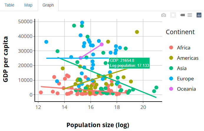
The morale of the story is that, between layout(),
style(), and config(), you can adjust
virtually any aspect of a plotly graph, much as in
ggplot2 using theme() and the
scale_*() functions. However, it may require some Googling
and experimentation to figure out exactly how to do any
specific thing!
Update, don’t remake, plotly edition!
Once again, it’s time to see how to update a plotly
graph “on the fly” in response to user actions without re-rendering
it!
That again first means giving users a fun way to affect the graph. Let’s create a drop-down widget that lets users pick a new color palette for the graph:
R
##This code should **replace** the "sidebar panel" cell's content within the BODY section of your ui.R file!

##... other UI code...
###SIDEBAR CELL
    column(width = 4,
           selectInput(
             inputId = "sorted_column",
             label = "Select a column to sort the table by.",
             choices = names(gap)
           ),
           actionButton(
             inputId = "go_button",
             label = "Go!"),
           sliderInput(
             inputId = "year_slider",
             label = "Pick what year's data are shown in the map.",
             value = 2007,
             min = min(gap$year),
             max = max(gap$year),
             step = 5,
             sep = ""
           ),
           selectInput( #ADD A COLOR PALETTE SELECTOR
             inputId = "color_scheme",
             label = "Pick a color palette for the graph.",
             choices = c("viridis", "plasma", "Spectral", "Dark2")
           )
    ),
##... other UI code...
In plotly, color scheme is generally specified inside
the plot_ly() call (the equivalent of ggplot()
in ggplot2) or inside an add_*() function call
(the equivalent of a geom_* call in ggplot2).
However, one can be specified or modified using style()
too.
To update rather than remake our graph, we’ll use the
plotly functions plotlyProxy() and
plotlyProxyInvoke(), which are like
dataTableProxy() and its helper functions like
replaceData(). They are a “package deal;” both are needed
to accomplish the task. Specifically, we’ll use the
"restyle" method inside plotProxyInvoke() to
trigger a re-styling of the graph.
As before, we make a new observer that watches
input$color_scheme and triggers restyling using
plotlyProxy(), leaving renderPlotly({}) to
produce only the version of the graph we see on start-up:
R
##This code should **replace** all your plotly-related code to date in your server.R file!

##... other server code...

###GRAPH OBSERVER (COLOR SCHEME SELECTOR)
  #THIS OBSERVER UPDATES THE GRAPH WHEN EVENTS ARE TRIGGERED.
  observeEvent(input$color_scheme, {

    #WE FIRST DESIGN AN APPROPRIATE COLOR PALETTE FOR THE DATA, GIVEN THE USER'S COLOR SCHEME CHOICE
    new_pal = colorFactor(palette = input$color_scheme,
                          domain = unique(gap2007$continent))

    plotlyProxy("basic_graph", session) %>% #<--WE HAVE TO INCLUDE session HERE TOO.
      plotlyProxyInvoke("restyle", #<-THE TYPE OF CHANGE WE WANT
                        list(marker = list(
                          color = new_pal(gap2007$continent), #FOR OUR MARKERS, USE THESE NEW COLORS.
                          size = 11.3 #AND THIS POINT SIZE.
      )),
      0:4) #APPLY THIS CHANGE TO ALL 5 GROUPS OF MARKERS WE HAVE.

  })
The inputs to plotlyProxyInvoke() are a little
complicated, so let’s go over them. The first is the name of a
method the proxy should use. Here, we use the
"restyle" method because we want to adjust things the
style() function regulates, such as the graph’s color
scheme. There’s also a "relayout" method for adjusting
things that layout() controls, such as the legend.
The second input is a list of lists—this is where we’re very
nearly writing JavaScript code; if there’s one thing JS loves, it’s
lists! The outermost list contains the aspects of the graph we want to
re-style (here, markers are the only such thing).
Then, we provide a list to each such aspect—what specific
features do we want to change about that aspect? Here, we’re changing
the colors of our markers, setting them equal to the new
colors we’ve generated using colorFactor() from
leaflet.
However, we also specify point sizes. Why? If
plotlyProxy() is asked to redraw our graph’s markers, it’ll
do so “from scratch,” using plotly default values for any
properties we don’t specifically specify. Since our original graph
featured custom-sized points, we need to “override the defaults” to get
the same point sizes after the redraw as we had before it.
The last input to plotlyProxyInvoke() is a set of
trace numbers. A plotly
trace is one “set” of data being graphed. In our case,
we have five traces, one for each continent, and we’re modifying all
five, so you’d think we’d need to put 1:5 here.
However, JS starts counting things at 0, not 1 (it’s a “zero-indexed
language,” whereas R is a “one-indexed language”), so we actually need
0:4 instead.
You’ll notice that, with this new proxy in place, our points change colors as we adjust our new selector. However, our lines don’t, and our legend keys do change but to the wrong colors:
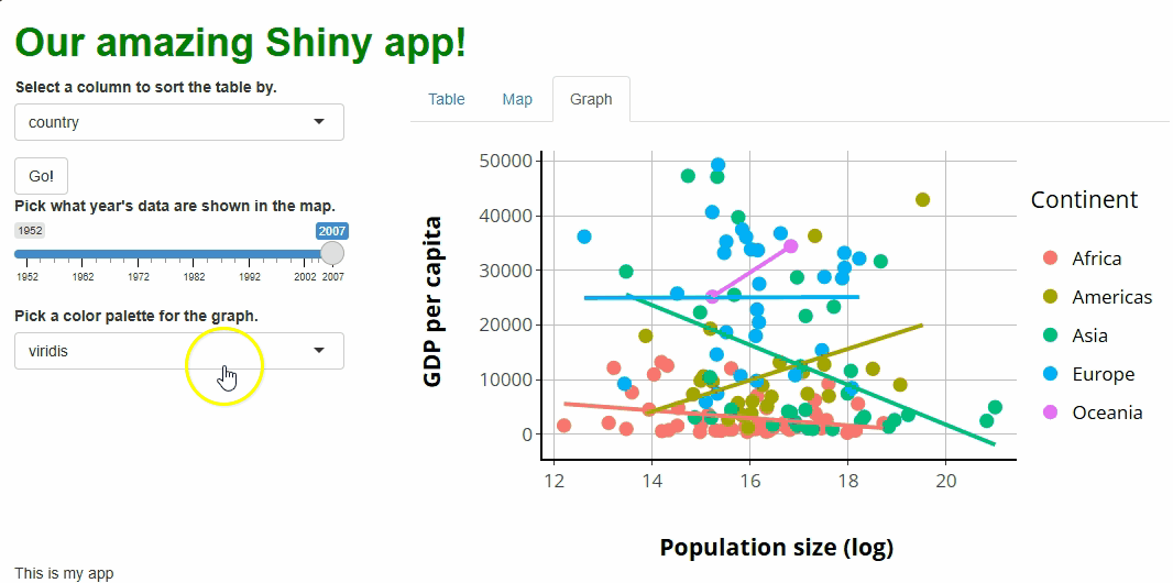
These are fixable problems, but not without some
grief—in simple terms, the graph conversion performed by
ggplotly() comes with baggage that we’re running into here.
If we really want to allow users to choose our graph’s color palette,
we’d have an easier time if we rebuilt our graph in
plotly.
Point and click
As with all other widgets, user interactions with plotly
graphs can trigger events.
However, plotly is unusual in that info about events is
not passed from the UI to the server via input.
Instead, plotly has an alternative (but equivalent) system
that uses the functions event_register() to specify which
events to track and event_data() to pass the relevant event
data to the server as a reactive object. This
sounds more complicated than what we’re used to, but it’s
really the same idea with differently named parts.
First, let’s create a textOutput() in our UI, beneath
our graph. We will report a message to the user there abiut the point
they’ve clicked that we will build server-side:
R
##This code should **replace** the "main panel" cell's content within the BODY section of your ui.R file!

##... other UI code...
###MAIN PANEL CELL
    column(width = 8, tabsetPanel(
      tabPanel(title = "Table", dataTableOutput("table1")),
      tabPanel(title = "Map", leafletOutput("basic_map")),
      tabPanel(title = "Graph",
               plotlyOutput("basic_graph"),
               textOutput("point_clicked")) #<--ADD TEXTOUTPUT TO UI.
    ))
##... other UI code...
Next, let’s “register” with our graph that we want to watch for mouse
click events. At the same time, we’ll give our graph a special attribute
(a source) that is used just to make this system work, sort
of how an inputId is used for tracking event data
normally:
R
##This code should **replace** the ggplotly() call within your global.R file!

##... other global code...
###PLOTLY CONVERSION
p2 = ggplotly(p1,
              tooltip = "text",
              source = "our_graph") %>% #<--A SPECIAL ID JUST FOR THIS SYSTEM.
  style(hoverinfo = "text") %>%
  event_register("plotly_click") #<--WATCH FOR USER CLICK EVENTS
Lastly, let’s create a new observer in our server.R file
to watch for clicks, referencing the source and event type
data we just established. When a user clicks a point in our graph, a
text message will appear telling them the raw population count for that
point, which might be helpful given that we are currently
log-transforming those data:
R
##This code should **added to** the bottom of your server.R file, within the server function!

##... other server code...

  #WE USE THE event_data() CALL LIKE ANY OTHER REACTIVE OBJECT.
  observeEvent(event_data(event = "plotly_click",
                          source = "our_graph"), {

    output$point_clicked = renderText({
      paste0(
        "The exact population for this point was: ",
        prettyNum(round(exp(
          event_data(event = "plotly_click", source = "our_graph")$x
          )), big.mark = ",") #<--WE CAN ACCESS THE X VALUE OF THE POINT CLICKED THIS WAY.
      )

    })

  })
If you run the app at this point and click on any of the points, you should see something like this:
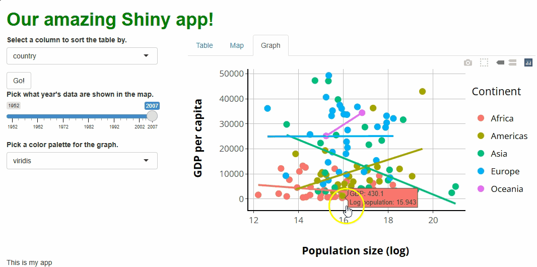
In this setup, we aren’t using input like we have
before, but we are creating something equivalent—a single reactive
object that passes one type of event data for one UI component to the
server for use in event handling.
Whenever an event triggers, we use renderText({}) and
textOutput() to show the population datum of the point
clicked. This is admittedly not a thrilling use of this functionality,
but it hopefully shows what’s possible, and it could be of value to some
users.
Ultimately, this system of event watching and handling is not
much harder to learn and use than the typical one involving
input; it’s more difficult only in that it’s
different.
Key Points
- The
DT,leaflet, andplotlypackages can be used to produce web-enabled, interactive tables, maps, and graphs for incorporation into Shiny apps. - Each of the graphics these packages create come with tons of interactive features. Because some of this functionality might be confusing or unnecessary for some users or contexts, it’s valuable to know how to adjust or disable them. It’s better to have only as many features as are needed and that your users can handle.
- The aesthetics of these graphics can be adjusted or customized, but the specifics of how to do this (and how easy or intuitive it will be) varies widely.
- We should strive to update graphics, changing only the aspects that
need changing, rather than remaking graphics from scratch. This
generally means handling events using observers and proxies rather than
using
render*({})functions. - Like with other widgets, user interactions with these graphics can
be tracked by the UI and passed to the server for handling. This passing
happens with the
inputobject forDTandleaflet, but an equivalent system must be used forplotly.